RecyclerView-FlexibleDivider
Android library providing simple way to control divider items of RecyclerView


Release Note
[Release Note] (https://github.com/yqritc/RecyclerView-FlexibleDivider/releases)
Gradle
repositories {
    jcenter()
}

dependencies {
    compile 'com.yqritc:recyclerview-flexibledivider:1.4.0'
}
Usage
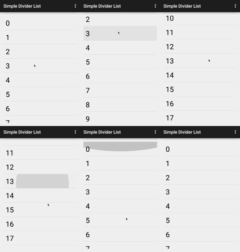
The following is the simplest usage.
Drawing a divider drawable retrieved from android.R.attr.listDivider between each cell.
RecyclerView recyclerView = (RecyclerView) findViewById(R.id.recyclerview);
recyclerView.addItemDecoration(new HorizontalDividerItemDecoration.Builder(this).build());
| ItemDecoration | Usage |
|---|---|
| HorizontalDividerItemDecoration | For layout manager having vertical orientation to draw horizontal divider |
| VerticalDividerItemDecoration | For layout manager having horizontal orientation to draw vertical divider |
| *Please note that you can only set one of above item decorations at a time. |
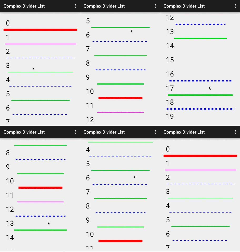
If you want to set color, size and margin values, you can specify as the followings.
RecyclerView recyclerView = (RecyclerView) findViewById(R.id.recyclerview);
recyclerView.addItemDecoration(
        new HorizontalDividerItemDecoration.Builder(this)
                .color(Color.RED)
                .sizeResId(R.dimen.divider)
                .marginResId(R.dimen.leftmargin, R.dimen.rightmargin)
                .build());
Instead of setting color and size, you can set paint object.
Paint paint = new Paint();
paint.setStrokeWidth(5);
paint.setColor(Color.BLUE);
paint.setAntiAlias(true);
paint.setPathEffect(new DashPathEffect(new float[]{25.0f, 25.0f}, 0));
recyclerView.addItemDecoration(
        new HorizontalDividerItemDecoration.Builder(this).paint(paint).build());
Also 9patch drawable can be used for drawing divider.
RecyclerView recyclerView = (RecyclerView) findViewById(R.id.recyclerview);
recyclerView.addItemDecoration(new HorizontalDividerItemDecoration.Builder(this)
        .drawable(R.drawable.sample)
        .size(15)
        .build());
If you want to customize divider depending on the position, implement the following interfaces.
List of provider
The following providers can be implemented and controllable for each divider drawn between cells.
Please refer to ComplexAdapter class in the sample for the usage of providers in detail.
ColorProvider Provide color for divider
PaintProvider Provide paint object for divider line to draw.
DrawableDivider Provide drawable object for divider line
SizeProvider Provide height for horizontal divider, width for vertical divider.
VisibilityProvider
Enables you to control the visibility of dividers.MarginProvider for horizontal divider (vertical list)
Enables you to specify left and right margin of divider.MarginProvider for vertical divider (horizontal list)
Enables you to specify top and bottom margin of divider.
For GridLayoutManager, the position parameter of above providers is group index of items. So, control your divider based on [group index](http://developer.android.com/intl/ja/reference/android/support/v7/widget/GridLayoutManager.SpanSizeLookup.html#getSpanGroupIndex(int, int)) instead of the position of items.
Optional
Builder.showLastDivider
Draw divider line at the end of last item in RecyclerView. If you enable this, the range of position parameter of providers listed above is 0 to itemCount-1. Otherwise, the range is 0 to itemCount-2.Builder.positionInsideItem
Draw divider inside items.
If you want to follow material design guideline, enable this feature.
Note
- When neither of color, paint, drawable is set, default divider retrieved from android.R.attr.listDivider will be used.
- When you set Paint, you must use setColor and setStrokeWidth methods of paint class.
- If you want to use DashPathEffect, please note the following issue. https://code.google.com/p/android/issues/detail?id=29944
Looking for custom ItemDecoration to achieve equal column space for GridLayoutManager?
Check out https://gist.github.com/yqritc/ccca77dc42f2364777e1
License
Copyright 2016 yqritc

Licensed under the Apache License, Version 2.0 (the "License");
you may not use this file except in compliance with the License.
You may obtain a copy of the License at

   http://www.apache.org/licenses/LICENSE-2.0

Unless required by applicable law or agreed to in writing, software
distributed under the License is distributed on an "AS IS" BASIS,
WITHOUT WARRANTIES OR CONDITIONS OF ANY KIND, either express or implied.
See the License for the specific language governing permissions and
limitations under the License.


