compose-shimmer
A library which offers a shimmering effect for Compose.

Setup
The library is available on mavenCentral().
dependencies {
    implementation("com.valentinilk.shimmer:compose-shimmer:1.5.0")
}
Multiplatform Targets
Supported CMP targets are: Android, iOS, JVM (Desktop), JS (Browser) and Wasm (WebAssembly).
Compose Multiplatform Version
In case of compatibility issues, select a library version that is based on the same compose version as your project.
| Shimmer Version | Based on Compose |
|---|---|
| 1.5.0 | 1.11 |
| 1.4.0 | 1.10.3 |
| 1.3.3 | 1.8.1 |
| 1.3.2 | 1.7.3 |
Quick Start
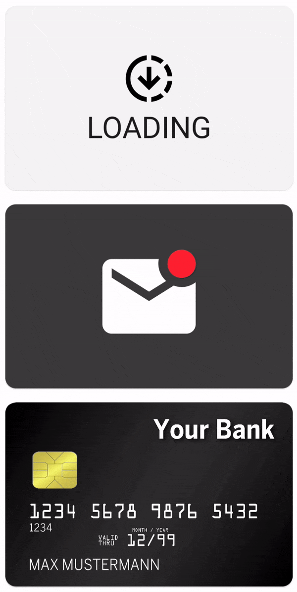
Simply apply the shimmer modifier to any UI of your choice. The code below will emit the shimmering UI that can be
seen in the GIF above.
@Composable
fun ShimmeringPlaceholder() {
    Row(
        modifier = Modifier
            .shimmer() // <- Affects all subsequent UI elements
            .fillMaxWidth()
            .padding(16.dp),
        horizontalArrangement = Arrangement.spacedBy(16.dp),
    ) {
        Box(
            modifier = Modifier
                .size(80.dp, 80.dp)
                .background(Color.LightGray),
        )
        Column(
            verticalArrangement = Arrangement.spacedBy(16.dp),
        ) {
            Box(
                modifier = Modifier
                    .fillMaxWidth()
                    .height(24.dp)
                    .background(Color.LightGray),
            )
            Box(
                modifier = Modifier
                    .size(120.dp, 20.dp)
                    .background(Color.LightGray),
            )
        }
    }
}
Modifier placement
As usual with modifiers the order
matters.
Every UI component defined after the shimmer modifier will be affected by the animation. This includes child views
and other modifiers:
The first example demonstrates that only the inner Box is shimmering, even though the shimmer has been added to
the outer Box's modifier stack. The blue background is not shimmering, as it's sitting above the shimmer modifier.
Box(
    modifier = Modifier
        .size(128.dp)
        .background(Color.Blue)
        .shimmer(),
    contentAlignment = Alignment.Center
) {
    Box(
        modifier = Modifier
            .size(64.dp)
            .background(Color.Red)
    )
}

If the modifier, however, is applied earlier, the outer Box's background modifier is affected by the
shimmer as well.
Box(
    modifier = Modifier
        .size(128.dp)
        .shimmer()
        .background(Color.Blue),
    contentAlignment = Alignment.Center
) {
    Box(
        modifier = Modifier
            .size(64.dp)
            .background(Color.Red)
    )
}

Theming
The library includes a ShimmerTheme which can be provided as
a local composition.
A good practice would be to integrate the theming into
your customized MaterialTheme.
There is no need to wrap every single shimmer into a CompositionLocalProvider.
val yourShimmerTheme = defaultShimmerTheme.copy(/* Set your desirable values */)

CompositionLocalProvider(
    LocalShimmerTheme provides yourShimmerTheme
) {
    /* content */
}
The theme can also be passed as a parameter by using the rememberShimmer(...) function, which is
explained further down below.
The theme itself offers a few simple configurations like the shimmer's rotation or width.
Additionally, a few unabstracted objects like an AnimationSpec or BlendMode are exposed. While
this violates the principles
of information hiding, it allows for some great
customizations.
For further information have a look at documentation in data class itself and have a look at
the ThemingSamples in the sample app.
Advanced Usage
The default shimmer() modifier creates a shimmering animation, which will traverse over the view
in a certain time. That means that the animation will have a different velocity, depending on the
size of the view.
If you apply the modifier to multiple views, each of a different size, then each shimmer will have its own velocity. This effect can be seen in the following GIF:

That might not always be the desired effect, that's why the library offers a way to set the boundaries for the animation:
val shimmerInstance = rememberShimmer(shimmerBounds = ShimmerBounds.XXX)
Box(modifier = Modifier.shimmer(shimmerInstance))
ShimmerBounds.View (default)
The view's height and width will be used as the boundaries for the animation. This option was used to create the GIFs shown above and should be sufficient for most use cases.
ShimmerBounds.Window
This option uses the window's height, with and coordinate system for the calculations. It will create a shimmer that travels over the whole window instead of only the views. But only views that have the shimmer modifier attached will be affected.
Be aware that this option might look odd on scrollable content, because the shimmer will be positioned relative to the window. So the shimmer will not be moved together with the content.
Column {
    val shimmerInstance = rememberShimmer(shimmerBounds = ShimmerBounds.Window)
    Text("Shimmering Text", modifier = Modifier.shimmer(shimmerInstance))
    Text("Non-shimmering Text")
    Text("Shimmering Text", modifier = Modifier.shimmer(shimmerInstance))
}

ShimmerBounds.Custom
The downsides of the Window option is why the ShimmerBounds.Custom option exists.
By using this option, the shimmer and its content will not be drawn until the bounds are set
manually by using the updateBounds method on the Shimmer.
This can be used to attach the shimmer to a scrollable list for example. Or simply use the default
ShimmerBounds.View option.
val shimmerInstance = rememberShimmer(ShimmerBounds.Custom)
Column(
    modifier = Modifier
        .fillMaxSize()
        .verticalScroll(rememberScrollState())
        .onGloballyPositioned { layoutCoordinates ->
            // Util function included in the library
            val position = layoutCoordinates.unclippedBoundsInWindow()
            shimmerInstance.updateBounds(position)
        },
) {
    Text("Shimmering Text", modifier = Modifier.shimmer(shimmerInstance))
    Text("Non-shimmering Text")
    Text("Shimmering Text", modifier = Modifier.shimmer(shimmerInstance))
}
Sample Apps
Sample apps for different platforms are included in the project. To use them, clone the repository into a folder locally.
Android
To run the Android app, simply open the project in Android Studio. Select the sample configuration and run it.
iOS
The iOS app can be build and launched by using XCode. Open the iosApp folder with XCode as a project. Adapt the
signing in XCode to match your needs and launch the app on an emulator or iOS device.
Desktop
The desktop app can be launched by using the sample.desktop configuration in Android Studio. Or run
./gradlew :sample:run in the terminal.
Browser
To run the sample in the browser, simply use the sample.browser configuration in Android Studio. Or run
./gradlew :sample:jsBrowserDevelopmentRun in the terminal.
WebAssembly (Wasm)
To run the Wasm sample use the sample.wasm configuration in Android Studio or run
./gradlew :sample:wasmJsBrowserDevelopmentRun in the terminal.
License
Copyright 2026 Valentin Ilk

Licensed under the Apache License, Version 2.0 (the "License");
you may not use this file except in compliance with the License.
You may obtain a copy of the License at

   http://www.apache.org/licenses/LICENSE-2.0

Unless required by applicable law or agreed to in writing, software
distributed under the License is distributed on an "AS IS" BASIS,
WITHOUT WARRANTIES OR CONDITIONS OF ANY KIND, either express or implied.
See the License for the specific language governing permissions and
limitations under the License.
