DateRangePicker
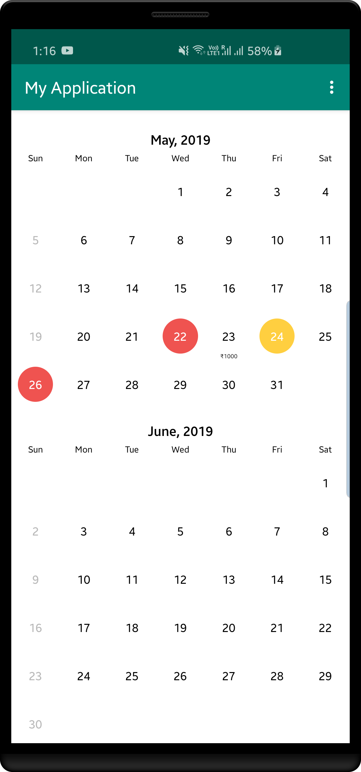
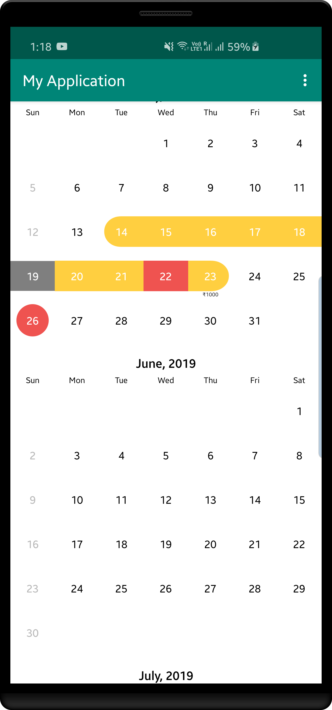
Date Range Picker is a Calendar Picker View to show a Customized Date Range Picker with improved UI and functionality to add subtitles to the dates
Screenshots


Usage
- Add Calendar Picker View to XML
<com.savvi.rangedatepicker.CalendarPickerView
        xmlns:android="http://schemas.android.com/apk/res/android"
        xmlns:app="http://schemas.android.com/apk/res-auto"
        android:id="@+id/calendar_view"
        android:layout_width="match_parent"
        android:layout_height="match_parent"
        android:scrollbarStyle="outsideOverlay"
        android:clipToPadding="false"
        app:tsquare_orientation_horizontal="false"
        app:tsquare_dividerColor="@color/transparent"
        app:tsquare_headerTextColor="@color/custom_header_text"
        />
- Initialize it in Java Class
        calendar.init(lastYear.getTime(), nextYear.getTime()) //
                .inMode(CalendarPickerView.SelectionMode.RANGE)
                .withSelectedDate(new Date())
// deactivates given dates, non selectable
                .withDeactivateDates(list)
// highlight dates in red color, mean they are aleady used.
                .withHighlightedDates(arrayList)
// add subtitles to the dates pass a arrayList of SubTitle objects with date and text
                .withSubtitles(getSubtitle())
There are other Selection modes also SINGLE and MULTIPLE
Adding Deactivated Dates User wont able to select these dates they will be deactivated. for eg, if you dont want to provide services on Saturday and Sunday you can mark them deactivated in that case the date text color wil be grey..
You can aslo specify custom month header style by passing SimpleDateFormat object in constructor For eg. if we want to display year
calendar.init(lastYear.getTime(), nextYear.getTime(), new SimpleDateFormat("MMMM, YYYY", Locale.getDefault()));
- Getting Selected Dates You can get selected dates with the below function call when your user click finish or next button (which will you implement).
calendar.getSelectedDates()
- Specifying Horizontal Orientation You can change the orientation of the CalendarPickerView by declaring it in xml view
app:tsquare_orientation_horizontal="true"
- Changing the colors of different states
Add this attr in your colors.xml file to override the default colors
<color name="calendar_selected_day_bg">#E91E63</color>
<color name="calendar_selected_range_bg">#8BC34A</color>

//this is for HighLighted dates
<color name="calendar_unavailable_bg">#F44336</color>
<color name="calendar_range_middle_unavailable_bg">#F44336</color>

// this is for Deactivated dates
<color name="calendar_range_middle_deactivated_bg">#673AB7</color>
For Changing the text colors please have a look at day_text_color.xml in rangepicker module and you can ovveride the resource colors to customize it
Import DateRangePicker dependency
declare it into your pom.xml
<dependency>
  <groupId>com.savvi.datepicker</groupId>
  <artifactId>rangepicker</artifactId>
  <version>1.3.0</version>
  <type>pom</type>
</dependency>
or into your build.gradle
dependencies {
    compile 'com.savvi.datepicker:rangepicker:1.3.0'
}
License
Copyright 2017 Sarabjeet Singh

Licensed under the Apache License, Version 2.0 (the "License");
you may not use this file except in compliance with the License.
You may obtain a copy of the License at

   http://www.apache.org/licenses/LICENSE-2.0

Unless required by applicable law or agreed to in writing, software
distributed under the License is distributed on an "AS IS" BASIS,
WITHOUT WARRANTIES OR CONDITIONS OF ANY KIND, either express or implied.
See the License for the specific language governing permissions and
limitations under the License.

