jetlime
A simple yet highly customizable UI library to show a timeline view in Compose Multiplatform.


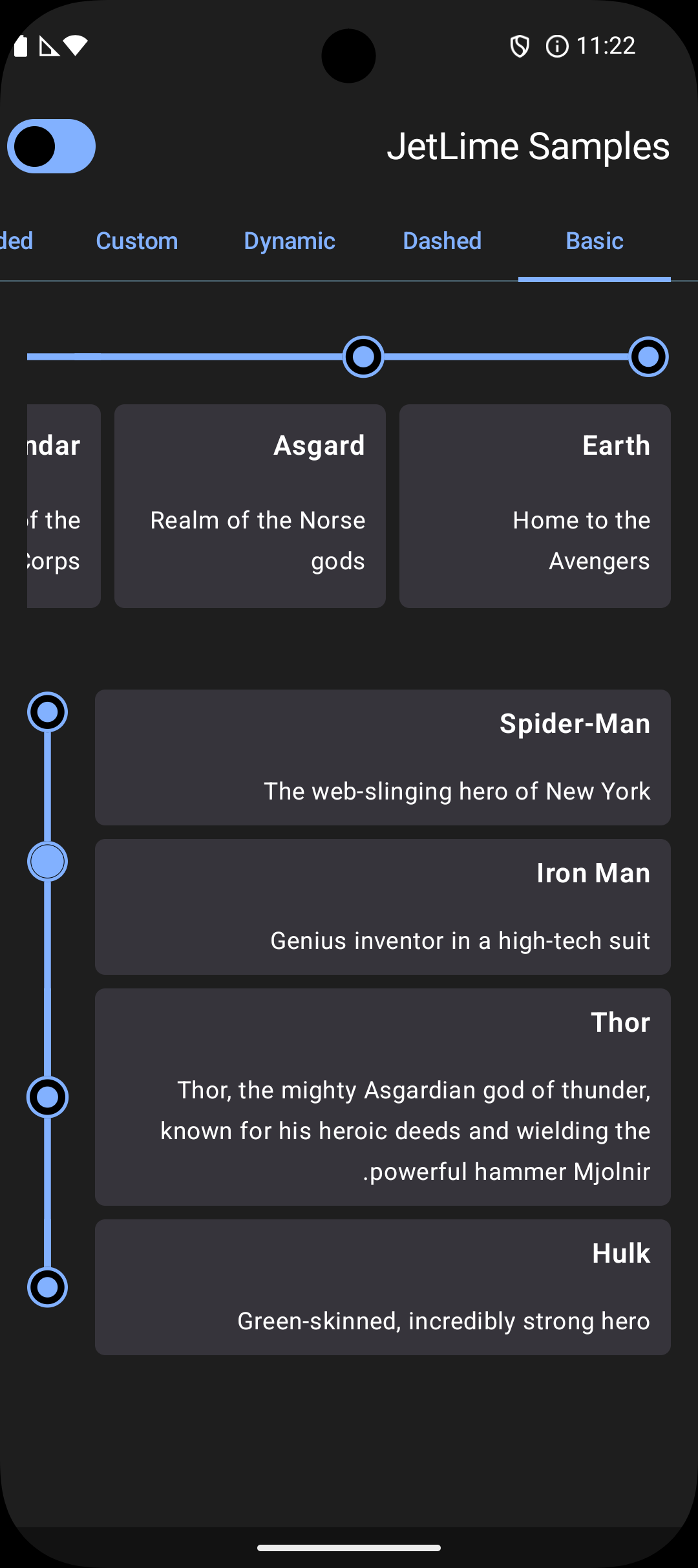
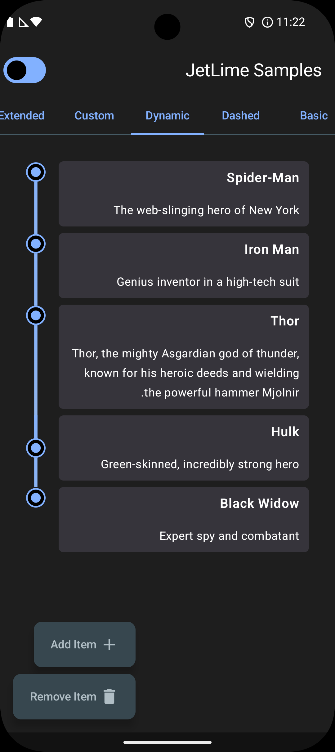
| Basic | Dashed | Dynamic |
|---|---|---|
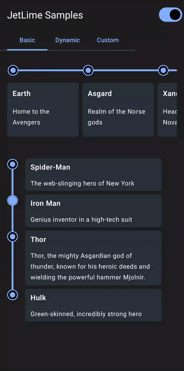 |
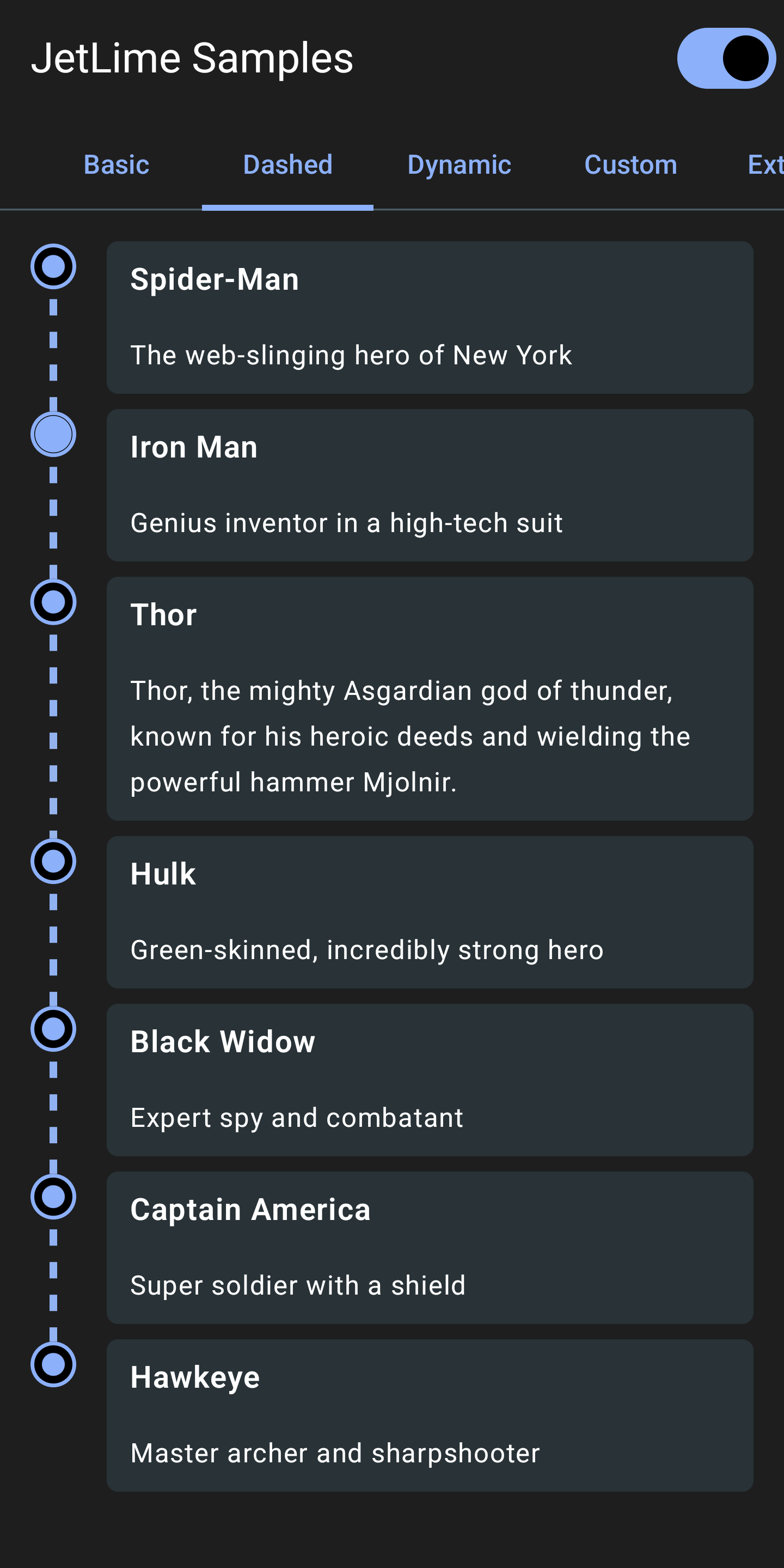 |
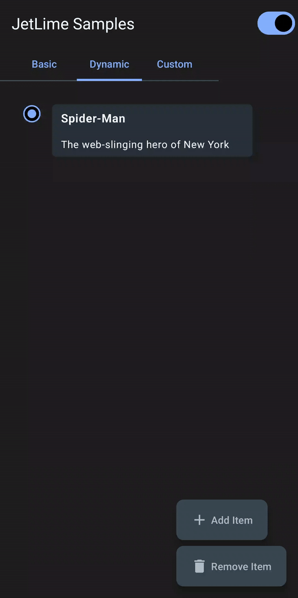 |
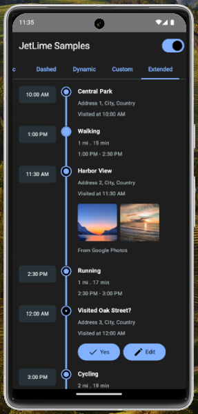
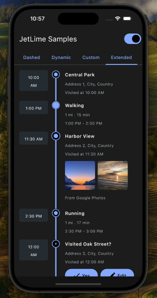
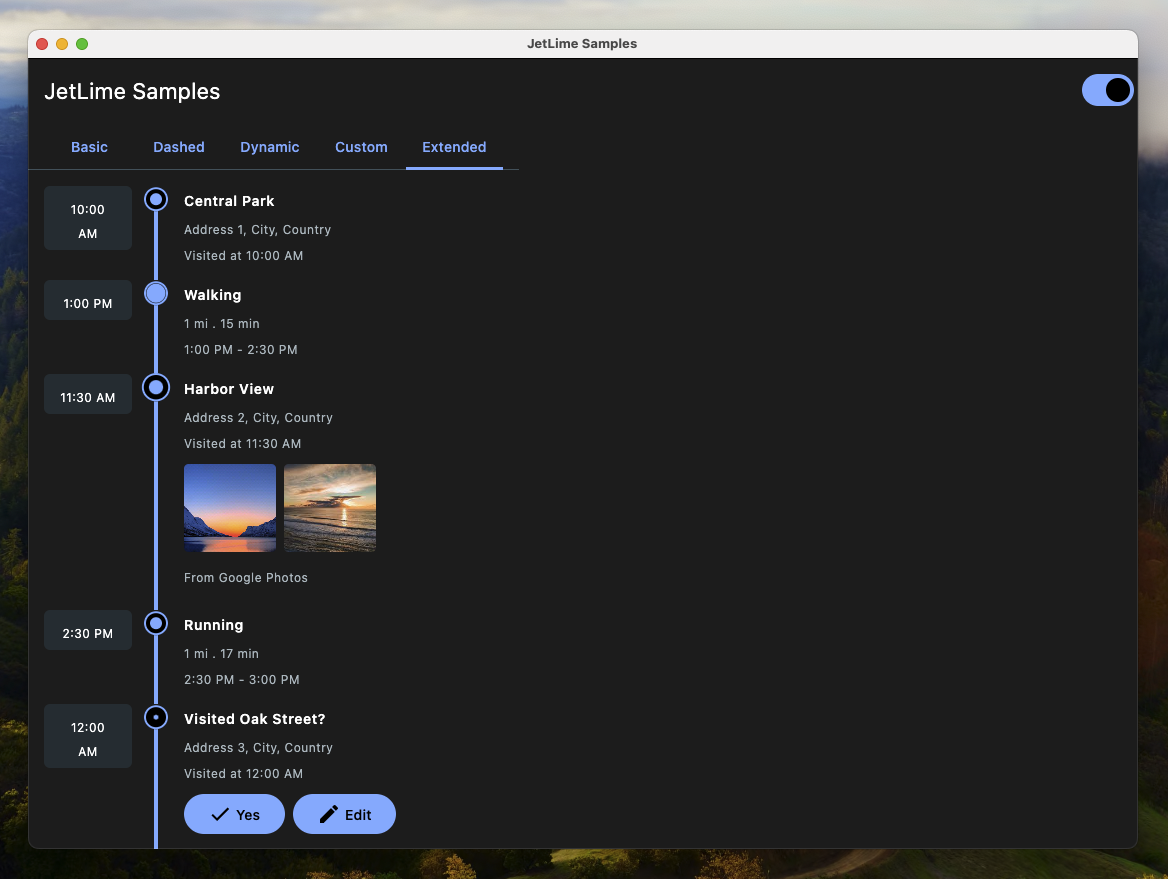
| Custom | Extended | |
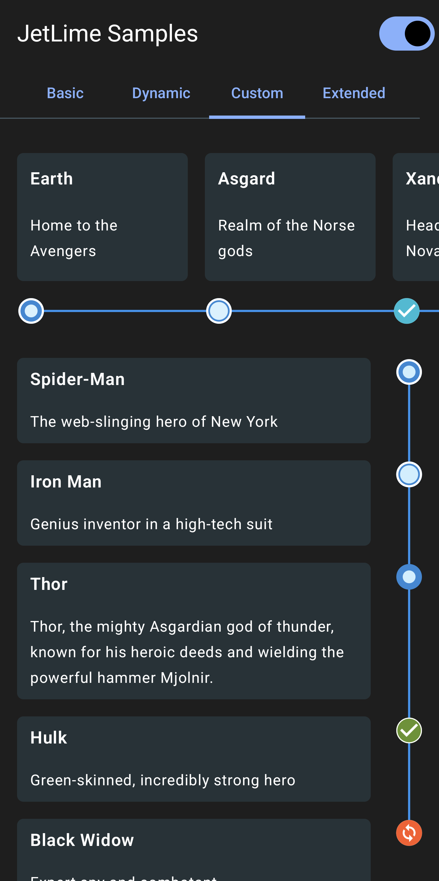 |
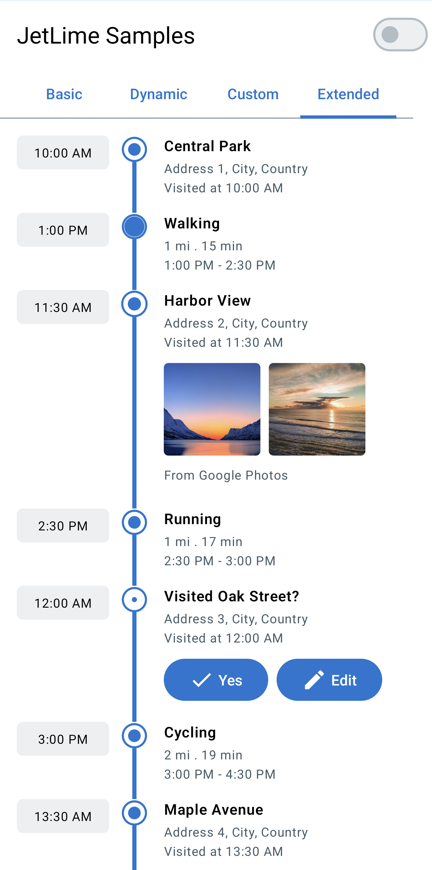 |
Supported Platform Samples
| Android | iOS | Desktop | Web |
|---|---|---|---|
 |
 |
 |
 |
✨ Highlights
- Compose Multiplatform timelines: Android, iOS, Desktop (JVM), Web (JS & WASM)
- Vertical and horizontal layouts (JetLimeColumn / JetLimeRow)
- Flexible point placement: START, CENTER, END with continuous line joins
- RTL layout support for JetLimeRow and JetLimeExtendedEvent (mirrors timelines and keeps content visible in right-to-left layouts)
- Dashed/gradient/solid lines via Brush + PathEffect
- Extended events with dual content slots (left/right), icons, and animations
- Built-in pagination / infinite scroll (JetLimePaginatedColumn / JetLimePaginatedRow) with no extra dependency
- Small, focused API with sensible defaults (JetLimeDefaults)
📦 Installation
In build.gradle of shared module, include the following dependency
dependencies {
  implementation("io.github.pushpalroy:jetlime:4.3.0")
}
📖 Usage
📍 Add items in a Vertical Timeline
Use the JetLimeColumn
val items = remember { mutableListOf(Item1, Item2, Item3) } // Any type of items

JetLimeColumn(
  modifier = Modifier.padding(16.dp),
  itemsList = ItemsList(items),
  key = { _, item -> item.id },
) { index, item, position ->
  JetLimeEvent(
    style = JetLimeEventDefaults.eventStyle(
      position = position
    ),
  ) {
    // Content here
  }
}
📍 Add items in a Horizontal Timeline
Use the JetLimeRow
val items = remember { mutableListOf(Item1, Item2, Item3) } // Any type of items

JetLimeRow(
  modifier = Modifier.padding(16.dp),
  itemsList = ItemsList(items),
  key = { _, item -> item.id },
) { index, item, position ->
  JetLimeEvent(
    style = JetLimeEventDefaults.eventStyle(
      position = position
    ),
  ) {
    // Content here
  }
}
Pass the key to define factory of stable and unique keys representing the item. Using the same key for multiple items in the list is not allowed.
This key will be used by a LazyColumn or LazyRow internally.
If we want to to add items dynamically from a data source, we should use mutableStateListOf, so that our list can be observed as a state:
val items = remember { mutableStateListOf<MyItem>() }
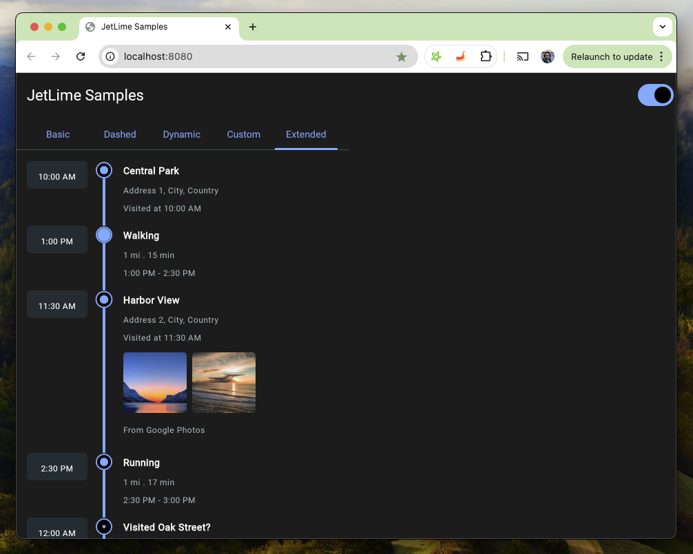
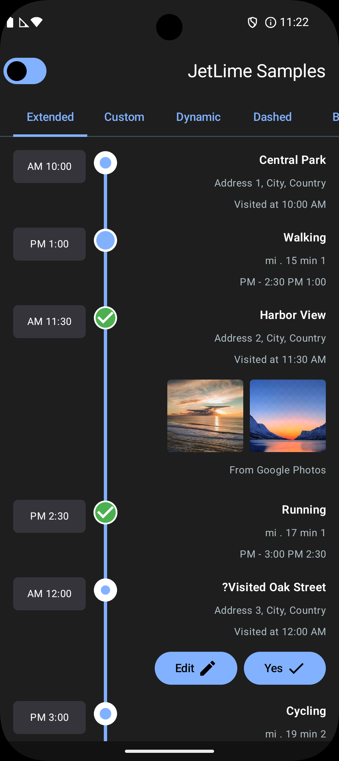
🧩 Extended Events (Vertical Timeline)
Use the JetLimeExtendedEvent with a JetLimeColumn Using this we can pass an additional content to draw on the left side of the timeline.
val items = remember { mutableListOf(Item1, Item2, Item3) } // Any type of items

JetLimeColumn(
  modifier = Modifier.padding(16.dp),
  itemsList = ItemsList(items),
  key = { _, item -> item.id },
  style = JetLimeDefaults.columnStyle(contentDistance = 24.dp),
) { index, item, position ->
  JetLimeExtendedEvent(
    style = JetLimeEventDefaults.eventStyle(
      position = position
    ),
    additionalContent = {
      // Additional content here
    }
  ) {
    // Content here
  }
}
🔄 Paginated Timeline (Infinite Scroll)
Use JetLimePaginatedColumn
(or JetLimePaginatedRow) to load items page by page as the user scrolls. The component watches the
scroll position and calls onLoadMore when the user gets within loadMoreThreshold items of the end,
as long as a page is not already loading and more items remain. Pagination is implemented natively —
no extra dependency is added.
You own the page state (itemsList, isLoading, hasMoreItems); append the next page inside
onLoadMore and update the flags. While hasMoreItems is true, the timeline line stays continuous
into the next page, and it terminates once you set hasMoreItems = false.
val items = remember { mutableStateListOf<Item>() }
var isLoading by remember { mutableStateOf(false) }
var hasMore by remember { mutableStateOf(true) }
val scope = rememberCoroutineScope()

// Trigger the first page; the scroll-based loader fires only once items exist.
LaunchedEffect(Unit) { if (items.isEmpty()) loadNextPage() }

JetLimePaginatedColumn(
  itemsList = ItemsList(items),
  key = { _, item -> item.id },
  isLoading = isLoading,
  hasMoreItems = hasMore,
  onLoadMore = {
    scope.launch {
      isLoading = true
      val page = repository.loadNextPage() // your data source
      items.addAll(page.items)
      hasMore = !page.isLast
      isLoading = false
    }
  },
) { index, item, position ->
  JetLimeEvent(
    style = JetLimeEventDefaults.eventStyle(position = position)
  ) {
    // Content here
  }
}
A default centered progress indicator is shown while isLoading is true. Customize it by passing
your own composable to loadingContent, or hide it entirely by passing loadingContent = null (no
footer is added in that case):
JetLimePaginatedColumn(
  itemsList = ItemsList(items),
  isLoading = isLoading,
  hasMoreItems = hasMore,
  onLoadMore = { /* ... */ },
  loadingContent = null, // or a custom composable, e.g. { MyLoader() }
) { index, item, position ->
  // Content here
}
🎛️ Customize JetLimeColumn Style
Use the JetLimeDefaults.columnStyle()
JetLimeColumn(
  style = JetLimeDefaults.columnStyle(
    contentDistance = 32.dp,
    itemSpacing = 16.dp,
    lineThickness = 2.dp,
    lineBrush = JetLimeDefaults.lineSolidBrush(color = Color(0xFF2196F3)),
    lineVerticalAlignment = RIGHT,
  ),
) {
  // Code to add events
}
🎛️ Customize JetLimeRow Style
Use the JetLimeDefaults.rowStyle()
JetLimeRow(
  style = JetLimeDefaults.rowStyle(
    contentDistance = 32.dp,
    itemSpacing = 16.dp,
    lineThickness = 2.dp,
    lineBrush = JetLimeDefaults.lineSolidBrush(color = Color(0xFF2196F3)),
    lineHorizontalAlignment = BOTTOM,
  ),
) {
  // Code to add events
}
🎛️ Customize JetLimeEvent Style
Use the JetLimeEventDefaults.eventStyle()
JetLimeEvent(
  style = JetLimeEventDefaults.eventStyle(
    position = position,
    pointColor = Color(0xFF2889D6),
    pointFillColor = Color(0xFFD5F2FF),
    pointRadius = 14.dp,
    pointAnimation = JetLimeEventDefaults.pointAnimation(),
    pointType = EventPointType.filled(0.8f),
    pointStrokeWidth = 2.dp,
    pointStrokeColor = MaterialTheme.colorScheme.onBackground,
  ),
) {
  // Code to add event content
}
⚙️ JetLimeColumn and JetLimeRow Properties
🧭 Alignment
The timeline line and point circles can be set to either side.
For a JetLimeColumn the alignment can be set to LEFT or RIGHT
lineVerticalAlignment = LEFT or RIGHT // Default is LEFT
For a JetLimeRow the alignment can be set to TOP or BOTTOM
lineHorizontalAlignment = TOP or BOTTOM // Default is TOP
🎨 Line Style
The line can be drawn by passing a Brush object to lineBrush in a columnStyle or rowStyle.
Default values can also be used from JetLimeDefaults and colors can be modified for quick setup:
lineBrush = JetLimeDefaults.lineGradientBrush()

or

lineBrush = JetLimeDefaults.solidBrush()
A dashed/dotted line can also be drawn using the pathEffect property by passing a PathEffect to a columnStyle or rowStyle.
style = JetLimeDefaults.columnStyle(
        pathEffect = PathEffect.dashPathEffect(
          intervals = floatArrayOf(30f, 30f),
          phase = 0f,
        )
      )
↔️ Content Distance
The contentDistance in Dp specifies how far the timeline line should be from the timeline content.
↕️ Item Spacing
The itemSpacing in Dp specifies the gap between the event items.
📏 Line Thickness
The lineThickness in Dp the thickness of the timeline line.
🌍 RTL Layout Support
JetLime supports right-to-left (RTL) layouts out of the box using Compose’s LayoutDirection.Rtl.
Horizontal timelines (
JetLimeRow+JetLimeEvent)- The timeline direction is mirrored in RTL.
- Start and end items are correctly connected.
- Points and lines stay aligned without clipping, and the last item’s line joins cleanly.
Extended vertical events (
JetLimeExtendedEventinsideJetLimeColumn)- Additional content remains fully visible on the side nearest the logical start.
- Main content remains fully visible on the opposite side.
- The timeline line and point stay between additional and main content without overlapping them.
To preview RTL behavior in your app, wrap your content with a CompositionLocalProvider:
CompositionLocalProvider(LocalLayoutDirection provides LayoutDirection.Rtl) {
  JetLimeColumn(
    itemsList = ItemsList(items),
    key = { _, item -> item.id },
  ) { index, item, position ->
    JetLimeExtendedEvent(
      style = JetLimeEventDefaults.eventStyle(position = position),
      additionalContent = { /* Additional content */ },
    ) {
      // Main content
    }
  }
}
| Basic (RTL) | Dynamic (RTL) | Extended (RTL) |
|---|---|---|
 |
 |
 |
⚙️ JetLimeEvent Properties
📍 Position
We always need to pass the position to the eventStyle that will be received in the JetLimeColumn lambda.
This is needed so that JetLimeColumn can calculate the position of an event in the list at any time.
Based on the calculation it will assign either of the three EventPosition: START, MIDDLE or END.
This classification is needed to render correct lines for start and end items.
JetLimeColumn(
  itemsList = ItemsList(items),
  key = { _, item -> item.id },
) { index, item, position ->
  JetLimeEvent(
    style = JetLimeEventDefaults.eventStyle(
      position = position
    ),
  ) {
    // Content here
  }
}
📌 Point Placement
The pointPlacement of type PointPlacement controls where the point renders within the item:
START– near the start edge (top for vertical, left for horizontal). Default.CENTER– centered within the item.END– near the end edge (bottom for vertical, right for horizontal).
Examples:
// All items CENTER
JetLimeEventDefaults.eventStyle(position = position, pointPlacement = PointPlacement.CENTER)

// All items END
JetLimeEventDefaults.eventStyle(position = position, pointPlacement = PointPlacement.END)

// Mixed: second-to-last CENTER, rest START
JetLimeEventDefaults.eventStyle(
  position = position,
  pointPlacement = if (index == items.size - 2) PointPlacement.CENTER else PointPlacement.START,
)
Notes:
- Lines connect continuously across START/CENTER/END, and stop cleanly at the last item’s point.
- Works for both JetLimeColumn (vertical) and JetLimeRow (horizontal).
🟡 Point Type
The pointType of type EventPointType specifies the style of the point circle.
It can be any of the three types: EMPTY, FILLED or CUSTOM.
For using EMPTY
pointType = EventPointType.EMPTY
For using FILLED, the filled() function has to be used which takes an optional fillPercent
pointType = EventPointType.filled(0.8f)
For using CUSTOM, the custom() function has to be used which takes an icon of Painter.
This can be used to use a custom icon instead of the default types defined. An optional tint can also be applied on the icon.
pointType = EventPointType.custom(icon = painterResource(id = R.drawable.icon_check), tint = Color.Green)
🔁 Point Animation
The pointAnimation of type EventPointAnimation specifies the animation of the point circle.
To enable the default animation
pointAnimation = JetLimeEventDefaults.pointAnimation()
To use a custom animation initialValue, targetValue and animationSpec can be passed to pointAnimation().
animationSpec should be of the type InfiniteRepeatableSpec<Float>.
🎨 Point Color
The pointColor is the color of the event point circle background.
🎨 Point Fill Color
The pointFillColor is the fill color of the event point circle which is drawn over the pointColor.
📐 Point Radius
The pointRadius in Dp is the radius of the point circle.
🖊️ Point Stroke Width
The pointStrokeWidth in Dp is the width of the circle border.
🖍️ Point Stroke Color
The pointStrokeColor is the color of the circle border.
📚 Documentation
The full API documentation is available here: JetLime Documentation
💡 Inspiration
- Timeline-View by Vipul Asri
- This amazing blog by Vita Sokolova on Timeline component with Jetpack Compose
🤝 Contribution
Would love to receive contributions! Read contribution guidelines for more information regarding contribution.
💬 Discuss?
Have any questions, doubts or want to present your opinions, views? You're always welcome. You can start discussions.
📝 License
MIT License

Copyright (c) 2024 Pushpal Roy

Permission is hereby granted, free of charge, to any person obtaining a copy
of this software and associated documentation files (the "Software"), to deal
in the Software without restriction, including without limitation the rights
to use, copy, modify, merge, publish, distribute, sublicense, and/or sell
copies of the Software, and to permit persons to whom the Software is
furnished to do so, subject to the following conditions:

The above copyright notice and this permission notice shall be included in all
copies or substantial portions of the Software.

THE SOFTWARE IS PROVIDED "AS IS", WITHOUT WARRANTY OF ANY KIND, EXPRESS OR
IMPLIED, INCLUDING BUT NOT LIMITED TO THE WARRANTIES OF MERCHANTABILITY,
FITNESS FOR A PARTICULAR PURPOSE AND NONINFRINGEMENT. IN NO EVENT SHALL THE
AUTHORS OR COPYRIGHT HOLDERS BE LIABLE FOR ANY CLAIM, DAMAGES OR OTHER
LIABILITY, WHETHER IN AN ACTION OF CONTRACT, TORT OR OTHERWISE, ARISING FROM,
OUT OF OR IN CONNECTION WITH THE SOFTWARE OR THE USE OR OTHER DEALINGS IN THE
SOFTWARE.
