FitButton
Introduction: The button which can use with icon, text, divider, custom ripple effect, border, corner radius e.t.c.
Tags:

The button which includes features:
- Icon,
- Text,
- Divider,
- Corner radius,
- Border of the button,
- Custom ripple effect,
- Custom elements sizes,
- Custom colors of elements,
- Different positions of elements on the button
Installation
Download
Add to gradle root:
allprojects {
  repositories {
    mavenCentral()
  }
}
After migrating to MavenCentral, use Groove:
implementation 'io.github.nikartm:fit-button:2.0.0'
Or Kotlin DSL:
implementation("io.github.nikartm:fit-button:2.0.0")
Or take a different approach
Old way (deprecated):
implementation 'com.github.nikartm:fit-button:$LAST_VERSION'
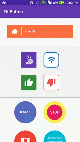
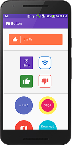
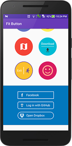
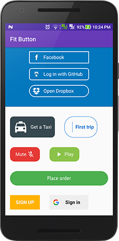
Screenshots
How to use?
Adjust the XML view:
<com.github.nikartm.button.FitButton
    android:id="@+id/fbtn"
    android:layout_width="match_parent"
    android:layout_height="58dp"
    android:layout_margin="32dp"
    android:enabled="true"
    android:gravity="center_vertical"
    app:fb_cornerRadius="2dp"
    app:fb_shape="rectangle"
    app:fb_divColor="#fff"
    app:fb_divWidth="1dp"
    app:fb_divHeight="40dp"
    app:fb_rippleColor="#FBE9E7"
    app:fb_iconWidth="28dp"
    app:fb_iconHeight="28dp"
    app:fb_iconPosition="left"
    app:fb_iconMarginStart="20dp"
    app:fb_iconMarginEnd="16dp"
    app:fb_icon="@drawable/ic_thumb_up"
    app:fb_iconColor="#FFF"
    app:fb_textPaddingStart="16dp"
    app:fb_textColor="#FFF"
    app:fb_text="Like Me"
    app:fb_backgroundColor="#FF7043"/>
Or programmatically:
private fun setupButton() {
    fitButton = findViewById(R.id.fbtn)
    fitButton!!
            .setTextFont(R.font.share_tech_regular)
            .setWidth(250)
            .setHeight(70)
            .setTextSize(20f)
            .setIconMarginStart(16f)
            .setIconMarginEnd(12f)
            .setTextColor(Color.parseColor("#F5F5F5"))
            .setIconColor(Color.parseColor("#FFFFFF"))
            .setDividerColor(Color.parseColor("#BCAAA4"))
            .setBorderColor(Color.parseColor("#FFF59D"))
            .setButtonColor(Color.parseColor("#FF7043"))
            .setBorderWidth(2f)
            .setRippleEnable(true)
            .setRippleColor(resources.getColor(R.color.colorAccent))
            .setOnClickListener {
                Toast.makeText(this,
                        "Click on ${fitButton?.getText()}",
                        Toast.LENGTH_SHORT).show()
            }
}
License
Copyright 2019 Ivan Vodyasov
Licensed under the Apache License, Version 2.0 (the "License"); you may not use this file except in compliance with the License. You may obtain a copy of the License at
http://www.apache.org/licenses/LICENSE-2.0
Unless required by applicable law or agreed to in writing, software distributed under the License is distributed on an "AS IS" BASIS, WITHOUT WARRANTIES OR CONDITIONS OF ANY KIND, either express or implied. See the License for the specific language governing permissions and limitations under the License.
