compose-shared-elements
Introduction: Shared Elements Transition for Jetpack Compose
Tags:
Originated from mobnetic/compose-shared-element.
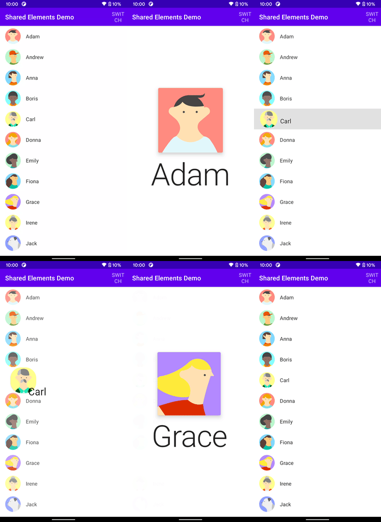
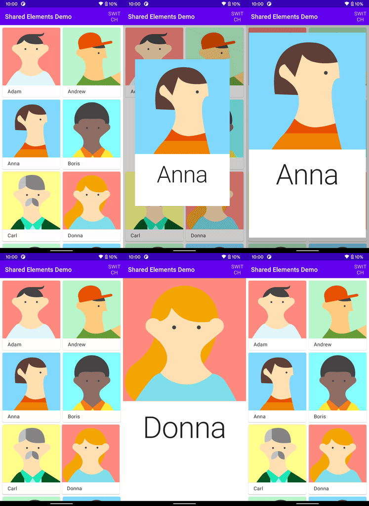
Shared elements transition implementation for compose with various customization options. Currently providing the following transition patterns:
- Standard shared elements transition
- Material container transform (which basically mimics the
MaterialContainerTransformof MDC-Android library)


Download
While this library is highly experimental, if you want to use it, snapshot versions are available at Sonatype OSSRH's snapshot repository. These are updated on every commit to main.
To use it:
repositories {
    // ...
    maven("https://s01.oss.sonatype.org/content/repositories/snapshots")  // build.gradle.kts
    maven { url 'https://s01.oss.sonatype.org/content/repositories/snapshots' }  // build.gradle
}

dependencies {
    implementation("com.mxalbert.sharedelements:shared-elements:0.1.0-SNAPSHOT")
}
How to use
- Define elements with the same
keyand differentscreenKeys usingSharedElementorSharedMaterialContainercomposables. - Wrap different screens in a single
SharedElementRoot.
Transition will start when elements with the same key are detected.
Notes
SharedElementsTransitionSpecof the start element will be used.- Transition is only applied to the shared elements, so you have to define the transition for the rest yourself. See the demo for examples. If you want to prevent an element from showing in your self-defined transition, call
prepareTransition(key). - Elements are composed separately in an overlay during transition, so
rememberwon't work as expected. If your element is stateful, define the state outside theSharedElementorSharedMaterialContainercomposables. - If the element is root element (i.e. direct child of
SharedElementRoot) and is full-screen (e.g. hasModifier.fillMaxSize()), specifyingisFullscreen = trueon it can greatly improve performance and allows you to use stateful composables.
