wavy-slider

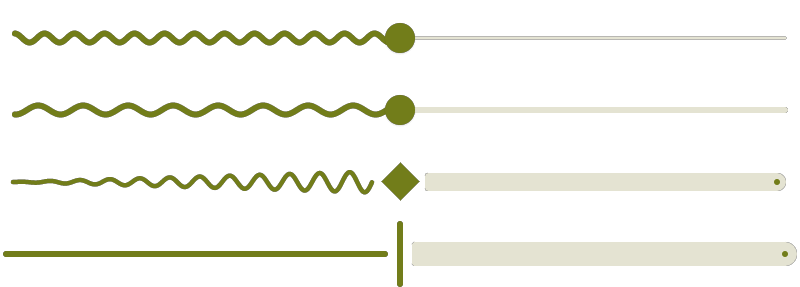
Animated wavy Material Slider and progress/seek bar similar to the one used in Android 13 media controls.
It has curly, wobbly, squiggly, wiggly, jiggly, wriggly, dancing movements.
Some users call it the sperm.
The library can be used in Jetpack Compose and Compose Multiplatform projects like
a regular Material Slider.
Supported target platforms are Android, iOS, Desktop (JVM), and Web (Kotlin/JS and Kotlin/Wasm).
Demo
For a live, interactive Web demo go to https://mahozad.ir/wavy-slider.
For real-world apps in various platforms using the library, see the showcase directory.
Usage
implementation("ir.mahozad.multiplatform:wavy-slider:2.2.0")
Setup for multiplatform projects
If you target a subset of the library supported platforms, add the library to your common source set:
kotlin {
    sourceSets {
        commonMain.dependencies {
            implementation("ir.mahozad.multiplatform:wavy-slider:2.2.0")
            // ...
        }
If you have targets that are not supported by the library, add the library separately to each supported target:
kotlin {
    val desktopMain /* OR jvmMain */ by getting {
        dependencies {
            implementation("ir.mahozad.multiplatform:wavy-slider:2.2.0")
            // ...
        }
    }
    androidMain.dependencies {
        implementation("ir.mahozad.multiplatform:wavy-slider:2.2.0")
        // ...
    }
    // Other targets...
Using the WavySlider is much like using the Material Slider (you can even make it a regular flat Slider):
import ir.mahozad.multiplatform.wavyslider.material3.WavySlider as WavySlider3
import ir.mahozad.multiplatform.wavyslider.material.WavySlider as WavySlider2
import ir.mahozad.multiplatform.wavyslider.WaveDirection.*

@Composable
fun MyComposable() {
    var fraction by remember { mutableStateOf(0.5f) }
    WavySlider3( // OR WavySlider2. See the imports above that use "as ..."
        value = fraction,
        onValueChange = { fraction = it },
        waveLength = 16.dp,     // Setting this to 0.dp results in a Slider
        waveHeight = 16.dp,     // Setting this to 0.dp results in a Slider
        waveVelocity = 15.dp to HEAD, // Speed per second and its direction
        waveThickness = 4.dp,   // Defaults to 4.dp irregardless of variant
        trackThickness = 4.dp,  // Defaults to a thickness based on variant
        incremental = false,    // Whether to gradually increase waveHeight
        // animationSpecs = ... // Customize various animations of the wave
        // Other options that are available in standard Material 2/3 Slider
    )
}
FAQ
How to create a wavy divider that is still and fixed and static and not animated?
WavySlider3(
    value = 1f,
    onValueChange = {},
    thumb = {},
    track = {
        SliderDefaults.Track(
            sliderState = it,
            enabled = false,
            colors = SliderDefaults.colors(disabledActiveTrackColor = Color.Magenta),
            thumbTrackGapSize = 0.dp,
            waveThickness = 1.dp,
            waveVelocity = 0.dp to HEAD,
            animationSpecs = WaveAnimationSpecs(
                waveAppearanceAnimationSpec = snap(),
                waveVelocityAnimationSpec = snap(),
                waveHeightAnimationSpec = snap()
            )
        )
    }
)
How to flatten the wave on click/drag, or conversely, make it wavy only on click/drag?
See the solution in https://github.com/mahozad/wavy-slider/issues/8#issuecomment-1903921917.
How to disable the initial/starting/appearance (aka composition) spread/expand animation?
Use the Compose snap() animation spec (make sure to import the proper M2/M3 SliderDefaults object):
animationSpecs = SliderDefaults.WaveAnimationSpecs.copy(waveAppearanceAnimationSpec = snap())
How to get or use or see the default value of parameters like waveHeight, animationSpecs, etc?
Use the properties available in SliderDefaults (make sure to import the proper M2/M3 SliderDefaults object).
How is the wavy slider component used in its website (aka in a regular HTML/CSS/JavaScript page)?
Compose Multiplatform and its underlying Kotlin Multiplatform, support JavaScript and WebAssembly. The project website is also made with Compose Multiplatform (and compiled to Wasm) with some additional regular HTML and CSS code. The source code of the website is available at website-source branch.
Related
- AOSP native squiggly progress: Main branch ❖ Android 14 ❖ Android 13
- LinearWavyProgressIndicator (available since Material 3 v1.4.0-alpha01)
- Squiggly slider (Android-only): https://github.com/saket/squiggly-slider
- Wave slider (Android-only): https://github.com/galaxygoldfish/waveslider
- Squiggly seekbar (Flutter): https://github.com/hannesgith/squiggly_slider
- WavyLineView (Android XML): https://github.com/andyxialm/WavyLineView
- Sliders with custom styles: https://github.com/krottv/compose-sliders
- Customizable seeker/slider: https://github.com/2307vivek/Seeker
- Squiggly text underlines: https://github.com/saket/ExtendedSpans
- Waveform seekbar: https://github.com/massoudss/waveformSeekBar
- Colorful sliders: https://github.com/SmartToolFactory/Compose-Colorful-Sliders
- StackOverflow posts:
