VerticalSeekBar

Presentation
This is the source code of an Android library: -=:[ VerticalSeekBar ]:=-
📃 Check also the Medium article about it!
Why would you need it?
"Reinventing the wheel is, most of the time, a bad idea."
If you've ever tried to make a vertical SeekBar work properly, you know this is not the case. 😏
From the moment you apply that android:rotation="270" all start to get messy: you cannot set the proper height for the drawable; the width of the bar distorts the width of your drawable; even customizing your interaction with the bar is kind of tricky.
I've been through all of this and suddenly I've had enough.
Introducing a nicer, redesigned and highly customizable VerticalSeekBar.
What you got:
- custom progress drawable: apply resources or color gradients
- custom thumb: chose your size, background color, corner radius or even to completely hide it
- view width and drawable width completely separated
- choose how to set your progress (just sliding the thumb, clicking around, or both)
- min and max placeholders
- much more!
How to use it?
Step 1. add the JitPack repository to your ROOT build.gradle at the end of repositories:
allprojects {
    repositories {
        ...
        maven { url 'https://jitpack.io' }
    }
}
Step 2. add the dependency:
implementation 'com.github.lukelorusso:VerticalSeekBar:1.2.7'
That's it!
Now you can add the view to your layout:
<com.lukelorusso.verticalseekbar.VerticalSeekBar
        android:layout_width="160dp"
        android:layout_height="280dp"/>
maybe add some attributes... here you got some, we'll discuss them later
        ...
        app:vsb_click_to_set_progress="false"
        app:vsb_bar_corner_radius="15dp"
        app:vsb_bar_width="60dp"
        app:vsb_bar_background="#eeeeee"
        app:vsb_bar_progress_gradient_end="#4dd0e1"
        app:vsb_bar_progress_gradient_start="#03a2ba"
        app:vsb_max_placeholder_position="inside"
        app:vsb_max_placeholder_src="@drawable/max_placeholder"
        app:vsb_min_placeholder_position="inside"
        app:vsb_min_placeholder_src="@drawable/min_placeholder"
        app:vsb_progress="50"
        app:vsb_show_thumb="true"
        app:vsb_thumb_container_corner_radius="5dp"
        app:vsb_thumb_container_tint="@color/placeholderBackground"
        app:vsb_thumb_placeholder_src="@drawable/thumb_placeholder"
        app:vsb_use_thumb_to_set_progress="true"
        ...
All of them can be also set programmatically.
(Please note: it's strongly recommended to avoid pre-1.2.0 versions due to inconsistencies compared to this guide)
For Java projects
Someone experienced this InflateException. For those guys, it's worth noticing that this is a KOTLIN library! The reason why you're getting an InvocationTargetException is because, in case you're still on Java, you also have to specify:
implementation 'org.jetbrains.kotlin:kotlin-stdlib:1.3.+'
// or one of the -jre7, -jre8 stdlib depending on your config
// put the most up-to-date version
on your app module's build.gradle.
Another solution is just to... migrate to Kotlin guys!
Attributes
Background and Progress
To set your progress value programmatically:
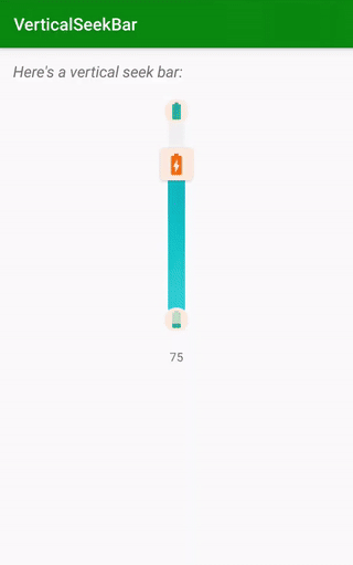
mainVerticalSeekBar.progress = 75
Do you need a smaller or bigger range? You can change maxValue like this:
mainVerticalSeekBar.maxValue = 70 // "progress" will be automagically reduced!
Let's put some color on this view, shall we?
You can set a drawable for the background and a drawable for the progress. If you don't, default colors will be applied.
For both background and progress you have 3 choices:
- set a start color and an end color, the view will create a gradient for you
- set a drawable resource or color (REMEMBER: this choice has priority on the one before)
- just don't choose (it's still a choice anyway 😉)
Example for the first choice: apply a gradient
mainVerticalSeekBar.barBackgroundStartColor = ContextCompat.getColor(this, R.color.my_background_start_color)
mainVerticalSeekBar.barBackgroundEndColor = ContextCompat.getColor(this, R.color.my_background_end_color)
mainVerticalSeekBar.barProgressStartColor = ContextCompat.getColor(this, R.color.my_progress_start_color)
mainVerticalSeekBar.barProgressEndColor = ContextCompat.getColor(this, R.color.my_progress_end_color)
Example for the second choice: apply a resource (will eventually override the first one)
mainVerticalSeekBar.barBackgroundDrawable = getDrawable(R.color.my_background_color)
mainVerticalSeekBar.barProgressDrawable = getDrawable(R.drawable.my_progress)
Your bar can also have rounded corners...
mainVerticalSeekBar.barCornerRadius = 40 // those are pixels
...and a proper independent width
mainVerticalSeekBar.barWidth = 30 // those are pixels
Placeholders
To set minimum and/or maximum placeholders (null is a possible value to remove them):
mainVerticalSeekBar.minPlaceholderDrawable = getDrawable(R.drawable.my_min_placeholder)
mainVerticalSeekBar.maxPlaceholderDrawable = getDrawable(R.drawable.my_max_placeholder)
Since v1.1.4 you can also choose placeholders' position
You can choose between {"inside", "outside", "middle"} ("middle" by default)
Programmatically, it will be:
mainVerticalSeekBar.minPlaceholderPosition = VerticalSeekBar.Placeholder.INSIDE
mainVerticalSeekBar.maxPlaceholderPosition = VerticalSeekBar.Placeholder.OUTSIDE
Now about the thumb placeholder 👆
It is child of a androidx.cardview.widget.CardView. You can choose the color tint and the corner radius of the CardView:
mainVerticalSeekBar.thumbContainerColor = ContextCompat.getColor(this, R.color.my_thumb_background_color)
mainVerticalSeekBar.thumbContainerCornerRadius = 15 // those are pixels
You can set your thumb drawable like this:
mainVerticalSeekBar.thumbPlaceholderDrawable = getDrawable(R.drawable.my_thumb_placeholder)
If you just don't want to see it:
mainVerticalSeekBar.showThumb = false
Interaction
You can interact with your VerticalSeekBar in two ways:
- sliding the thumb
- tapping on the bar
Both those interactions can be disabled if you like (they are true by default).
For instance, It can be useful to disable sliding in case you need to put the VerticalSeekBar on a ScrollView.
To do so:
mainVerticalSeekBar.useThumbToSetProgress = false
mainVerticalSeekBar.clickToSetProgress = true
Try to change those booleans too see other possibilities!
Listeners
You have the possibility to set a listener for progress changes:
mainVerticalSeekBar.setOnProgressChangeListener { progressValue ->
    Log.d("VerticalSeekBar", "PROGRESS CHANGED at value: $progressValue")
}

mainVerticalSeekBar.setOnPressListener { progressValue ->
    Log.d("VerticalSeekBar", "PRESSED at value: $progressValue")
} // since v.1.2.2 thanks to https://github.com/ModischFabrications

mainVerticalSeekBar.setOnReleaseListener { progressValue ->
    Log.d("VerticalSeekBar", "RELEASED at value: $progressValue")
} // since v.1.2.2 thanks to https://github.com/ModischFabrications
This is how it will look like using Java:
VerticalSeekBar mainVerticalSeekBar = findViewById(R.id.mainVerticalSeekBar);
mainVerticalSeekBar.setOnProgressChangeListener(
    new Function1<Integer, Unit>() {
        @Override
        public Unit invoke(Integer progressValue) {
            Log.d("VerticalSeekBar", "PROGRESS CHANGED at value: " + progressValue);
            return null;
        }
    }
);
mainVerticalSeekBar.setOnPressListener(
    new Function1<Integer, Unit>() {
        @Override
        public Unit invoke(Integer progressValue) {
            Log.d("VerticalSeekBar", "PRESSED at value: " + progressValue);
            return null;
        }
    }
);
mainVerticalSeekBar.setOnReleaseListener(
    new Function1<Integer, Unit>() {
        @Override
        public Unit invoke(Integer progressValue) {
            Log.d("VerticalSeekBar", "RELEASED at value: " + progressValue);
            return null;
        }
    }
);
// Too much verbose for you? Time to migrate to Kotlin!
Still want more?
If this level of customization is not enough, I have one last good news for you: the seekbar layout is ENTIRELY CUSTOMIZABLE!
You can pick the original layout_verticalseekbar.xml and put it in your project's res/layout folder.
Now you can modify it as you wish; just remember to keep all the original ids! 😉 (thumbCardView and thumbPlaceholder can be safely removed)
Explore!
Feel free to checkout and launch the example app 🎡
Also, see where using this library has been the perfect choice:


Copyright
Make with 💚 by Luca Lorusso, licensed under Apache License 2.0
Thanks for the help to Lopez Mikhael
