colorpreference
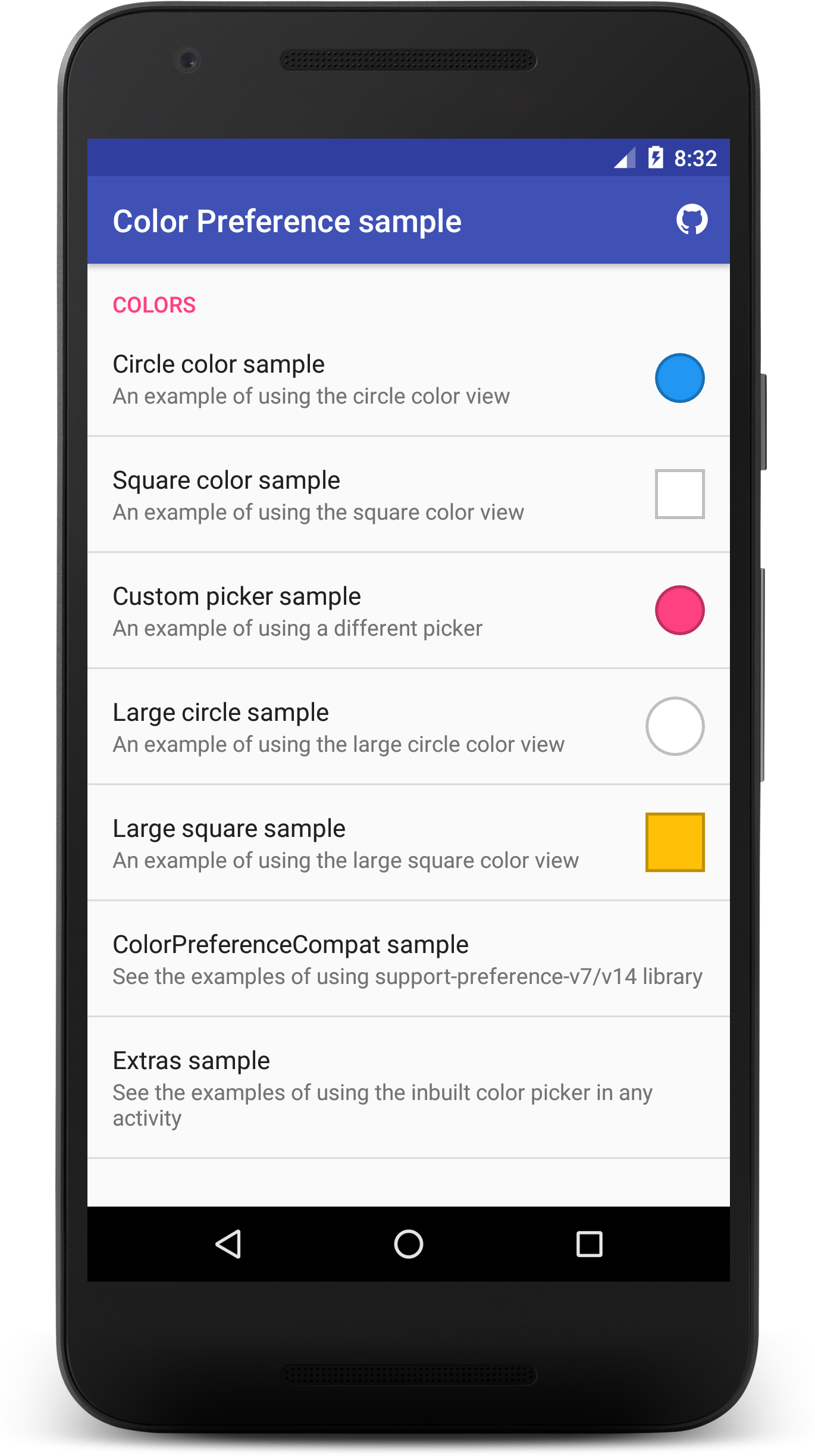
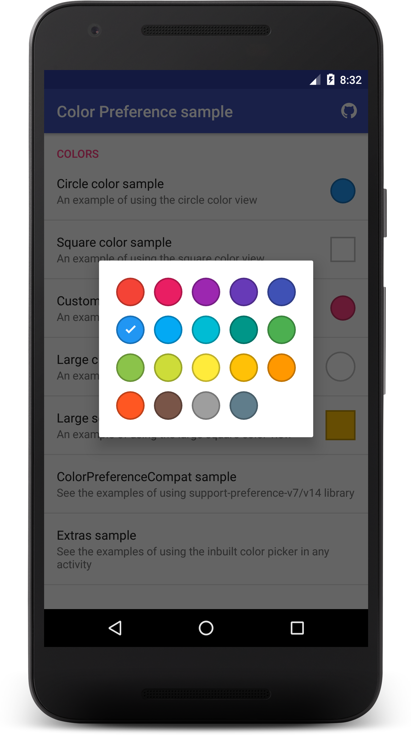
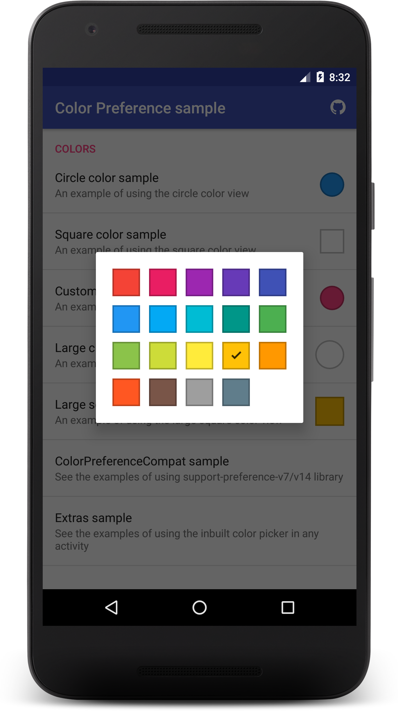
An Android library for creating a nice color picker in the preference screen. You can use the inbuilt picker or any other color picker of your choice. The library can be used with the standard preference classes or the AndroidX preference/legacy-preference-v14(support-preference-v7/v14) classes.
Preview


Get the sample apk here
Also checkout the sample module here
Setup
Gradle
Add this to your project level build.gradle:
allprojects {
 repositories {
    jcenter()
    maven { url "https://jitpack.io" }
 }
}
Add this to your app build.gradle:
dependencies {
    implementation 'com.github.kizitonwose.colorpreference:core:<latest-version>'
}
If you are using the AndroidX preference/legacy-preference-v14 library, you should use this in your app build.gradle instead:
dependencies {
    implementation 'com.github.kizitonwose.colorpreference:support:<latest-version>'
}
Note: <latest-version> value can be found on the JitPack badge above the preview images.
Usage
Just like every other preference object, you add it to the XML file of your Preference screen.
Preference usage
<PreferenceScreen>

    <com.kizitonwose.colorpreference.ColorPreference
        android:defaultValue="@color/color_default"
        android:key="@string/pref_key" />

    <CheckBoxPreference
        ... />

    <SwitchPreference
        ... />

</PreferenceScreen>
AndroidX preference/legacy-preference-v14
<androidx.preference.PreferenceScreen>

    <com.kizitonwose.colorpreferencecompat.ColorPreferenceCompat
        android:defaultValue="@color/color_default"
        android:key="@string/pref_key" />

    <androidx.preference.SwitchPreferenceCompat
        ... />

    <androidx.preference.SwitchPreferenceCompat
        ... />

</androidx.preference.PreferenceScreen>
The default implementation is the circle color view. For custom settings, add the app namespace to your XML file:
xmlns:app="http://schemas.android.com/apk/res-auto"
Now you can use the custom attributes. All custom attributes are available for the ColorPreference and ColorPreferenceCompat classes.
<com.kizitonwose.colorpreference.ColorPreference
    android:defaultValue="@color/color_default"
    android:key="@string/pref_key"
    android:summary="@string/pref_summary"
    android:title="@string/pref_title"
    app:colorShape="circle"
    app:colorChoices="@array/color_choices"
    app:viewSize="large"
    app:numColumns="5"
    app:showDialog="true" />
Two important methods in the ColorPreference and ColorPreferenceCompat classes:
Get the color value:
getValue()Set the color value and update the preference view:
setValue(int newColor)
Attributes
| Attribute name | Description | Default value |
|---|---|---|
| colorShape | The shape of the color view(circle or square) |
circle |
| colorChoices | An array of colors to show on the dialog | An internal array |
| viewSize | The size of the color view(normal or large) |
large |
| numColumns | The number of columns for the colors on the dialog | 5 |
| showDialog | If false, the user can suppress the in-built dialog and then show a custom color picker. To save the color from the custom picker, just call setValue(int newColor) |
true |
Custom Picker sample
You can find a working example of how to use a custom color picker in the included sample module.
Actually, all you have to do is include app:showDialog="false" in the preference item to suppress the inbuilt picker, then when you get your color from the custom picker, call setValue(int newColor) method of the ColorPreference(or ColorPreferenceCompat) class and pass in the color. This saves the color and updates the view accordingly.
The custom picker in the sample uses the Lobster Color Picker Library. You can use any color picker of your choice.
Extras
If you want to use the inbuilt color picker in any activity as a simple color picker, you can use the ColorDialog.Builder class. A working sample is also included in the sample module.
// The context shuould be an Activity which implements ColorDialog.OnColorSelectedListener
new ColorDialog.Builder(this)
        .setColorShape(ColorShape.CIRCLE) //CIRCLE or SQUARE
        .setColorChoices(R.array.color_choices) //an array of colors
        .setSelectedColor(Color.GREEN) //the checked color
        .setTag("TAG") // tags can be useful when multiple components use the picker within an activity
        .show();
Activity usage example
public class ExampleActivity extends Activity implements ColorDialog.OnColorSelectedListener {

    // set these tags when building the color picker dialog
    // if you have only one picker in an Activity, you don't need a tag
    private final String TOOLBAR_PICKER_TAG = "toolbar";
    private final String BACKGROUND_PICKER_TAG = "background";

    @Override
    protected void onCreate(Bundle savedInstanceState) {
        // activity initialization code
    }

    @Override
    public void onColorSelected(int newColor, String tag) {
        switch (tag){
            case TOOLBAR_PICKER_TAG:
                //change the toolbar color with newColor
                break;
            case BACKGROUND_PICKER_TAG:
                //change the activity background color with newColor
                break;
        }
    }
}
Changelog
See the changelog file.
Thanks
Thanks to Roman Nurik for his initial implementation.
License
Copyright (C) 2016 Kizito Nwose

Licensed under the Apache License, Version 2.0 (the "License");
you may not use this file except in compliance with the License.
You may obtain a copy of the License at

http://www.apache.org/licenses/LICENSE-2.0

Unless required by applicable law or agreed to in writing, software
distributed under the License is distributed on an "AS IS" BASIS,
WITHOUT WARRANTIES OR CONDITIONS OF ANY KIND, either express or implied.
See the License for the specific language governing permissions and
limitations under the License.

