DiscreteSlider
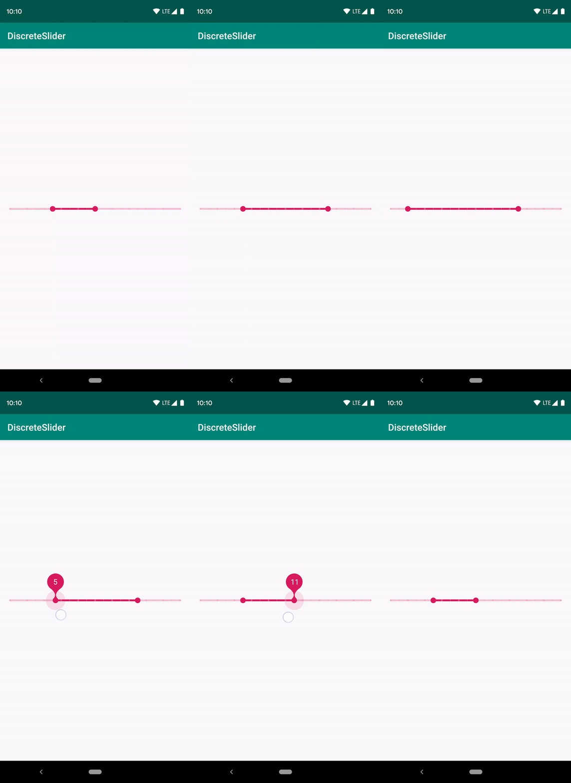
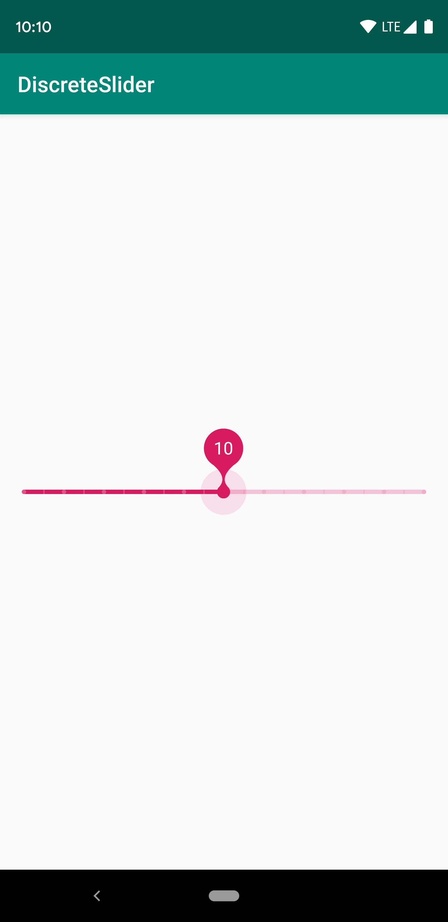
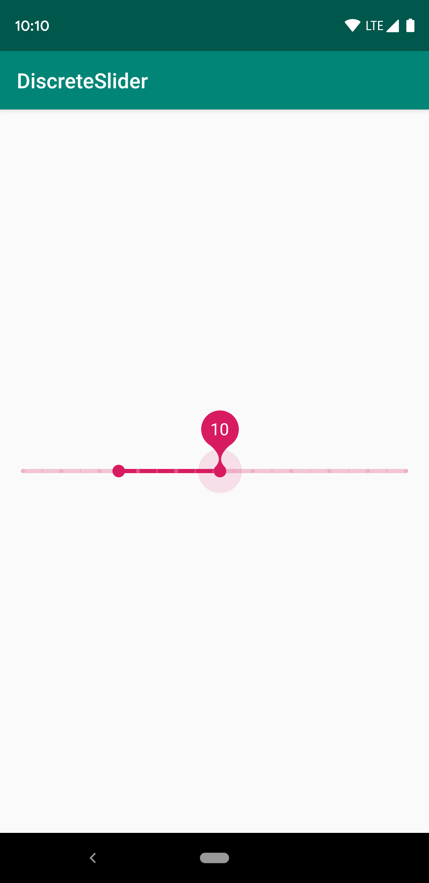
DiscreteSlider tries to offer you the slider with value label as shown in the Material Design spec, with an API. The library also offer you range slider mode.
Screenshot

Normal Mode

Range Mode

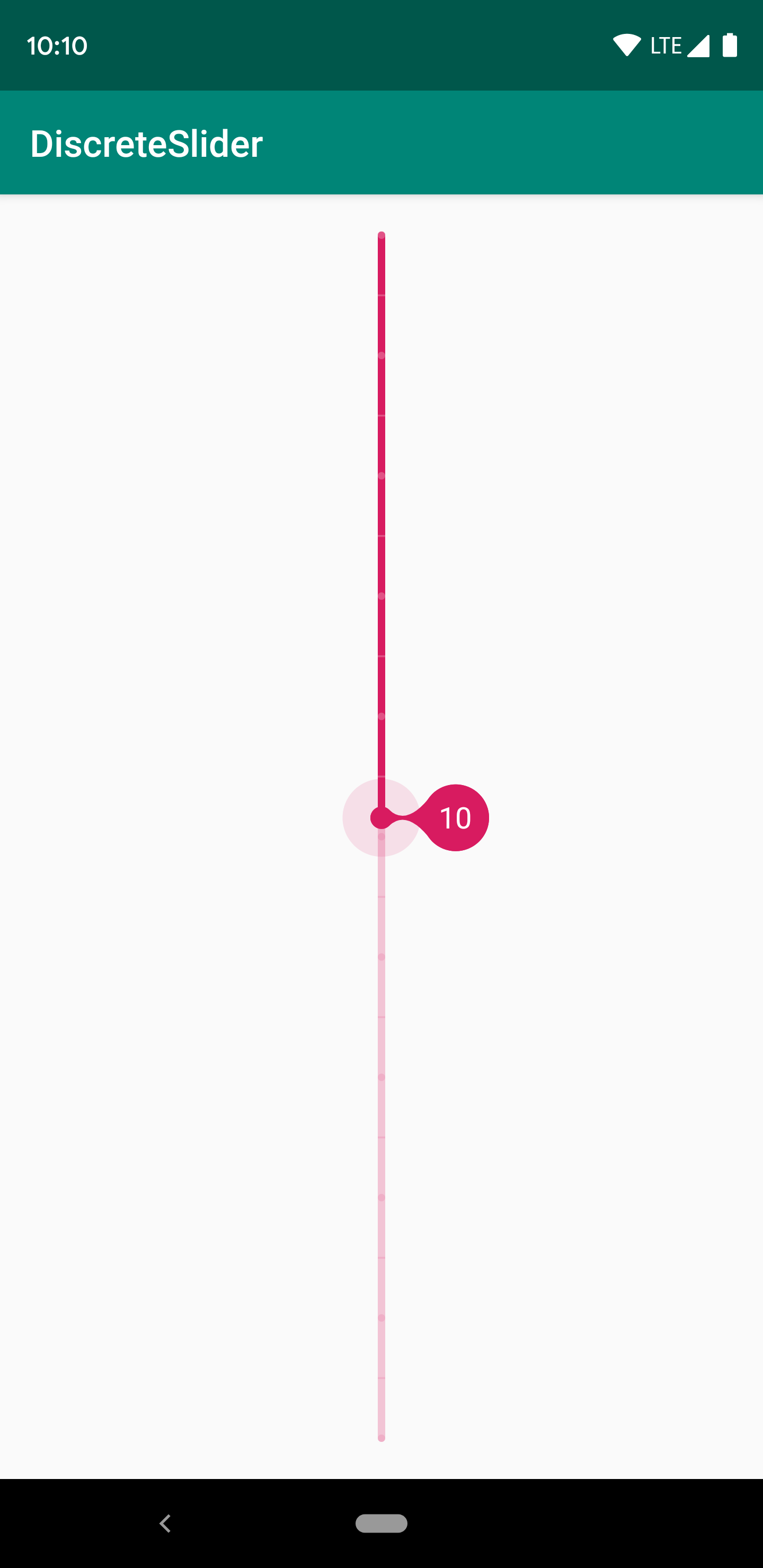
Vertical Orientation

Setup
The easiest way to add the DiscreteSlider library to your project is by adding it as a dependency to your build.gradle
Step 1. Add the JitPack repository to your build file
allprojects {
    repositories {
        ...
        maven { url 'https://jitpack.io' }
    }
}
Step 2. Add the dependency
dependencies {
    implementation 'com.github.hearsilent:DiscreteSlider:1.2.1'
}
Usage
Setup Track in Java
mSlider.setTrackWidth(Utils.convertDpToPixel(4, this));
mSlider.setTrackColor(0xFFD81B60);
mSlider.setInactiveTrackColor(0x3DD81B60);
Setup Track in Xml
app:ds_trackWidth="4dp"
app:ds_trackColor="#D81B60"
app:ds_inactiveTrackColor="#3DD81B60"
Setup Thumb in Java
mSlider.setThumbRadius(Utils.convertDpToPixel(6, this));
mSlider.setThumbColor(0xFFD81B60);
mSlider.setThumbPressedColor(0x1FD81B60);
Setup Thumb in Xml
app:ds_thumbRadius="6dp"
app:ds_thumbColor="#D81B60"
app:ds_thumbPressedColor="#1FD81B60"
Setup TickMark in Java
mSlider.setTickMarkColor(0x3DFFFFFF);
mSlider.setTickMarkInactiveColor(0x1FD81B60);
mSlider.setTickMarkPatterns(Arrays.asList(new Dot(), new Dash(Utils.convertDpToPixel(1, this))));
// TickMark step must be a factor of (count - 1)
mSlider.setTickMarkStep(1);
Setup TickMark in Xml
app:ds_tickMarkColor="#3DFFFFFF"
app:ds_tickMarkInactiveColor="#1FD81B60"
<!-- Separated by commas, only accept `dot` or `dash`. You can also fill in "dot,dash,dash" -->
app:ds_tickMarkPatterns="dot,dash"
app:ds_tickMarkDashLength="1dp"
<!-- TickMark step must be a factor of (count - 1) -->
app:ds_tickMarkStep="1"
Setup ValueLabel in Java
mSlider.setValueLabelTextColor(Color.WHITE);
mSlider.setValueLabelTextSize(Utils.convertSpToPixel(16, this));
mSlider.setValueLabelGravity(DiscreteSlider.TOP);
// Customize value label's text by `setValueLabelFormatter`
mSlider.setValueLabelFormatter(new DiscreteSlider.ValueLabelFormatter() {

    @Override
    public String getLabel(int input) {
        return Integer.toString(input);
    }
});
mSlider.setValueLabelMode(1); // 0: none, 1: showOnPressHold, 2: showOnProgressChange, 3: showOnPressHold & showOnProgressChange
mSlider.setValueLabelDuration(1500); // Use for mode `showOnProgressChange`
Setup ValueLabel in Xml
app:ds_valueLabelTextColor="#FFF"
app:ds_valueLabelTextSize="16sp"
app:ds_valueLabelGravity="top"
app:ds_valueLabelMode="showOnPressHold|showOnProgressChange" <!-- Default is showOnPressHold -->
app:ds_valueLabelDuration="2500" <!-- Default is 1500ms -->
Setup Progress in Java
mSlider.setCount(21);
mSlider.setProgressOffset(10);
mSlider.setProgress(5); // The same as `setMinProgress`.
mSlider.setMinProgress(5);
mSlider.setMaxProgress(10); // Only can call in range mode.
Setup Progress in Xml
app:ds_count="21"
app:ds_progressOffset="10"
app:ds_minProgress="5"
app:ds_maxProgress="5"
Get Progress in Java
mSlider.getProgress(); // The same as `getMinProgress`.
mSlider.getMinProgress();
mSlider.getMaxProgress();
mSlider.setValueChangedImmediately(true); // Default is false
mSlider.setOnValueChangedListener(new DiscreteSlider.OnValueChangedListener() {

    @Override
    public void onValueChanged(int progress, boolean fromUser) {
        super.onValueChanged(progress, fromUser);
        Log.i("DiscreteSlider", "Progress: " + progress + ", fromUser: " + fromUser);
    }

    @Override
    public void onValueChanged(int minProgress, int maxProgress, boolean fromUser) {
        super.onValueChanged(minProgress, maxProgress, fromUser);
        Log.i("DiscreteSlider",
                "MinProgress: " + minProgress + ", MaxProgress: " + maxProgress +
                        ", fromUser: " + fromUser);
    }
});
Setup Mode in Java
mSlider.setMode(DiscreteSlider.MODE_RANGE);
Setup Mode in Xml
app:ds_mode="range"
Setup Click to Move in Java (By default is false)
mSlider.setClickable(true);
Setup Click to Move in Xml (By default is false)
android:clickable="true"
android:focusable="true"
Setup Orientation in Xml (By default is horizontal)
app:ds_orientation="vertical"
Setup HapticFeedback in Java (By default is Enabled)
mSlider.setHapticFeedbackEnabled(false);
Customize
You can draw thumb as you want.
public class CustomDiscreteSlider extends DiscreteSlider {

    @Override
    public void onDrawThumb(Canvas canvas, float cx, float cy, boolean hasTouched) {
        // Draw thumb as you want
    }

    @Override
    public int getSize() {
        // Override this value to your thumb size
        return super.getSize();
    }
}
Notice
Must set clipChildren to false in parent layout.
Compatibility
Android ICE CREAM SANDWICH 4.0+
Credits
This project was inspired by the Material Design spec by Google.
License
MIT License

Copyright (c) 2019 HearSilent

Permission is hereby granted, free of charge, to any person obtaining a copy
of this software and associated documentation files (the "Software"), to deal
in the Software without restriction, including without limitation the rights
to use, copy, modify, merge, publish, distribute, sublicense, and/or sell
copies of the Software, and to permit persons to whom the Software is
furnished to do so, subject to the following conditions:

The above copyright notice and this permission notice shall be included in all
copies or substantial portions of the Software.

THE SOFTWARE IS PROVIDED "AS IS", WITHOUT WARRANTY OF ANY KIND, EXPRESS OR
IMPLIED, INCLUDING BUT NOT LIMITED TO THE WARRANTIES OF MERCHANTABILITY,
FITNESS FOR A PARTICULAR PURPOSE AND NONINFRINGEMENT. IN NO EVENT SHALL THE
AUTHORS OR COPYRIGHT HOLDERS BE LIABLE FOR ANY CLAIM, DAMAGES OR OTHER
LIABILITY, WHETHER IN AN ACTION OF CONTRACT, TORT OR OTHERWISE, ARISING FROM,
OUT OF OR IN CONNECTION WITH THE SOFTWARE OR THE USE OR OTHER DEALINGS IN THE
SOFTWARE.

