compose-fluent-ui
 Compose Fluent


Fluent Design UI library for Compose Multiplatform
This library is experimental, any API would be changed in the future without any notification.
Please note that there are lots of hard-coding and workarounds in our source code, which we plan to eliminate in the future.
Thank you for using our library. We look forward to receiving your feedback and contributions!
Supported Kotlin Targets
| Target | Platform |
|---|---|
| desktop | Linux, macOS, Windows |
| iosX64 | iPhone, iPad |
| iosArm64 | iPhone, iPad |
| iosSimulatorArm64 | iOS Simulator |
| androidTarget | Android Devices |
| wasmJs | Web Browsers |
| js | Web Browsers |
Quick Start
Add Dependency
implementation("io.github.compose-fluent:fluent:v0.1.0")
implementation("io.github.compose-fluent:fluent-icons-extended:v0.1.0") // If you want to use full fluent icons.
Snapshot Versions
Snapshot versions are automatically published from the dev branch. To access snapshot artifacts, add the Sonatype snapshot repository to your build.gradle.kts:
repositories {
    mavenCentral()
    // Add Sonatype snapshots repository
    maven("https://central.sonatype.com/repository/maven-snapshots/")
}
Then specify the snapshot dependency with the -SNAPSHOT suffix:
implementation("io.github.compose-fluent:fluent:0.1.0-SNAPSHOT")
You can check our latest snapshots at Maven Central.
Example
import io.github.composefluent.component.*

@Composable
fun App() {
  FluentTheme {
    Mica(Modifier.fillMaxSize()) {
      Column(Modifier.padding(24.dp)) {
        Button(onClick = {}) {
          Text("Hello Fluent Design")
        }
      }
    }
  }
}
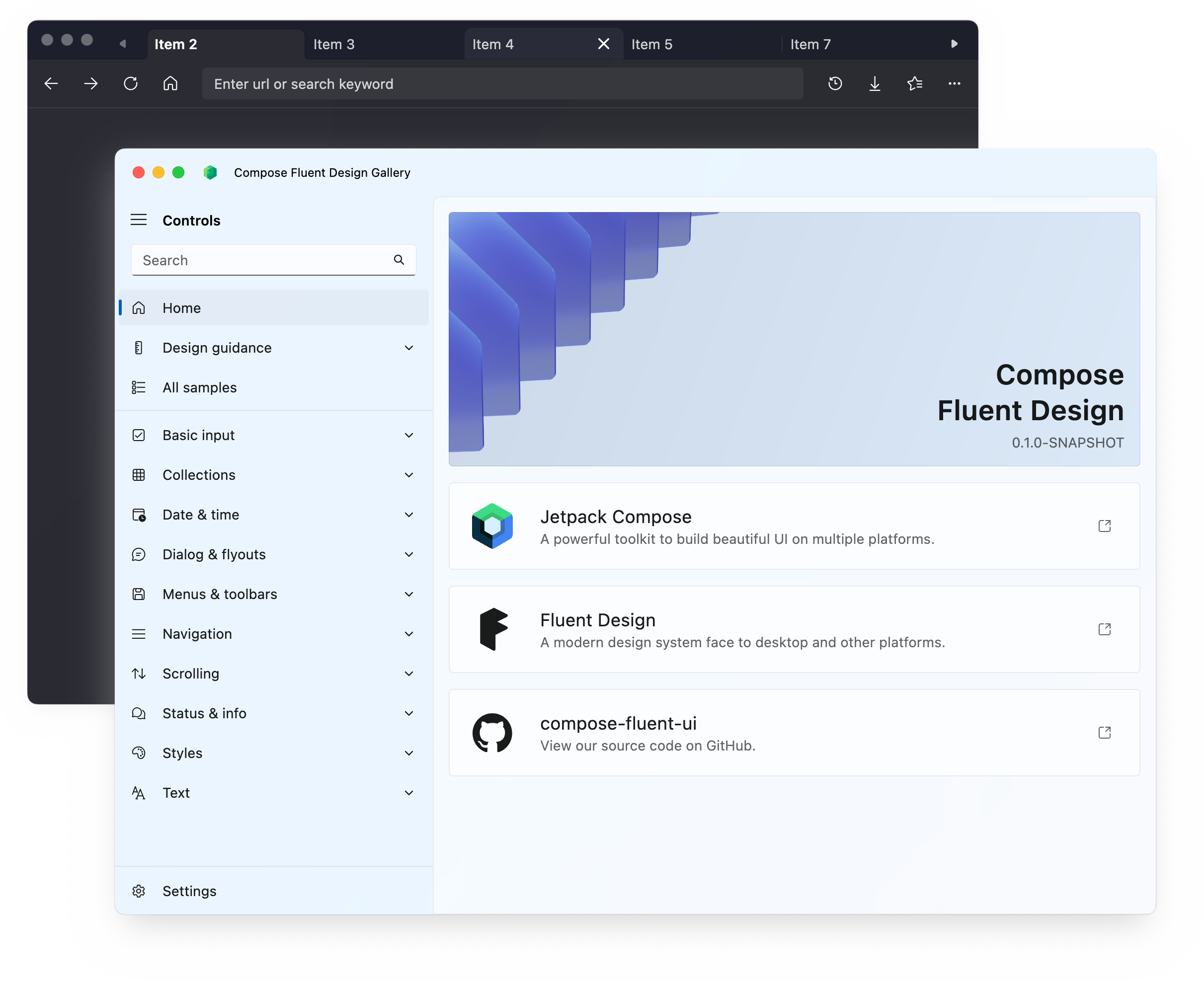
See gallery module for more details.
FluentTheme()is the context and entry point of the application, just likeMaterialTheme- Components are under
componentpackage MicaandLayerare underbackgroundpackage
Components
Layers
- Materials
- App Layer Mica
- App Layer Mica Alt
- App Layer Acrylic Default
- App Layer Acrylic Base
- App Layer Accent Acrylic Default
- App Layer Accent Acrylic Base
- App Layer Thin Acrylic
- Window Layer Mica
- Window Layer Acrylic
- Mica
- Simple Mica
- Real Mica
- Layer
- Simple Layer
- Real Layer
- Card
Basic Components
Buttons
- Button
- Accent Button
- Subtle Button
- Dropdown Button
- Hyperlink Button
- Repeat Button
- Toggle Button
- Split Button
- Toggle Split Button
Radio Button
Toggle Switch
Check Box
- TriState Check Box
Combo Box (Simple)
Progress Bar
Progress Ring
Slider
Text Field
Text
Color Picker
Rating Control
Pill Button
Segmented Button
Lite Filter
List Item
Grid View Item
Flip View
Pips Pager
Compound Components
- Calendar View (Simple)
If you need running on the Android 7.1 and below, you should enable core library desugar to avoid crash.
- Date Time Picker (Simple)
- Color Picker
- Navigation
- Side Nav
- Top Nav
- Navigation View
- Breadcrumb Bar
- Pivot
- Tab View
- Selector Bar
- Tooltip
- Info Bar
- Badge
- File Picker
- Menu Bar (Simple)
- MenuFlyout (Simple)
- Expander
- Command Bar
- Command Bar Flyout
- Auto Suggest Box
Dialogs
- Fluent Dialog
- Content Dialog
- Flyout (Simple)
Animations
- Animation Preset Constants (Duration, Easing Functions)
Theme
- Light and Dark theme
- Custom accent color
Accessibility
- Accessibility Semantics
Contribution
See CONTRIBUTION.md
License
This library is licensed under the Apache License 2.0.
The copyright of the icon assets (in io.github.composefluent.icons package) belongs to Microsoft.
Credits
This project is built upon the foundations laid by several remarkable open-source projects. We extend our sincere gratitude to the developers and maintainers of these projects for their invaluable contributions to the open-source community.
Fluent
| Project | Description | License |
|---|---|---|
| Windows UI Kit (Figma) | Provided design mockups for controls. | CC BY 4.0 |
| JetBrains/compose-multiplatform | Provides the fundamental framework for Compose Multiplatform development. | Apache License 2.0 |
| Kotlin/kotlinx-datetime | Provides a unified clock API. | Apache License 2.0 |
| chrisbanes/haze | Offers essential implementations for acrylic and mica effects. | Apache License 2.0 |
Fluent-Icons
| Project | Description | License |
|---|---|---|
| microsoft/fluentui-system-icons | Supplies the icon assets used in the project. | MIT License |
| DevSrSouza/svg-to-compose | Facilitates the conversion of SVG icons to Compose icons, aiding in the implementation of Fluent icons. | MIT License |
Gallery
| Project | Description | License |
|---|---|---|
| lhwdev/compose-window | Provides guidance on passing pointer events back to the parent window. | Apache License 2.0 |
| grassator/win32-window-custom-titlebar | Demonstrates how to hide the Windows title bar. | MIT License |
| MayakaApps/ComposeWindowStyler | Enables mica window backgrounds on Windows. | MIT License |
| java-native-access/jna | Provides the capability to interact with Win32 APIs, enabling title bar customization. | Apache License 2.0 |
| google/ksp | Along with KotlinPoet, helps with source code generation for examples and navigation logic. | Apache License 2.0 |
| square/kotlinpoet | Along with KSP, helps with source code generation for examples and navigation logic. | Apache License 2.0 |
| SnipMeDev/Highlights | Enables syntax highlighting for example code. | Apache License 2.0 |
| yshrsmz/BuildKonfig | Facilitates the generation of build configuration parameter classes. | Apache License 2.0 |
