BGATransformersTip-Android
Introduction: Android 通用 PopupWindow,支持从锚点控件的各个位置弹出浮窗,可以配置箭头指示器展示到浮窗边缘的任意位置
Tags:
Android 通用 PopupWindow,再也不用找 UI 小姐姐切 .9 图片了,大致能为你节省 30 分钟的开发时间
功能介绍
- 支持配置浮窗展示在锚点控件的任意位置
- 支持配置指示箭头(是否展示、展示在浮窗的任意位置、高度、圆角、颜色)
- 支持配置浮窗背景色
- 支持配置浮窗边框阴影(是否展示、宽度、颜色)
- 支持配置浮窗以外的其他区域是否变暗
- 浮窗超出屏幕区域后会自动移动浮窗到屏幕区域内
- 对于只有文字的浮窗,直接使用 SimpleTextTip,不用写布局文件
效果图
 |
 |
|---|---|
 |
 |

使用说明
添加 Gradle 依赖
- 把
maven { url 'https://jitpack.io' }加入到 repositories 中 - 添加如下依赖,末尾的「latestVersion」指的是徽章
 里的版本名称,请自行替换。
dependencies {
    // 使用 AndroidX 时
    implementation 'com.github.bingoogolapple.BGATransformersTip-Android:library:latestVersion@aar'

    // 没有使用 AndroidX 时
    // implementation 'com.github.bingoogolapple.BGATransformersTip-Android:library-noandroidx:latestVersion@aar'
}
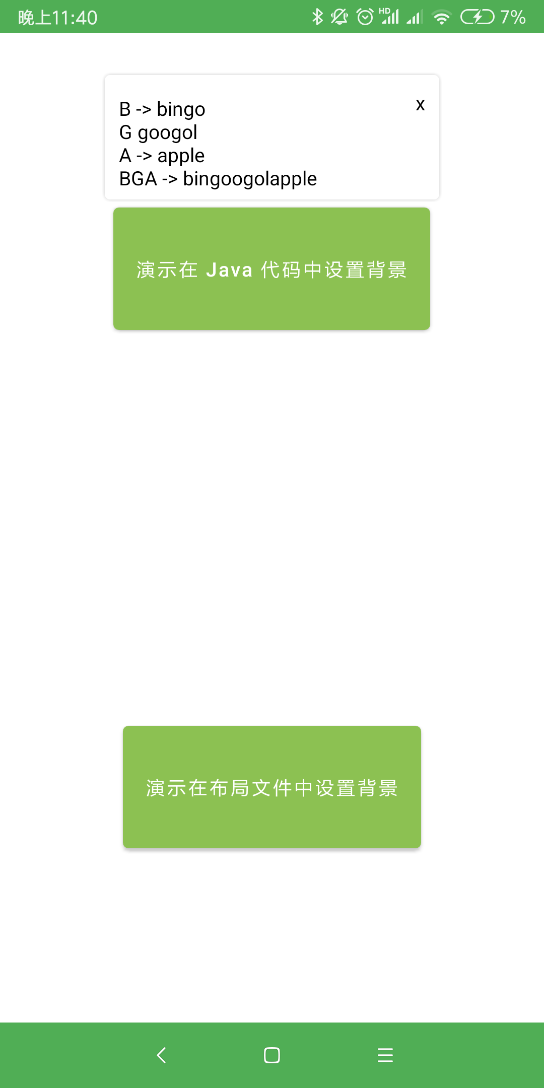
方式一:在 Java 代码中设置浮窗位置,在布局文件中设置浮窗背景、箭头位置
- 这种方式的优点是可以提前查看预览效果,提升开发效率
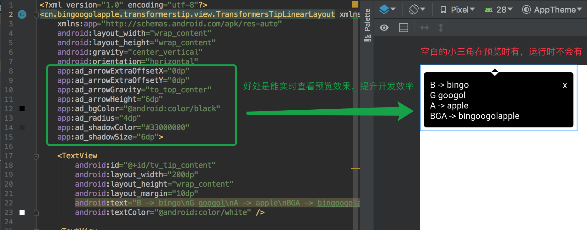
- 添加浮窗布局文件,在布局文件中设置浮窗背景、箭头位置
<?xml version="1.0" encoding="utf-8"?>
<cn.bingoogolapple.transformerstip.view.TransformersTipLinearLayout xmlns:android="http://schemas.android.com/apk/res/android"
    xmlns:app="http://schemas.android.com/apk/res-auto"
    android:layout_width="wrap_content"
    android:layout_height="wrap_content"
    android:gravity="center_vertical"
    android:orientation="horizontal"
    app:ad_arrowExtraOffsetX="0dp"
    app:ad_arrowExtraOffsetY="0dp"
    app:ad_arrowGravity="to_top_center"
    app:ad_arrowHeight="6dp"
    app:ad_bgColor="@android:color/black"
    app:ad_radius="4dp"
    app:ad_shadowColor="#33000000"
    app:ad_shadowSize="6dp">

    <TextView
        android:id="@+id/tv_tip_content"
        android:layout_width="200dp"
        android:layout_height="wrap_content"
        android:layout_margin="10dp"
        android:text="B -> bingo\nG googol\nA -> apple\nBGA -> bingoogolapple"
        android:textColor="@android:color/white" />

    <TextView
        android:id="@+id/tv_tip_close"
        android:layout_width="wrap_content"
        android:layout_height="wrap_content"
        android:layout_marginTop="6dp"
        android:layout_marginEnd="6dp"
        android:layout_gravity="top"
        android:padding="4dp"
        android:text="x"
        android:textColor="@android:color/white" />
</cn.bingoogolapple.transformerstip.view.TransformersTipLinearLayout>
- 在 Java 代码中设置浮窗位置
new TransformersTip(anchorView, R.layout.layout_demo1_tip) {
    @Override
    protected void initView(View contentView) {
        // 点击浮窗中自定按钮关闭浮窗
        contentView.findViewById(R.id.tv_tip_close).setOnClickListener(new View.OnClickListener() {
            @Override
            public void onClick(View v) {
                dismissTip();
            }
        });
    }
}
        .setTipGravity(TipGravity.TO_BOTTOM_CENTER) // 设置浮窗相对于锚点控件展示的位置
        .setTipOffsetXDp(0) // 设置浮窗在 x 轴的偏移量
        .setTipOffsetYDp(-6) // 设置浮窗在 y 轴的偏移量

        .setBackgroundDimEnabled(true) // 设置是否允许浮窗的背景变暗
        .setDismissOnTouchOutside(false) // 设置点击浮窗外部时是否自动关闭浮窗

        .show(); // 显示浮窗
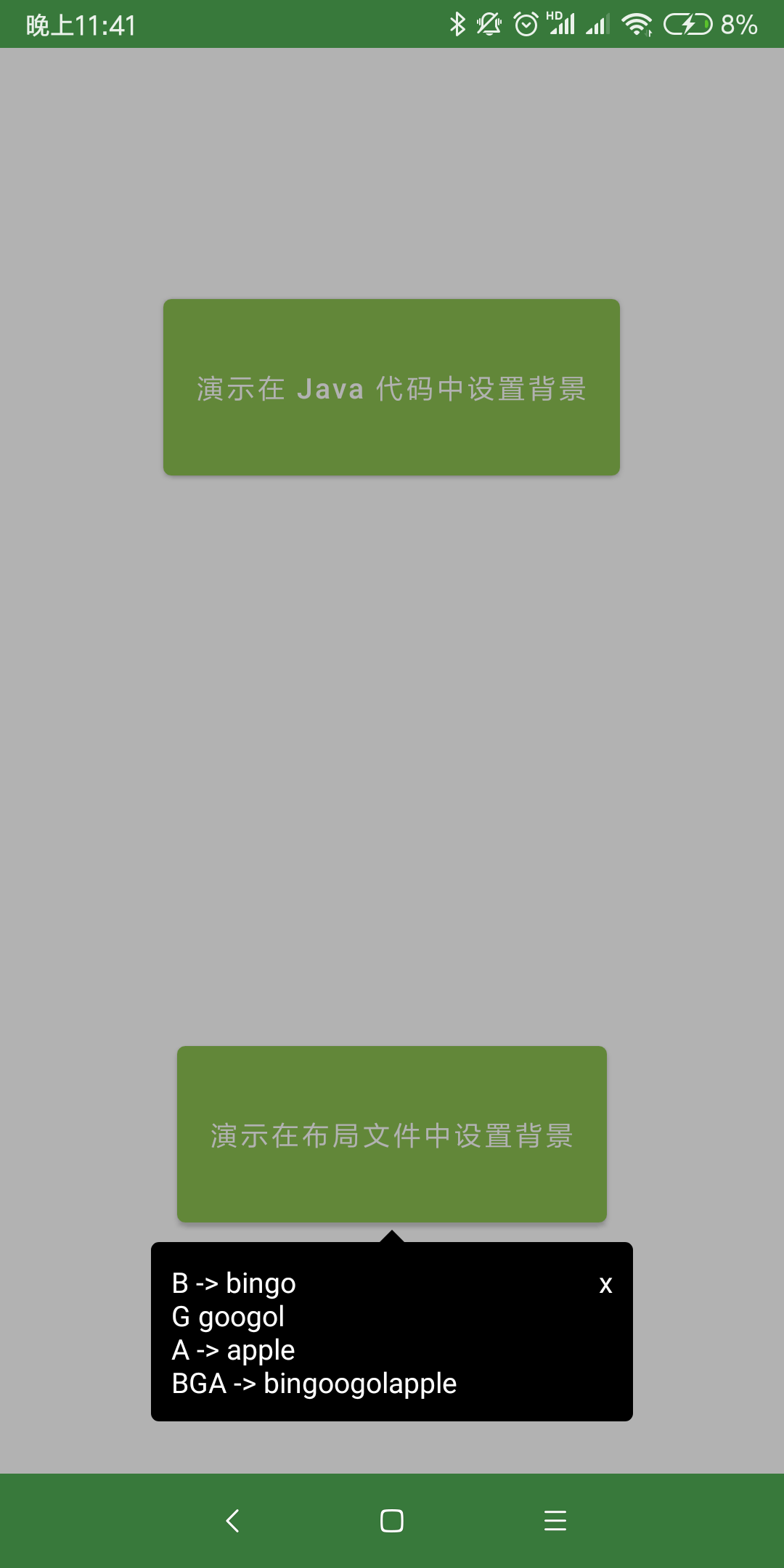
方式二:在 Java 代码中设置浮窗位置、浮窗背景、箭头位置
- 添加浮窗布局文件
<?xml version="1.0" encoding="utf-8"?>
<LinearLayout xmlns:android="http://schemas.android.com/apk/res/android"
    android:layout_width="wrap_content"
    android:layout_height="wrap_content"
    android:orientation="horizontal">

    <TextView
        android:id="@+id/tv_tip_content"
        android:layout_width="200dp"
        android:layout_height="wrap_content"
        android:layout_margin="10dp"
        android:text="B -> bingo\nG googol\nA -> apple\nBGA -> bingoogolapple"
        android:textColor="@android:color/black" />

    <TextView
        android:id="@+id/tv_tip_close"
        android:layout_width="wrap_content"
        android:layout_height="wrap_content"
        android:layout_marginTop="6dp"
        android:layout_marginEnd="6dp"
        android:layout_gravity="top"
        android:padding="4dp"
        android:text="x"
        android:textColor="@android:color/black" />
</LinearLayout>
- 在 Java 代码中设置浮窗位置、浮窗背景、箭头位置
new TransformersTip(anchorView, R.layout.layout_demo2_tip) {
    @Override
    protected void initView(View contentView) {
        // 点击浮窗中自定按钮关闭浮窗
        contentView.findViewById(R.id.tv_tip_close).setOnClickListener(new View.OnClickListener() {
            @Override
            public void onClick(View v) {
                dismissTip();
            }
        });
    }
}
        .setArrowGravity(ArrowGravity.TO_BOTTOM_CENTER) // 设置箭头相对于浮窗的位置
        .setBgColor(Color.WHITE) // 设置背景色
        .setShadowColor(Color.parseColor("#33000000")) // 设置阴影色
        .setArrowHeightDp(6) // 设置箭头高度
        .setRadiusDp(4) // 设置浮窗圆角半径
        .setArrowOffsetXDp(0) // 设置箭头在 x 轴的偏移量
        .setArrowOffsetYDp(0) // 设置箭头在 y 轴的偏移量
        .setShadowSizeDp(6) // 设置阴影宽度

        .setTipGravity(TipGravity.TO_TOP_CENTER) // 设置浮窗相对于锚点控件展示的位置
        .setTipOffsetXDp(0) // 设置浮窗在 x 轴的偏移量
        .setTipOffsetYDp(6) // 设置浮窗在 y 轴的偏移量

        .setBackgroundDimEnabled(false) // 设置是否允许浮窗的背景变暗
        .setDismissOnTouchOutside(false) // 设置点击浮窗外部时是否自动关闭浮窗

        .show(); // 显示浮窗
方式三:对于仅有文字的浮窗,可以直接使用 SimpleTextTip,不用再写布局文件了
new SimpleTextTip(anchorView)
        .setTextContent("适用于只有文字的浮窗\n 不写布局文件\n 在 Java 代码中设置文本内容属性") // 设置浮窗文本内容
        .setTextPaddingDp(12) // 设置文字与浮窗边框的间距
        .setTextColor(Color.BLACK) // 设置文字颜色
        .setTextSizeSp(14) // 设置文字大小
        .setTextGravity(Gravity.CENTER) // 设置文字对其方式
        .setLineSpacingExtraDp(4) // 设置文字行间距

        .setArrowGravity(ArrowGravity.TO_BOTTOM_ALIGN_START) // 设置箭头相对于浮窗的位置
        .setBgColor(Color.WHITE) // 设置背景色
        .setShadowColor(Color.parseColor("#33000000")) // 设置阴影色
        .setArrowHeightDp(6) // 设置箭头高度
        .setRadiusDp(4) // 设置浮窗圆角半径
        .setArrowOffsetXDp(0) // 设置箭头在 x 轴的偏移量
        .setArrowOffsetYDp(0) // 设置箭头在 y 轴的偏移量
        .setShadowSizeDp(6) // 设置阴影宽度

        .setTipGravity(TipGravity.TO_TOP_ALIGN_START) // 设置浮窗相对于锚点控件展示的位置
        .setTipOffsetXDp(0) // 设置浮窗在 x 轴的偏移量
        .setTipOffsetYDp(6) // 设置浮窗在 y 轴的偏移量

        .setBackgroundDimEnabled(false) // 设置是否允许浮窗的背景变暗
        .setDismissOnTouchOutside(true) // 设置点击浮窗外部时是否自动关闭浮窗

        .show(); // 显示浮窗
TipGravity 说明
- 通过 TipGravity.xxxx 来设置浮窗相对于锚点控件展示的位置

ArrowGravity 说明
- 通过 ArrowGravity.xxxx 来设置箭头相对于浮窗的位置

TransformersTipLinearLayout 和 TransformersTipRelativeLayout 自定义属性说明
<declare-styleable name="ArrowDrawable">
    <!-- 背景色 -->
    <attr format="reference|color" name="ad_bgColor" />
    <!-- 阴影色 -->
    <attr format="reference|color" name="ad_shadowColor" />
    <!-- 箭头高度 -->
    <attr format="dimension" name="ad_arrowHeight" />
    <!-- 阴影宽度 -->
    <attr format="dimension" name="ad_shadowSize" />
    <!-- 浮窗圆角半径 -->
    <attr format="dimension" name="ad_radius" />
    <!-- 箭头在 x 轴的偏移量 -->
    <attr format="dimension" name="ad_arrowExtraOffsetX" />
    <!-- 箭头在 y 轴的偏移量 -->
    <attr format="dimension" name="ad_arrowExtraOffsetY" />
    <!-- 箭头相对于浮窗的位置 -->
    <attr name="ad_arrowGravity">
        <flag name="to_top_align_start" value="65" />
        <flag name="to_top_center" value="129" />
        <flag name="to_top_align_end" value="257" />

        <flag name="align_top_to_start" value="34" />
        <flag name="align_top_to_end" value="514" />

        <flag name="center_to_start" value="36" />
        <flag name="center_to_end" value="516" />

        <flag name="align_bottom_to_start" value="40" />
        <flag name="align_bottom_to_end" value="520" />

        <flag name="to_bottom_align_start" value="80" />
        <flag name="to_bottom_center" value="144" />
        <flag name="to_bottom_align_end" value="272" />
    </attr>
</declare-styleable>
代码是最好的老师,更多详细用法请查看 demo:feet:
作者联系方式
| 个人主页 | 邮箱 |
|---|---|
| bingoogolapple.cn | bingoogolapple@gmail.com |
| 个人微信号 | 微信群 | 公众号 |
|---|---|---|
 |
 |
 |
| 个人 QQ 号 | QQ 群 |
|---|---|
 |
 |
打赏支持作者
如果您觉得 BGA 系列开源库或工具软件帮您节省了大量的开发时间,可以扫描下方的二维码打赏支持。您的支持将鼓励我继续创作,打赏后还可以加我微信免费开通一年 上帝小助手浏览器扩展/插件开发平台 的会员服务
| 微信 | 支付宝 | |
|---|---|---|
 |
 |
 |
作者项目推荐
- 欢迎您使用我开发的第一个独立开发软件产品 上帝小助手浏览器扩展/插件开发平台
License
Copyright 2019 bingoogolapple

Licensed under the Apache License, Version 2.0 (the "License");
you may not use this file except in compliance with the License.
You may obtain a copy of the License at

   http://www.apache.org/licenses/LICENSE-2.0

Unless required by applicable law or agreed to in writing, software
distributed under the License is distributed on an "AS IS" BASIS,
WITHOUT WARRANTIES OR CONDITIONS OF ANY KIND, either express or implied.
See the License for the specific language governing permissions and
limitations under the License.
