ExpandableSelectionView

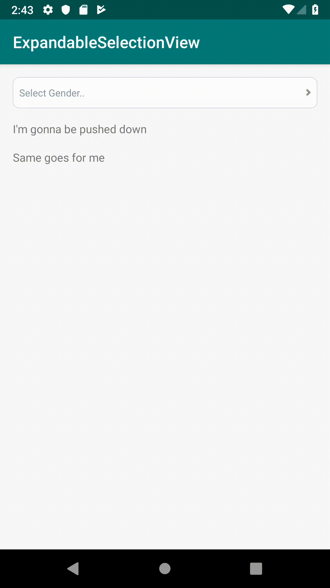
Expandable selection view is a dropdown selection view that unlike Android Spinners, pushes views down providing a better user experience.

iOS version
- SwiftyMenu, By my good friend Karim Ebrahim 🔥
Why use it?
- For a better user and developer experience.
- You might also be running away from Android spinners, cause you know 💩
Installation
Note: This library is only compatible with AndroidX, I'll add compatibility support later on.
Gradle
In your project level gradle file
allprojects {
    repositories {
        ...
        maven { url 'https://jitpack.io' }
    }
}
In your module level gradle file
dependencies {
    ...
    implementation 'com.github.ashrafDoubleO7:ExpandableSelectionView:1.0.1'
}
Basic Usage
The library provides two views, the ExpandableSingleSelectionView and the ExpandableMultiSelectionView, they both can be used in xml like:
<com.ashraf007.expandableselectionview.ExpandableSingleSelectionView
    android:id="@+id/singleSelectionView"
    android:layout_width="match_parent"
    android:layout_height="wrap_content"
    />
The component requires an ExpandableItemAdapter in order to work, for basic usage you can use an already defined BasicStringAdapter like this:
val genders = listOf(
    "Male",
    "Female",
    "Prefer not to specify"
)
// Provide a list of strings and an optional hint
val expandableAdapter = BasicStringAdapter(genders, "Select Gender..")

// Set the adapter to the component
singleSelectionView.setAdapter(expandableAdapter)

// Listen for selections
singleSelectionView.selectionListener = { index: Int? ->
    Toast.makeText(this, "SelectedIndex is $index", Toast.LENGTH_SHORT).show()
}
// Or in case of the ExpandableMultiSelectionView
multiSelectionView.selectionListener = { indices: List<Int>? ->
    Toast.makeText(this, "SelectedIndices are $indices", Toast.LENGTH_SHORT).show()
}
You can also programmatically control the following:
// To get the selected index at any time
val selectedIndex = singleSelectionView.selectedIndex

// Or in case of the ExpandableMultiSelectionView
val selectedIndices = multiSelectionView.selectedIndices

// To clear your selection
singleSelectionView.clearSelection()

// Or in case of the ExpandableMultiSelectionView
multiSelectionView.clearSelection()
// Or
multiSelectionView.unSelectIndex(1)
// Or
multiSelectionView.unSelectIndices(listOf(1, 2, 3))

// To select an index programmatically
singleSelectionView.selectIndex(1)
// Or in case of the ExpandableMultiSelectionView
multiSelectionView.selectIndex(1)
// Or
multiSelectionView.selectIndices(listOf(1, 2, 3))
/** Note:
* All selectIndex/Indices functions have an optional parameter that controls notifying the listener
* (notifyListener: Boolean = true)
**/

// Set the component's state
singleSelectionView.setState(ExpandableSelectionView.State.Expanded)

// Set an error to be shown at the bottom of the component (useful in form validation)
singleSelectionView.setError("Please select your gender")
// Or clear it
singleSelectionView.setError(null)
For a more detailed code example to use the library, please refer to the /sample app.
Design Customizations
You can customize how the component should look and behave through xml using one or more of these attributes:
<com.ashraf007.expandableselectionview.ExpandableSingleSelectionView
    android:id="@+id/singleSelectionView"
    android:layout_width="match_parent"
    android:layout_height="wrap_content"
    app:background="@drawable/bg_expandable_selection_view_2"
    app:dividerVisibility="true"
    app:scrollBarsVisibility="false"
    app:animationDuration="300"
    app:maximumHeight="200dp"
    app:dividerColor="@android:color/holo_blue_light"
    />
To change the style of the component, use the following attributes:
| Name | Type | Description | Default |
|---|---|---|---|
| background | reference | Component's background | The shape shown in the GIFs |
| dividerVisibility | boolean | Controls whether dividers should be shown under each item or not | true |
| scrollBarsVisibility | boolean | Controls whether the vertical scrollbars should be shown or not | true |
| animationDuration | integer | The expanding/collapsing animation duration | 300 milliseconds |
| maximumHeight | integer | Lets you specify the maximum height of the scrollable part of the component | INT_MAX (meaning it will by default expand to it's full size) |
| dividerColor | color | Allows you to specify a color for the divider if shown | #668b999f |
And of course it reacts normally to all android: prefix view attributes.
Advanced Usage
If the default look of the component isn't what you're really looking for,
you can still use the component but will need to provide your own implementation for the ExpandableItemAdapter like:
(A little bit similar to a header recycler view adapter)
class CustomExpandableItemAdapter : ExpandableItemAdapter {
    override fun inflateHeaderView(parent: ViewGroup): View {
        TODO("Inflate your own header view, and maybe set a hint or a placeholder or something?")
    }

    override fun inflateItemView(parent: ViewGroup): View {
        TODO("Inflate your item view")
    }

    override fun bindItemView(itemView: View, position: Int, selected: Boolean) {
        TODO("This is where you bind your item using it's position and it's selection state," +
                "maybe bind it's info and show/hide it's selection mark?")
    }

    override fun bindHeaderView(headerView: View, selectedIndices: List<Int>) {
        TODO("This is where you bind your header view," +
                "maybe using the selectedIndices to replace the placeholder/hint?")
    }

    override fun onViewStateChanged(headerView: View, state: ExpandableSelectionView.State) {
        TODO("This is where you react to a state change," +
                "maybe you want to toggle a collapsed/expanded drawable?")
    }

    override fun getItemsCount(): Int {
        TODO("This is where you provide the exact number of items expected to be shown.")
    }
}
You can also check out the BasicStringAdapter as an example implementation.
TODO
- Add select silently parameter to the different select functions.
- Scroll to first item after expanding.
- Have more control over auto collapsing the component when a choice is selected.
- Add a sample app for the advanced usage of the component.
- Allow component height to be customized using the number of items as input.
- Allow different types of expanding/collapsing animations.
- Allow different interactions to dismiss the component.
- Add compatibility support for pre-AndroidX usage.
- Add CI/CD to fasten things up.
Contributing
Pull requests are welcome. For major changes, please open an issue first to discuss what you would like to change.
License
ExpandableSelectionView is available under the MIT license. See the LICENSE file for more info.
