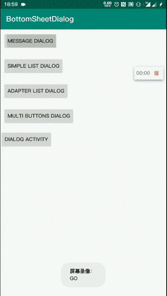
BottomDialog

心水纯纯写作很久的底部对话框样式,同时在 Google Play Store 也见到过此样式,不过经过多次问询,没得到想要的结果。只好自己动手实现。
使用 BottomSheet,支持滚动布局,同时底部布局不会因 BottomSheet 未显示全部内容而隐藏。
 |
 |
 |
|---|
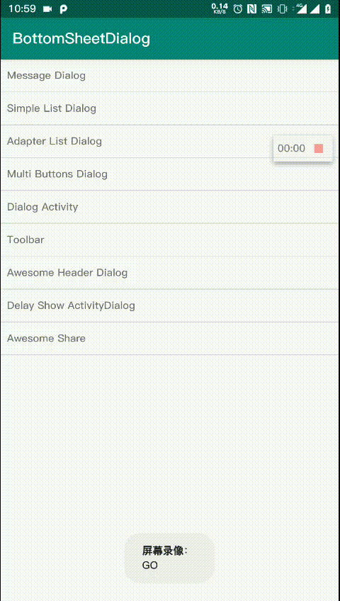
目录
特性
高度自定义
支持自定义头部布局(Toolbar...)、内容布局(列表、文字)和底部布局(按钮、BottomAppBar)
底部布局自适应导航栏
只在类原生机器测试过,不保证支持国产定制系统
支持 Activity 形式的 Dialog(BottomDialogActivity)
有 Context 即可显示的对话框
列表可操作 list 进行更新 View
支持监听 List
DEMO
简单标题文字
 BottomDialog.builder(this) {
     title("Hello")
     message(
             buildString {
                 for (i in 0..30) {
                     for (j in 0..i * 5) append(j)
                     appendln()
                 }
             }, true
     )
     oneButton("OK", autoDismiss = true) {
         //长按,更新内容布局
         onLongClick { dialog ->
             dialog.updateContent<MessageContentBuilder> {
                 text = Random().nextDouble().toString()
             }
         }
     }
 }
简单列表
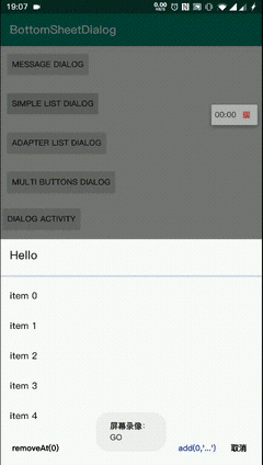
val list = ObservableList.build<String?> {
    for (i in 0..50) add("item $i")
    add("到底了")
}
BottomDialog.builder(this) {
    this.title("Hello")
    mutableList(list) { _, position, s, l ->
        toast("clicked $s at $position longClick: $l")
    }
    buttons {
        negativeButton()
        neutralButton("removeAt(0)") {
            if (list.isNotEmpty()) list.removeAt(0)
        }
        positiveButton("add(0, '...')") {
            list.add(0, "...")
        }
    }
}
自定义列表
加载应用列表,AppListBuilder 见下文自定义布局构造器
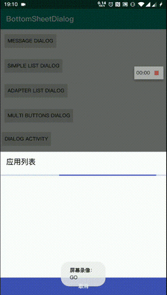
 BottomDialog.builder(this) {
     title("应用列表")
     content(AppListBuilder(this@MainActivity) { _, p, i, l ->
         toast("$p\n$i\n$l")
     })
     oneButton("取消")
 }
扩展
实现的更多的 ContentBuilder
- 仿一加系统分享对话框效果 [AwesomeHeader]
引入 BottomDialog
- 在工程
build.gradle添加
allprojects {
    repositories {
        //...
        maven { url 'https://jitpack.io' }
    }
}
- 添加依赖
最新版本 [AndroidX]:
- BottomDialog
dependencies {
    implementation 'com.github.Vove7.BottomDialog:bottomdialog:2.2.5'
}
- 扩展包(可选)
dependencies {
    implementation 'com.github.Vove7.BottomDialog:extension:2.2.5'
}
自定义布局构造器
1. 定义三层布局构造器
三层布局均可继承ContentBuilder
如 ToolbarHeader,其中title属性被listenToUpdate委托,在修改时,会通知updateContent进行更新布局。
class ToolbarHeader(title: CharSequence?) : ContentBuilder() {
    /**
     * 指定更新 type = 1
     */
    var title by listenToUpdate(title, this, type = 1)

    /**
     * 导航栏图标 type = 2
     */
    var navIconId: Int? by listenToUpdate(null, this, type = 2)

    /**
     * 导航图标点击事件 type = 3
     */
    var onIconClick: OnClick? by listenToUpdate(null, this, type = 3)

    override val layoutRes: Int = R.layout.header_toolbar

    lateinit var toolBar: Toolbar

    /**
     * 初始化 View
     * @param view View
     */
    override fun init(view: View) {
        toolBar = view.tool_bar
    }

    /**
     * 进行视图更新
     * @param type Int listenToUpdate 中指定的 type,初始化时 type 值为 -1
     * 可根据 type 值来选择更新视图,而不是全部更新
     * @param data Any? 传递值
     */
    override fun updateContent(type: Int, data: Any?) {
        //type 为 1 时,属性 title 被修改
        if (type == -1 || type == 1) toolBar.title = title

        if (type == -1 || type == 2)
            navIconId?.also {
                toolBar.setNavigationIcon(it)
            } ?: toolBar.setNavigationIcon(null)

        if (type == -1 || type == 3) {
            toolBar.setNavigationOnClickListener {
                onIconClick?.invoke(dialog)
            }
        }
    }
}
2. 设置扩展函数
此操作可选,目的是为了方便在 builder 函数中调用。
已扩展的函数有:
//设置标题
fun BottomDialogBuilder.title(title: CharSequence?): BottomDialogBuilder

//设置内容
fun BottomDialogBuilder.message(
    text: String,
    selectable: Boolean = false
): BottomDialogBuilder

//简单列表
fun BottomDialogBuilder.simpleList(
    items: List<String?>,
    autoDismiss: Boolean = true,
    onItemClick: OnItemClick<String?>
): BottomDialogBuilder

/**
 * 三个按钮布局
 * buttonPositive
 * buttonNegative
 * buttonNeutral
 */
fun BottomDialogBuilder.buttons(block: ButtonsBuilder.() -> Unit): BottomDialogBuilder

//........ 更多参考 Class: [BottomDialogBuilder]
如扩展BottomDialogBuilder一个 toolbar 函数:
/**
 * 头部使用 Toolbar
 */
fun BottomDialogBuilder.toolbar(action: ToolbarHeader.() -> Unit): BottomDialogBuilder {
    headerBuilder = ToolbarHeader().apply(action)
    return this
}
使用:
BottomDialog.builder(this, show = true) {
    toolbar {
        title = "Hello"
        navIconId = R.mipmap.ic_launcher
        onIconClick = {
            dialog.dismiss()
        }
    }
}
除了设置扩展函数,还可直接指定header(其他两种布局亦可,content, footer):
BottomDialog.builder(this) {
    header(ToolbarHeader()) {
        //...
    }
}
3. 自定义列表内容布局
可继承ListAdapterBuilder快速实现。
可指定
layoutManager
泛型
T可实现Typeable区分元素类别,以构建不同样式
如 应用列表内容构造器 AppListBuilder
class AppListBuilder(
        context: Context,
        autoDismiss: Boolean = true,
        private val appList: ObservableList<AppInfo> = ObservableList(),
        onItemClick: OnItemClick<AppInfo>

) : ListAdapterBuilder<AppInfo>(applist, autoDismiss, onItemClick) {

    init {
        loading = true //加载视图
        thread {
            sleep(1500)
            loadAppList(context)
        }
    }
    //type 为元素类型,若 items 未继承 Typeable: type = 0
    override val itemView: (type: Int) -> Int = { R.layout.item_app_list }

    //item 绑定到视图
    override val bindView: BindView<AppInfo> = { view, item ->
        view.text_1.text = item.name
        view.text_2.text = item.pkg
    }

    private fun loadAppList(context: Context) {
        val pm = context.packageManager
        appList.addAll(ObservableList.build {
            pm.getInstalledPackages(0)?.forEach {
                add(AppInfo(it.packageName, it.applicationInfo.loadLabel(pm)))
            }
        })

        //停止加载
        loading = false
    }
}

data class AppInfo(
        val pkg: String,
        val name: CharSequence
)
使用:
BottomDialog.builder(this) {
    title("应用列表")

    //指定内容布局 Builder
    content(AppListBuilder(this@MainActivity) { _, p, i, l ->
        toast("$p\n$i\n$l")
    })

    oneButton("取消")
}
适配主题
目前有两个自定义属性:
?attr/bd_bg_color 背景色
?android:attr/textColorPrimary 文字颜色
在使用自定义主题时,需要指定上面两个属性:
<style name="BottomDialog.Dark" parent="BottomDialog">
    <item name="bd_bg_color">#212121</item>
    <item name="android:textColorPrimary">#fff</item>
</style>
使用主题:
BottomDialog.builder(this) {
    themeId = R.style.BottomDialog_Dark
    //...
}
注意自定义的 ContentBuilder 也需使用动态属性:
<androidx.appcompat.widget.Toolbar
    android:background="?attr/bd_bg_color"
    app:titleTextColor="?android:attr/textColorPrimary" />
Faqs
1. show()过后如何更新布局?
此时比如更新 message 内容(内容布局类型为 MessageContentBuilder)
dialog.updateContent<MessageContentBuilder> {
    //text 属性被委托,才可通知布局刷新,见[MessageContentBuilder]
    text = "new message"
}
2. 属性委托相关
当属性被委托后,改变值即可通知ContentBuilder的updateContent(type: Int, data: Any?)
如:
var title by listenToUpdate(title, this, 2)
当 title 值被修改后,会执行 updateContent(2)
实现原理
列表类型为
ObservableList,可监听内容变化,来通知 Adapter 更新布局对话框底部布局,能够悬浮,由于:其中 BottomSheet 布局
bs_root与footer_lay同级。
布局文件dialog_content.xml。(已去除不重要属性)
<CoordinatorLayout>

    <!--BottomSheet-->
    <LinearLayout
        android:id="@+id/bs_root"
        app:layout_behavior="android.support.design.widget.BottomSheetBehavior">

        <!--头部布局-->
        <FrameLayout android:id="@+id/header_container" />


        <NestedScrollView android:id="@+id/container">

            <!--内容布局-->
            <FrameLayout android:id="@+id/content"/>
        </NestedScrollView>
    </LinearLayout>

    <LinearLayout
        android:id="@+id/footer_lay"
        android:layout_alignParentBottom="true"
        android:layout_gravity="bottom" >
        <!--底部布局-->
        <FrameLayout android:id="@+id/footer_contains" />
        <!--用于撑起底部布局于导航栏之上-->
        <View android:id="@+id/fill_nav" />
    </LinearLayout>

</CoordinatorLayout>
详细内容请参考源码
