RangeSeekBar
Introduction: A Range Seek Bar for Android
Tags:

Gradle
implementation "com.rizlee.view:rangeseekbar:$latest_version"
XML
<com.rizlee.rangeseekbar.RangeSeekBar
android:id="@+id/rangeSeekBar"
android:layout_width="300dp"
android:layout_height="wrap_content"
android:layout_marginTop="16dp"
app:active="true"
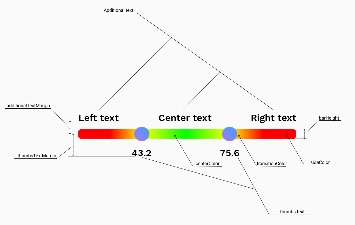
app:additionalTextMargin="6dp"
app:enableGradient="true"
app:layout_constraintEnd_toEndOf="parent"
app:layout_constraintStart_toStartOf="parent"
app:layout_constraintTop_toTopOf="parent"
app:roundedCorners="true"
app:showAdditionalText="above"
app:showThumbsText="below"
app:textColor="@android:color/black"
app:thumbsTextMargin="6dp" />
Kotlin
just implement:
OnRangeSeekBarPostListener
or
OnRangeSeekBarRealTimeListener

rangeSeekBar.listenerPost = this
or
rangeSeekBarlistenerRealTime = this
Attributes
| Attribute | Type | Description | Default value |
|---|---|---|---|
| minValue | float | min value of range | 0f |
| maxValue | float | max value of range | 100f |
| stepValue | float | it must be: (maxValue - minValue) % stepValue == 0f | 1f |
| valueType | intType, floatType | to display values in the form you want | intType |
| enableGradient | boolean | enable or disable gradient between center and sides | false |
| textColor | color | change all text color on view | Color.GRAY |
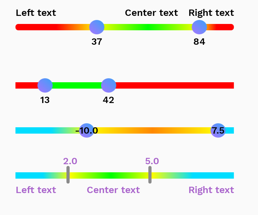
| showThumbsText | none, below, above, center | numeric values of selected range | none |
| thumbsTextMargin | dimension | margin from center of seekbar(сan be negative) | 0dp |
| additionalTextMargin | dimension | margin from center of seekBar(сan be negative) | 0dp |
| showAdditionalText | none, below, above, center | additional info on seekbar(left, center and right text) | none |
| roundedCorners | boolean | seekbar with rounded corners or not | false |
| barHeight | dimension | height of bar(possible problems with large values) | 8dp |
| active | boolean | enable or disable seekbar, if seekbar disabled thumb images will be replaced by others (thumbsDisabled) | true |
| textSize | dimension | change all text size on view | 12sp |
| textFont | not ready yeat | - | worksans-semibold |
| centerText | string | - | Center text |
| rightText | string | - | Right text |
| leftText | string | - | Left Text |
| thumbsNormal | drawable | - | thumb_normal.png |
| thumbsPressed | drawable | - | thumb_pressed.png |
| thumbsDisabled | drawable | - | thumb_disabled.png |
| sideColor | color | colors left and right of thumbs | Color.RED |
| transitionColor | color | color used in gradient formation, if enableGradient = false, this color not used | Color.YELLOW |
| centerColor | color | color between left and right thumbs | Color.GREEN |
Functions
| Function name | Description |
|---|---|
setRange(minValue: Float, maxValue: Float, stepValue: Float) |
set range values with valueType = float |
setRange(minValue: Int, maxValue: Int, stepValue: Int) |
set range values with valueType = int |
setCurrentValues(leftValue: Float, rightValue: Float) |
set selected values |
setCurrentValues(leftValue: Int, rightValue: Int) |
set selected values |
getRangeInfo() |
return RangeInfo(val minValue: Float, val maxValue: Float, val stepValue: Float) |
getCurrentValues() |
return Range(val leftValue: Float, val rightValue: Float) |
Public fields(getters and setters)
| Field name: type | Attribute equivalent |
|---|---|
| isActive: Boolean | active |
| leftText: String | leftText |
| rightText: String | rightText |
| centerText: String | centerText |
| sideBarColor: Int | sideColor |
| centerBarColor: Int | centerColor |
| transitionBarColor: Int | transitionColor |
| isGradientNeed: Int | enableGradient |
Interfaces
| Field name | Type | Description |
|---|---|---|
| listenerPost | OnRangeSeekBarPostListener | sends results after a user has finished changing them. |
| listenerRealTime | OnRangeSeekBarRealTimeListener | sends results while changing values |
*If you need some new features or you found bugs please write issue
