SquircleView
SquircleView
SquircleView is a library which provides you with Squircle views to use for buttons, views, etc.


Different kinds of buttons, layouts and images you can create
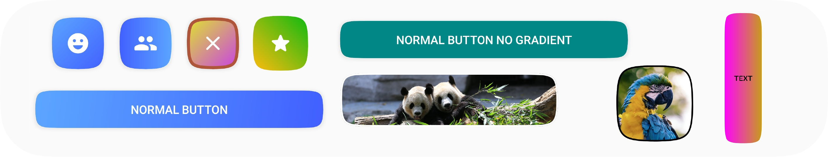
Table of Contents
- How to use
- Usage
- Android Shapes
- Todo
- Contributing
- Contributors
- Showcase
- Changelog
- Attribution
- License
How to use

Add the Maven repository to your root build.gradle file:
allprojects {
    repositories {
        mavenCentral()
    }
}
Also add the SquircleView dependency to your app build.gradle
dependencies {
    implementation "app.juky:squircleview:0.6.1"
}
Usage
For all use cases, check out the sample app which contains a bunch of different configurations.
SquircleImageView
This view extends the AppCompatImageView, which you can use to have a squircle image.
<squircleview.views.SquircleImageView
    android:id="@+id/imageButton"
    android:layout_width="100dp"
    android:layout_height="100dp"
    app:squircle_background_color="#FF00FF"
    app:squircle_background_image="@drawable/first_image"
    app:squircle_border_color="#000000"
    app:squircle_border_width="4dp"/>
SquircleButton
This view extends the AppCompatTextView, which you can use to have a squircle button
<squircleview.views.SquircleButton
    android:id="@+id/normalButton"
    android:layout_width="match_parent"
    android:layout_height="wrap_content"
    android:padding="16dp"
    android:text="Normal button"
    android:textColor="#FFFFFF"
    app:squircle_background_gradient_end_color="#415FFF"
    app:squircle_background_gradient_start_color="#5BA7FF"
    app:squircle_shadow_elevation="2dp"/>
SquircleConstraintLayout
This view extends the ConstraintLayout, which you can use to add all sorts of view to your squircle, like an icon or a
complex layout with texts and icons.
<squircleview.views.SquircleConstraintLayout
    android:layout_width="72dp"
    android:layout_height="72dp"
    android:padding="16dp"
    app:squircle_background_gradient_end_color="#415FFF"
    app:squircle_background_gradient_start_color="#5BA7FF"
    app:squircle_shadow_elevation="2dp">

    <!-- Embed whatever widget you would like, in this case an icon -->
    <androidx.appcompat.widget.AppCompatImageView
        android:layout_width="32dp"
        android:layout_height="32dp"
        android:src="@drawable/ic_emoji"
        android:tint="@color/white"
        app:layout_constraintBottom_toBottomOf="parent"
        app:layout_constraintEnd_toEndOf="parent"
        app:layout_constraintStart_toStartOf="parent"
        app:layout_constraintTop_toTopOf="parent"/>

</squircleview.views.SquircleConstraintLayout>
Load image
You can load an image in every view using the setBackgroundImage method, but you can also use your favorite image
loading library to load it in for you. We have out of the box support for Glide, Picasso, Fresco, Coil, etc.
Load image normally
my_squircle_image_view.setBackgroundImage(ContextCompat.getDrawable(context, R.drawable.my_image))
Load image using an image loading library like Glide:
Glide.with(this).load(R.drawable.my_image)
    .diskCacheStrategy(DiskCacheStrategy.ALL)
    .into(my_squircle_image_view)
Attributes
The following attributes can be used in your styles.xml / themes.xml or as attribute of the view in your layout xml files.
| Attribute | Type | Default | Description |
|---|---|---|---|
| squircle_background_image | reference | Background image of view | |
| squircle_background_color | color | #000000 | Background color of view |
| squircle_background_gradient_drawable | reference | Background gradient drawable displayed in view | |
| squircle_background_gradient_start_color | color | Background gradient start color | |
| squircle_background_gradient_end_color | color | Background gradient end color | |
| squircle_background_gradient_direction | enum | TOP_LEFT_BOTTOM_RIGHT | Direction of the background gradient (only for the color gradient) |
| squircle_shadow_elevation | dimension | Default of the super view | Shadow elevation |
| squircle_shadow_elevation_color | color | #42000000 | Shadow elevation color |
| squircle_border_color | color | Border color | |
| squircle_border_gradient_drawable | reference | Border gradient drawable displayed in view | |
| squircle_border_gradient_start_color | color | Border gradient start color | |
| squircle_border_gradient_end_color | color | Border gradient end color | |
| squircle_border_gradient_direction | enum | TOP_LEFT_BOTTOM_RIGHT | Direction of the border gradient (only for the color gradient) |
| squircle_border_width | dimension | 0 | Border width |
| squircle_ripple_enabled | boolean | true (false for SquircleImageView) | Ripple enabled or disabled (when a click listener is set) |
| squircle_ripple_drawable | reference | ?attr/selectableItemBackground | Drawable used for drawing the ripple |
| squircle_corner_smoothing_percentage | integer | 100% | Change the corner smoothing, a Squircle is 100% by default |
Methods
Properties of the views can be modified by setting using following variables / methods. They can be accessed via
the style property of the view. Note: Only supply color resources to the variables with the suffix Res, otherwise
your colors won't work.
// Property getters / setters
var backgroundImage: Bitmap?
var backgroundColor: Int
var backgroundColorRes: Int
var shadowElevation: Float
var shadowElevationColor: Int
var shadowElevationColorRes: Int
var backgroundGradientDrawable: GradientDrawable?
var backgroundGradientStartColor: Int
var backgroundGradientStartColorRes: Int
var backgroundGradientEndColor: Int
var backgroundGradientEndColorRes: Int
var backgroundGradientDirection: GradientDirection
var borderColor: Int
var borderColorRes: Int
var borderGradientDrawable: GradientDrawable?
var borderGradientStartColor: Int
var borderGradientStartColorRes: Int
var borderGradientEndColor: Int
var borderGradientEndColorRes: Int
var borderGradientDirection: GradientDirection
var borderWidth: Float
var rippleEnabled: Boolean

// Methods
fun setCornerSmoothing(cornerSmoothing: Int)
fun setBackgroundImage(drawable: Drawable?)
fun setBackgroundImage(resId: Int)
fun setBackgroundGradientDrawable(resId: Int)
fun setBackgroundGradientDirection(angle: Int)
fun setBorderGradientDrawable(resId: Int)
fun setBorderGradientDirection(angle: Int)


fun getCornerSmoothing(): Int
Example:
val button = findViewById<SquircleButton>(R.id.button)
button.style.backgroundColor = Color.RED
button.style.backgroundColorRes = R.color.teal_200
Notes:
You might notice that there's no ripple, even though it has been enabled or a drawable has been set. This is because the ripple will only be shown once you've set a click listener.
Android Shapes
As you might have encountered before, Android does support custom Shapes to be applied to buttons, images, ConstraintLayout, etc. I've decided to create a custom view to allow some flexibility when it comes to using gradients and other functionalities which don't work really well with shapes. If you would still like to use a ShapeDrawable / ShapeAppearance, I've decided to add this functionality to the library. Please note that this is only supported programmatically, not via XML.
ShapeAppearance
binding.buttonWithShapeDrawable.shapeAppearanceModel = SquircleShape.getShapeAppearance().build()
ShapeDrawable
// The background color is not preserved, so it needs to be re-applied
binding.constraintLayoutWithShapeDrawable.background =
    SquircleShape.getShapeDrawable(binding.constraintLayoutWithShapeDrawable).apply {
        this.paint.apply {
            this.color = ContextCompat.getColor(this, R.color.my_color)
        }
    }
Methods and classes
Methods
// Methods derived from SquircleShape
fun getSquirclePath(rect: RectF, width: Int, height: Int): ShapePath
fun getShapeAppearance(): ShapeAppearanceModel.Builder
fun getShapeDrawable(view: View): ShapeDrawable
Classes
If you would like to apply the Squircle to only a certain corner or such, you can retrieve the custom CutCornerTreatment
implementation, which is called SquircleCornerTreatment.
Todo
- Inner shadow support
- Layouts other than ConstraintLayout
- Expose all attributes via methods
- Ensure it works on API 21 - 30
- Check Java support
- Performance testing with lots of bitmaps
- Add tests
- Code documentation
- Option to determine text color by background / image
- Use precise angle of gradient instead of matching it to a segment
- Improve outer shadow boundaries
- Jetpack compose support
- Reduce
invalidate()calls when changing multiple style properties
Contributing
Check out the CONTRIBUTING.md file to know more
Contributors
 Niels G 💻 📖 🚧 |
 Thomas Bakker 👀 |
Showcase
Changelog
- V0.6.0 (23 may 2022)
- Fixed issue #20 where ComposeShape was incorrectly calculating the top left corner, thanks @imnithish for finding this issue
- V0.6.0 (23 may 2022)
- Breaking change:
Border gradients have been added, so existing gradient methods are now prefixed with
background_- Methods renamed:
gradientDrawabletobackgroundGradientDrawable,gradientStartColortobackgroundGradientStartColor,gradientStartColorRestobackgroundGradientStartColorRes,gradientEndColortobackgroundGradientEndColor,gradientEndColorRestobackgroundGradientEndColorRes,gradientDirectiontobackgroundGradientDirection - Attributes renamed:
squircle_gradient_drawabletosquircle_background_gradient_drawable,squircle_gradient_start_colortosquircle_background_gradient_start_color,squircle_gradient_end_colortosquircle_background_gradient_end_color,squircle_gradient_directiontosquircle_background_gradient_direction
- Methods renamed:
- Added border gradient support
- Breaking change:
Border gradients have been added, so existing gradient methods are now prefixed with
- V0.5.1 (20 may 2022)
- Android Studio previews would fail due to issues with attributes
- V0.5.0 (8 april 2022)
- Updated Gradle, Kotlin and dependencies
- Added Jetpack Compose Path components and paths
- Fixed SquircleImageView crash #15
- Fixed issue where clickable and focusable were set to true by default
- V0.4.2 (4 august 2021)
- Fixed issue where the text appearance of the button would override any custom styling set for the following attributes: android:fontFamily, android:textStyle, android:textAllCaps, android:textSize, android:letterSpacing
- V0.4.1 (1 august 2021)
- Fixed issues with backgrounds because of the recent ripple improvements
- Changed version numbering to follow the major.minor.patch version naming
- V0.0.4 (31 july 2021)
- Added support for customizing the corner smoothing (e.g. make the Squircle less rounded)
- Added support for custom ripple drawables
- Ripples will now only show up if any click listener is set
- V0.0.3 (19 june 2021)
- Added support for programmatically setting the view's properties
- V0.0.2 (12 june 2021):
- Added support for Android shapes
- Fixed Maven using the wrong source url
- V0.0.1 (10 june 2021):
- Initial release
Attribution
Images used in the sample app originate from Unsplash:
This library is inspired by the cupertino_rounded_corners Flutter library
License
MIT License

Copyright (c) 2021 Juky

Permission is hereby granted, free of charge, to any person obtaining a copy
of this software and associated documentation files (the "Software"), to deal
in the Software without restriction, including without limitation the rights
to use, copy, modify, merge, publish, distribute, sublicense, and/or sell
copies of the Software, and to permit persons to whom the Software is
furnished to do so, subject to the following conditions:

The above copyright notice and this permission notice shall be included in all
copies or substantial portions of the Software.

THE SOFTWARE IS PROVIDED "AS IS", WITHOUT WARRANTY OF ANY KIND, EXPRESS OR
IMPLIED, INCLUDING BUT NOT LIMITED TO THE WARRANTIES OF MERCHANTABILITY,
FITNESS FOR A PARTICULAR PURPOSE AND NONINFRINGEMENT. IN NO EVENT SHALL THE
AUTHORS OR COPYRIGHT HOLDERS BE LIABLE FOR ANY CLAIM, DAMAGES OR OTHER
LIABILITY, WHETHER IN AN ACTION OF CONTRACT, TORT OR OTHERWISE, ARISING FROM,
OUT OF OR IN CONNECTION WITH THE SOFTWARE OR THE USE OR OTHER DEALINGS IN THE
SOFTWARE.
