ComposeCookBook
Introduction: A Collection on all Jetpack compose UI elements, Layouts, Widgets and Demo screens to see it's potential
Tags:
ComposeCookBook
Declarative UI
A Collection of all Jetpack compose UI elements, Layouts, Widgets and Demo screens to see it's potential.




Jetpack Compose is Android’s modern toolkit for building native UI. It simplifies and accelerates UI development on Android. Quickly bring your app to life with less code, powerful tools, and intuitive Kotlin APIs.
Jetpack compose for Desktop:
FontAwesomeIcons in Compose:
Screens
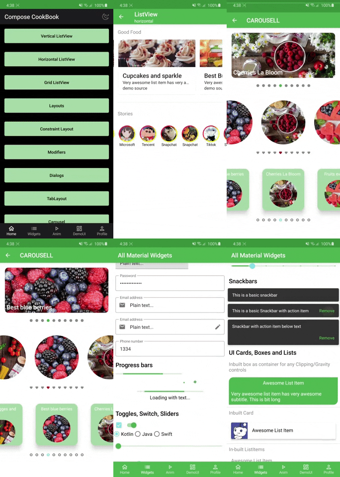
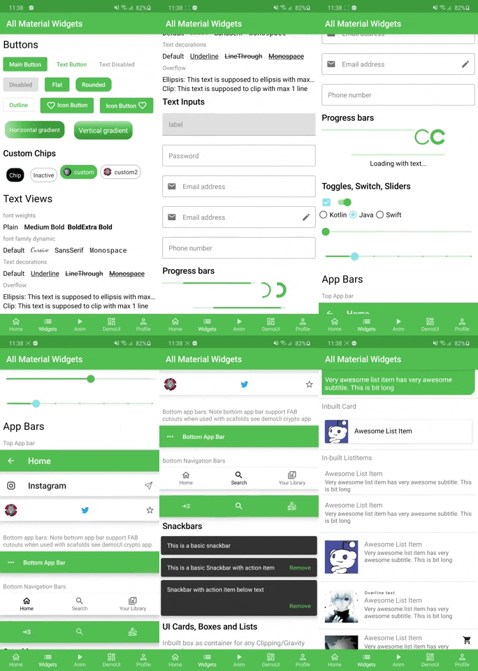
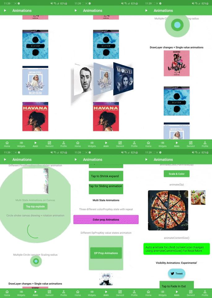
| List & Layouts | Widgets and building blocks | Animations | Theme |
|---|---|---|---|
 |
 |
 |
 |
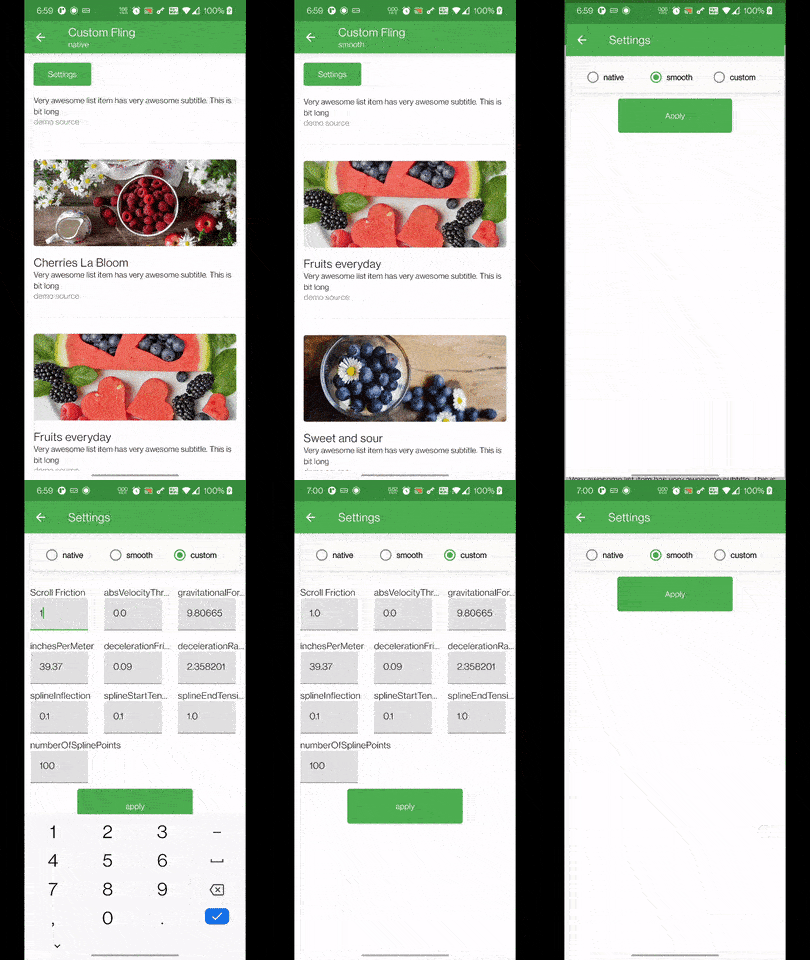
| Flinger |
|---|
 |
Demo UI
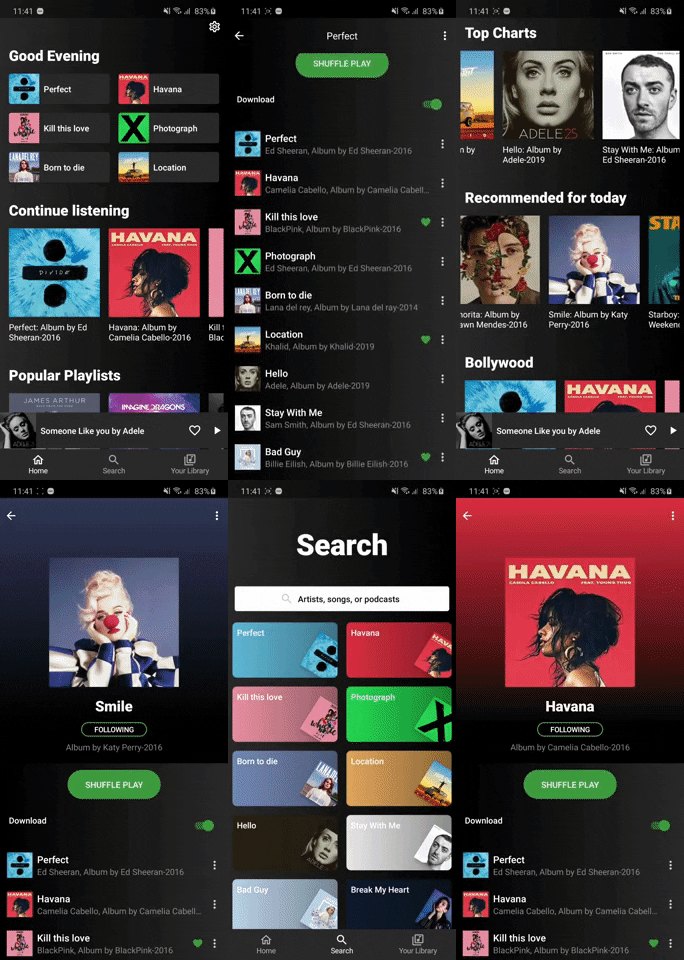
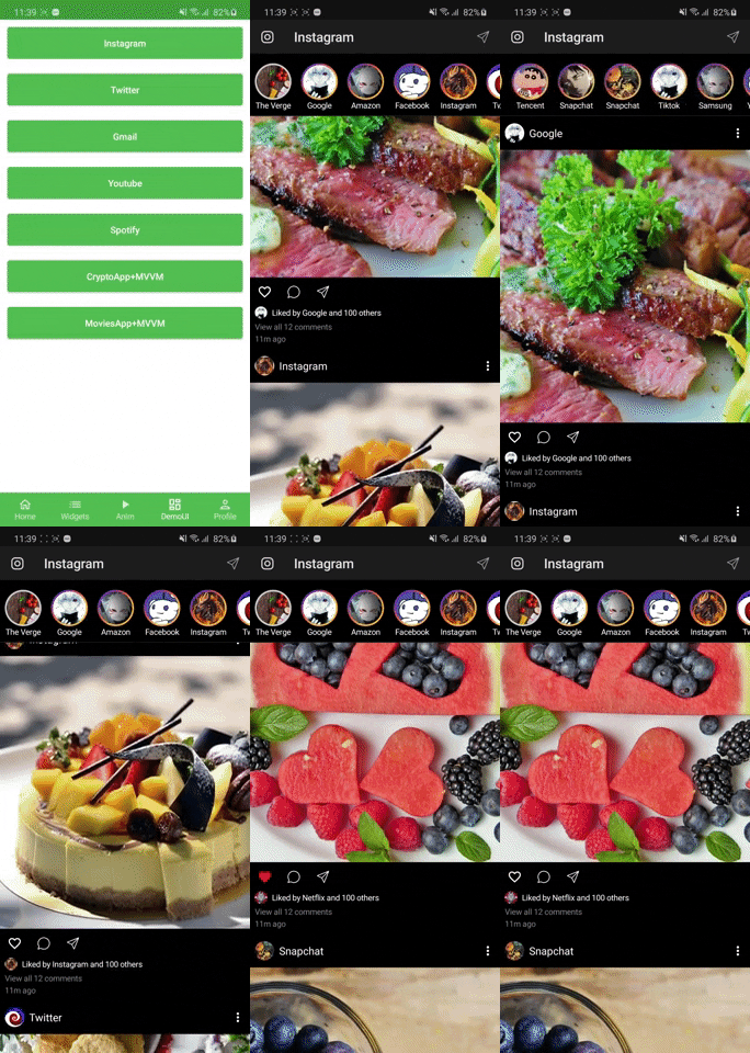
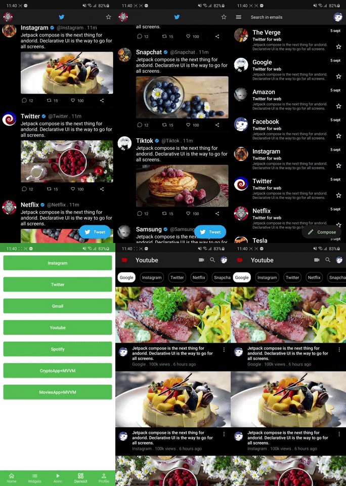
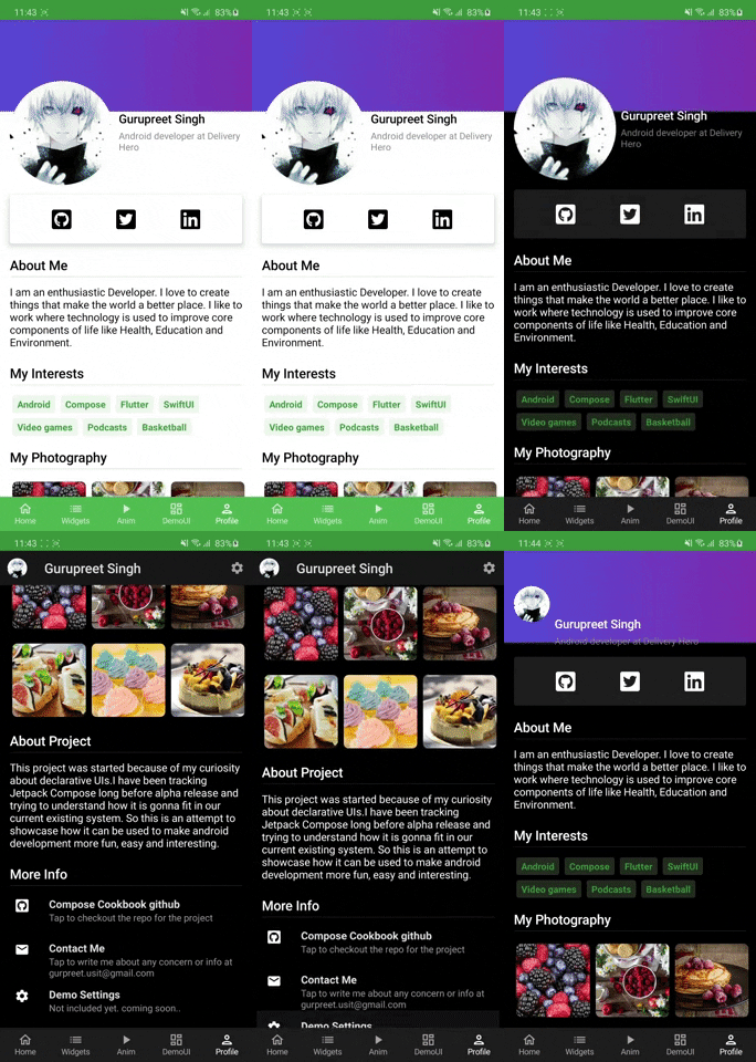
| Spotify | Instagram Demo | Twitter, Gmail, Youtube | Profile |
|---|---|---|---|
 |
 |
 |
 |
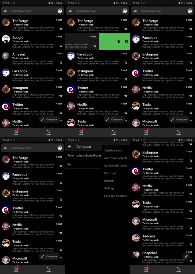
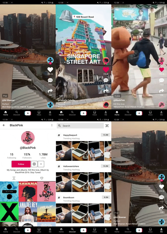
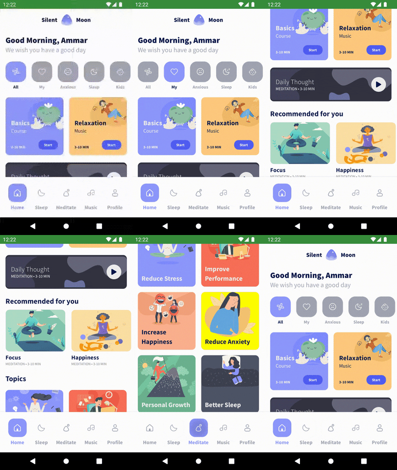
| Gmail full | Tiktok | Meditation |
|---|---|---|
 |
 |
 |
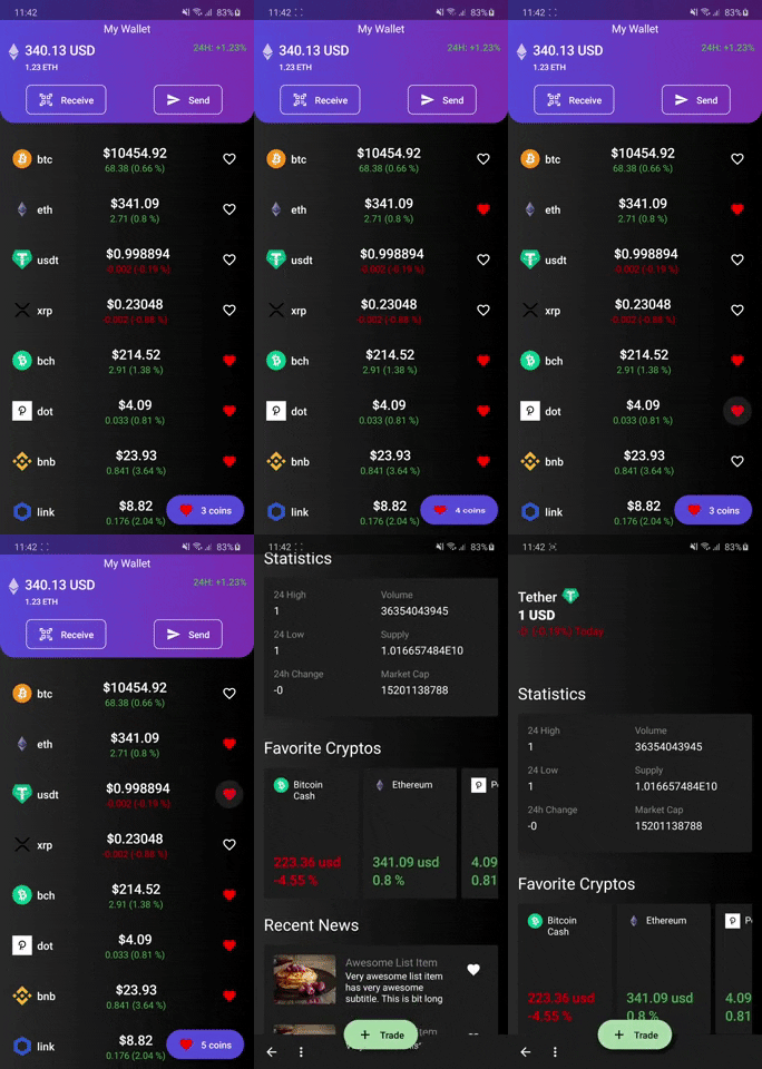
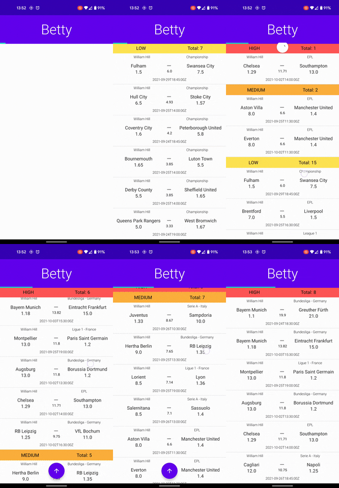
Apps with Api, Retrofit, Room, Flow, Livedata Integration
| CryptoApp MVVM | MovieApp MVI | Dating APP DEMO UI | Betty |
|---|---|---|---|
 |
 |
 |
 |
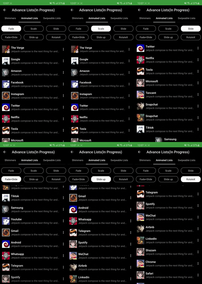
Advance lists and animations
| Shimmer Lists | List Scroll Animations |
|---|---|
 |
 |
Templates
| Adding card details | CaseCade Menu |
|---|---|
 |
 |
Build setup
- Dependencies and versions live in the Gradle version catalog:
gradle/libs.versions.toml - Shared module configuration (convention plugins, SDK levels) lives in buildSrc
How to get started
Use Android Studio Ladybug or newer and JDK 17 (the project targets AGP 8.7 / Kotlin 2.1).
The MoviesApp demo needs a TMDB API key. Add it to your
(git-ignored) local.properties as tmdbApiKey=YOUR_KEY, or export TMDB_API_KEY. Without it the
demo builds fine but the movie lists stay empty.
Features & Where to start
- Widgets: Widgets Screen show case all the available components to build UI.
- Home Screen: Start with Layouts, Modifiers and Simple Listviews
- Demo UI: Learn how demo UI have been made by using layouts, listviews and widgets.
- Animations: Animations are very interesting in compose. Checkout single value animations to get started.
- UI Tests: Checkout UI tests to understand how we can test compose UI.
- Others: After the above steps feel free to deep dive into Tablayouts, carousel, Dialogs and BottomSheets
Adaptive layouts (large screens)
NavigationSuiteScaffoldswitches between bottom bar, rail and drawer based on window sizeListDetailPaneScaffoldtwo-pane layout on tablets/foldables — find it under "Adaptive UI" on the home screen
Coming Soon
- Some of the features that will be available in coming weeks
- Clean Architecture Sample with coroutines.
- Advance canvas drawing. Much more in pipeline stay tuned!!
Official Documentations
Official Google Documentation
Contribution Info
- All the contributions are welcomed keeping following points in mind.
- If it's a widget/tool/UI element newly added please add to Widget Screen
- Any feature showcase like Collapsing AppBar, BottomSheets, Dialogs etc add in HomeScreen list
- Any Demo UI please add to Demo UI section
- Try not to add new Icons/Images unless must be needed.
- Please make sure whatever you add also supports dark mode as well. Thanks happy coding
Please Share & Star the repository to keep me motivated.