Theme
Introduction: 🎨 An Experimental Theme Engine for Android
Tags:

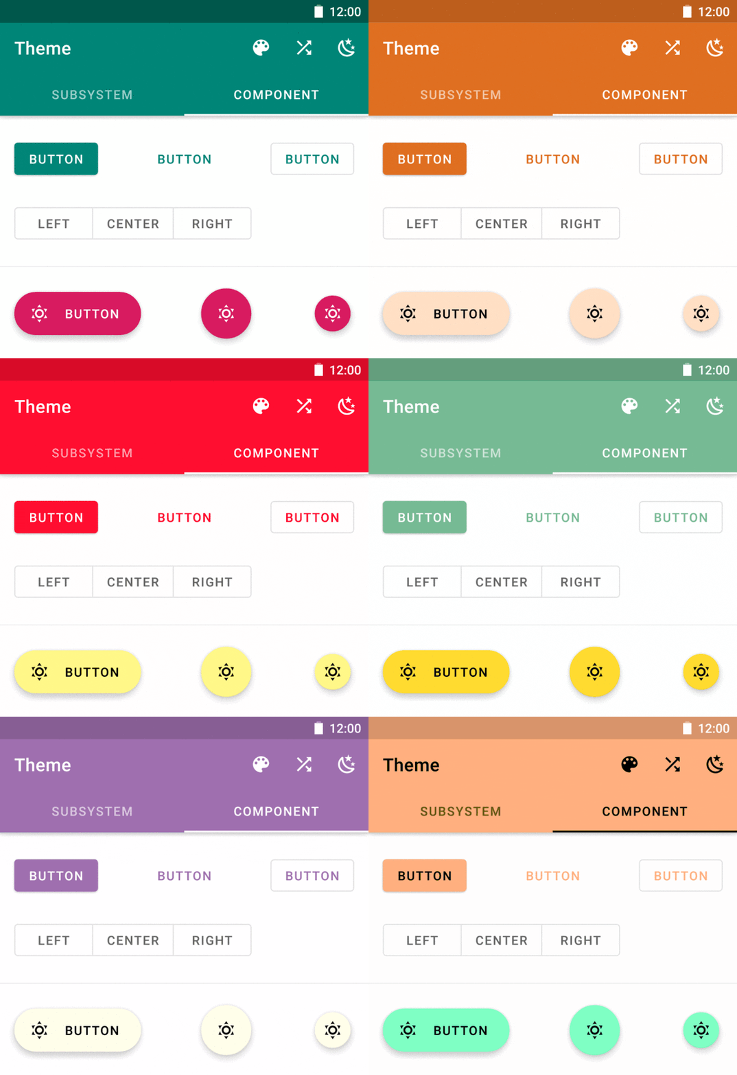
Theme is an experimental theme engine for Android by retinting views after their creation.
This library is inspired by aesthetic and Cyanea.
WARNING
Themeis a companion of material-components-android, so it requires you to adoptmaterial-components-androidin your project.- Currently,
Themeonly supportsmaterial-components-android1.4.0. Any other version doesn't work. - Because the implementation is fragile, think twice, and do some investigation before using this library.
- Jetpack Compose supports theming programmatically and is a better alternative(in the future).
Sample App
Usage
Install dependency:
Define six theme colors:
<resources> <color name="colorPrimary">#008577</color> <color name="colorPrimaryVariant">#00574B</color> <color name="colorOnPrimary">#FFFFFF</color> <color name="colorSecondary">#D81B60</color> <color name="colorSecondaryVariant">#A00037</color> <color name="colorOnSecondary">#FFFFFF</color> </resources>- The color resources name must be identical to the names above.
- Color values must be formatted as
#RRGGBB. Color references won't work because of howTypedArray.getResourceIdworks.
Add an attribute to your root theme:
<style name="AppTheme" parent="Theme.MaterialComponents.DayNight.NoActionBar">
    ...
    <!-- Add this line -->
    <item name="viewInflaterClass">xyz.aprildown.theme.ThemeViewInflater</item>
</style>
In your Application:
Theme.init(
    context = this,
    themeRes = R.style.AppTheme
) {
    // Optional. Provide initial colors here.
    // The usage is same as the code below.
}
Change colors:
Theme.edit(this) { colorPrimaryRes = R.color.md_amber_500 colorPrimaryVariantRes = R.color.md_amber_800 colorOnPrimary = on(colorPrimary) colorSecondaryRes = R.color.md_blue_500 colorSecondaryVariantRes = R.color.md_blue_800 colorOnSecondary = on(colorSecondary) colorStatusBar = colorPrimaryVariant }- Variables ending with
Resexpect aColorRes. Other variables expect aColorInt. - After editing, you have to recreate activities in the back stack manually.
- Variables ending with
[Optional] Use colors at runtime.
Theme.get().colorPrimary
More Settings
Tint Status Bar and Navigation Bar
Theme.tintSystemUi(activity)
- Put it in activity's
onCreate, but if you're usingDrawerLayout, put it afterDrawerLayoutis inflated(usually it's aftersetContentView).
Disable Theme
This's useful when you show a MaterialDatePicker because Theme messes up its colors.
button.setOnClickListener {
    Theme.get().enabled = false
    MaterialDatePicker.Builder.datePicker()
        .build()
        .apply {
            addOnDismissListener {
                Theme.get().enabled = true
            }
        }
        .show(childFragmentManager, null)
}
Support Custom Views
Create a
ThemeInflationDelegatelike AppComponentsDelegate.Add it after
Theme's initialization:Theme.init(...) Theme.installDelegates(AppComponentsDelegate())
Limitation
- Style
Toolbaraccording to the docs, or the tint doesn't work. Themedoesn't use any reflection, so it's hard to tint widgets likeTimePicker.
How Theme Works
material-components-android makes setting attributes programmatically very easy. ThemeViewInflater extends MaterialComponentsViewInflater and does all retint work. Classes named ***Tint resolves color attributes from AttributeSet and applies new color.

