ShineButton
Introduction: 改进的 Twitter 点赞特效
Tags:
点赞-特效-控件-Button-


A lightweight, customizable Android UI library that adds a "shining" effect to buttons, similar to Twitter's heart animation.
Features
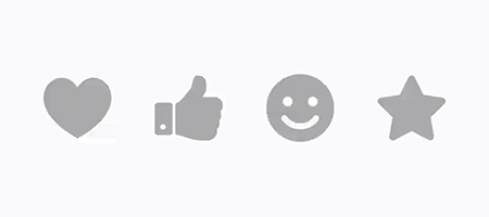
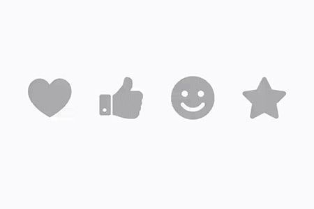
- Customizable Shapes: Use any PNG mask as a button shape.
- Vibrant Effects: Adjust shine color, size, count, and distance.
- Interactive: Smooth animations for both clicking and shining.
- Random Colors: Option to enable random colors for the shine effect.
- Dialog Support: Works seamlessly inside Dialogs.
- Lightweight: Minimal dependencies and easy to integrate.
Installation
JitPack (Recommended for latest version)
- Add the JitPack repository to your root
build.gradlefile:
allprojects {
    repositories {
        ...
        maven { url 'https://jitpack.io' }
    }
}
- Add the dependency to your
app/build.gradlefile:
dependencies {
    implementation 'com.github.ChadCSong:ShineButton:v2.0.0'
}
Gradle (Maven Central)
Add the dependency to your app/build.gradle file:
dependencies {
    implementation 'com.sackcentury:shinebutton:2.0.0'
}
Maven
<dependency>
  <groupId>com.sackcentury</groupId>
  <artifactId>shinebutton</artifactId>
  <version>2.0.0</version>
  <type>aar</type>
</dependency>
Usage
XML Layout
The simplest way to use ShineButton is in your XML layout:
<com.sackcentury.shinebuttonlib.ShineButton
    android:id="@+id/shine_button"
    android:layout_width="50dp"
    android:layout_height="50dp"
    android:layout_centerInParent="true"
    android:src="@android:color/darker_gray"
    app:btn_color="@android:color/darker_gray"
    app:btn_fill_color="#FF6666"
    app:allow_random_color="false"
    app:siShape="@raw/like" />
Java Implementation
ShineButton shineButton = (ShineButton) findViewById(R.id.shine_button);
shineButton.init(activity);
Jetpack Compose Implementation
ShineButton now supports Jetpack Compose natively!
var isChecked by remember { mutableStateOf(false) }

ShineButtonCompose(
    isChecked = isChecked,
    onCheckedChange = { isChecked = it },
    shape = Icons.Default.Favorite, // Use any ImageVector
    btnColor = Color.LightGray,
    btnFillColor = Color.Red,
    shineColor = Color.Red,
    shineSize = 50.dp,
    allowRandomColor = true
)
Or create it dynamically:
ShineButton shineButtonJava = new ShineButton(this);
shineButtonJava.setBtnColor(Color.GRAY);
shineButtonJava.setBtnFillColor(Color.RED);
shineButtonJava.setShapeResource(R.raw.heart);
shineButtonJava.setAllowRandomColor(true);

LinearLayout.LayoutParams layoutParams = new LinearLayout.LayoutParams(100, 100);
shineButtonJava.setLayoutParams(layoutParams);
linearLayout.addView(shineButtonJava);
Dialog Support
If you are using ShineButton inside a Dialog, call setFixDialog(dialog) to ensure it renders correctly:
shineButton.setFixDialog(dialog);
Attributes
| Attribute | Java Method | Description | Default |
|---|---|---|---|
app:siShape |
setShapeResource(int) |
Raw resource (PNG mask) for the shape | - |
app:btn_color |
setBtnColor(int) |
Initial color of the button | Color.GRAY |
app:btn_fill_color |
setBtnFillColor(int) |
Color of the button after being checked | Color.BLACK |
app:allow_random_color |
setAllowRandomColor(boolean) |
Whether the shine effects use random colors | false |
app:shine_count |
setShineCount(int) |
Number of shine particles | 8 |
app:shine_size |
setShineSize(int) |
Size of the shine particles in pixels | - |
app:big_shine_color |
setBigShineColor(int) |
Color of the primary shine particles | - |
app:small_shine_color |
setSmallShineColor(int) |
Color of the secondary shine particles | - |
app:shine_animation_duration |
setAnimDuration(int) |
Duration of the shine animation (ms) | 1500 |
app:click_animation_duration |
setClickAnimDuration(int) |
Duration of the click animation (ms) | 200 |
app:enable_flashing |
enableFlashing(boolean) |
Enable a flashing effect | false |
app:shine_distance_multiple |
setShineDistanceMultiple(float) |
Multiple of distance from button center | 1.5f |
app:shine_turn_angle |
setShineTurnAngle(float) |
Angle offset for shine particles | 20 |
Preview
| Small Shine | More Shine | Others |
|---|---|---|
 |
 |
|
Roadmap
We are continuously working to improve ShineButton. Here is what we have planned:
- Kotlin Migration: Fully convert the library to Kotlin for better safety and modern features.
- Jetpack Compose: Provide a native Composable version of ShineButton.
- Vector Support: Allow using
VectorDrawableas shape masks. - Custom Animators: Support for custom easing and path-based animations.
- Material 3: Update the demo app with Material 3 design and dynamic colors.
- Performance: Further optimize canvas operations and memory allocation.
Requirements
- Android API Level 14+ (Android 4.0+)
Credits
- Inspired by fave-button for iOS.
- Uses EasingInterpolator for smooth animations.
- Concepts from android-shape-imageview.
Third Party Bindings
React Native
You may now use this library with React Native via the module here
NativeScript
You may also use this library with NativeScript via the plugin here
License
MIT License. See LICENSE for details.
