themed-toggle-button-group


Customisable toggle buttons inside a FlexboxLayout.
ThemedToggleButtonGroup is a highly modular lightweight toggle button library for Android. It can be configured for single selection or multi selection. For multi selection the minimum/maximum amount of buttons that are required/enabled can be specified. Icon's can be added. Selection includes a fun press and circular reveal animation.
The main class ThemedToggleButtonGroup.kt extends Google's FlexboxLayout. Allowing you to use styling similar to CSS Flexbox for the button's inside the toggle group.
Notice
As of version 1.3.2 hosting will be moved from Bintray to MavenCentral. I will move all versions to mavenCentral, but to be safe please use the latest version of this library.
Installation
Add the dependency in your app's build.gradle file:
dependencies {
  implementation 'nl.bryanderidder:themed-toggle-button-group:1.4.1'
}
For Java projects you also have to add implementation 'org.jetbrains.kotlin:kotlin-stdlib:1.6.0'
Single selection

<nl.bryanderidder.themedtogglebuttongroup.ThemedToggleButtonGroup
    android:id="@+id/time"
    android:layout_width="match_parent"
    android:layout_height="wrap_content"
    app:justifyContent="center"> <!-- this attribute is from the underlying FlexboxLayout -->

      <nl.bryanderidder.themedtogglebuttongroup.ThemedButton
          android:id="@+id/btn1"
          android:layout_width="wrap_content"
          android:layout_height="38dp"
          app:toggle_text="5:30PM" />

      <nl.bryanderidder.themedtogglebuttongroup.ThemedButton
          android:id="@+id/btn2"
          android:layout_width="wrap_content"
          android:layout_height="38dp"
          app:toggle_text="7:30PM" />

      <nl.bryanderidder.themedtogglebuttongroup.ThemedButton
          android:id="@+id/btn3"
          android:layout_width="wrap_content"
          android:layout_height="38dp"
          app:toggle_text="8:00PM" />

</nl.bryanderidder.themedtogglebuttongroup.ThemedToggleButtonGroup>
Multiple selection
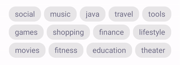
Declare how many buttons may be selected with toggle_selectableAmount.
Declare how many buttons must be selected with toggle_requiredAmount.
<nl.bryanderidder.themedtogglebuttongroup.ThemedToggleButtonGroup
    android:id="@+id/tags"
    android:layout_width="match_parent"
    android:layout_height="wrap_content"
    app:toggle_selectableAmount="3"
    app:justifyContent="space_between"
    app:flexWrap="wrap">

    <nl.bryanderidder.themedtogglebuttongroup.ThemedButton
        android:id="@+id/tag1"
        android:layout_width="wrap_content"
        android:layout_height="30dp"
        android:layout_margin="3dp"
        app:toggle_text="social" />

    <nl.bryanderidder.themedtogglebuttongroup.ThemedButton
        android:id="@+id/tag2"
        android:layout_width="wrap_content"
        android:layout_height="30dp"
        android:layout_margin="3dp"
        app:toggle_text="music" />

    <!-- ... -->

  </nl.bryanderidder.themedtogglebuttongroup.ThemedToggleButtonGroup>
Animations
| CIRCULAR_REVEAL | FADE | HORIZONTAL_SLIDE |
|---|---|---|
 |
 |
 |
| VERTICAL_SLIDE | HORIZONTAL_WINDOW | VERTICAL_WINDOW |
|---|---|---|
 |
 |
 |
To set the animation on your layout add this to the toggle group: app:toggle_selectAnimation="circular_reveal".
You can also set the animation programmatically:
Java
ThemedToggleButtonGroup themedToggleButtonGroup = findViewById<ThemedToggleButtonGroup>(R.id.themedToggleButtonGroup);
themedToggleButtonGroup.setSelectAnimation(SelectAnimation.HORIZONTAL_SLIDE);
val themedToggleButtonGroup = findViewById<ThemedToggleButtonGroup>(R.id.themedToggleButtonGroup)
themedToggleButtonGroup.selectAnimation = SelectAnimation.HORIZONTAL_SLIDE
Icon selection

It is possible to add icons to the buttons and show a different icon when the button is selected. This example also shows how to add borders.
<nl.bryanderidder.themedtogglebuttongroup.ThemedToggleButtonGroup
    android:id="@+id/toggleGroup"
    android:layout_width="match_parent"
    android:layout_height="80dp"
    app:alignItems="center"
    app:justifyContent="center"
    app:toggle_requiredAmount="0"
    app:toggle_selectableAmount="3">

    <nl.bryanderidder.themedtogglebuttongroup.ThemedButton
        android:id="@+id/btnMic"
        android:layout_width="70dp"
        android:layout_height="70dp"
        app:toggle_btnCornerRadius="50dp"
        app:toggle_borderWidth="5dp"
        app:toggle_borderColor="#C6C6C6"
        app:toggle_selectedBorderColor="#5e6fed"
        app:toggle_icon="@drawable/ic_mic_off_black_24dp"
        app:toggle_iconColor="#C6C6C6"
        app:toggle_selectedIcon="@drawable/ic_mic_black_24dp"
        app:toggle_backgroundColor="@android:color/white"
        app:toggle_iconPadding="18dp" />

    <!-- ... -->

</nl.bryanderidder.themedtogglebuttongroup.ThemedToggleButtonGroup>
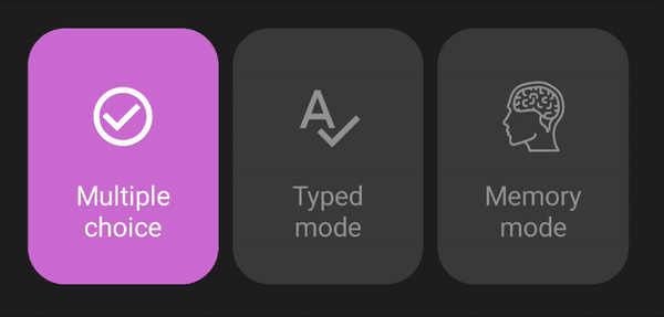
Text + icon selection
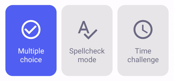
A demo for this example can be found here: demo-toggle-cards. You need to use SVG icons to allow the color to be altered.
<nl.bryanderidder.themedtogglebuttongroup.ThemedToggleButtonGroup
    android:id="@+id/cards"
    android:layout_width="match_parent"
    android:layout_height="155dp"
    android:layout_marginHorizontal="32dp"
    app:alignItems="center">

    <nl.bryanderidder.themedtogglebuttongroup.ThemedButton
        android:id="@+id/card1"
        android:layout_width="0dp"
        android:layout_height="145dp"
        app:layout_flexGrow="1"
        app:toggle_selectedTextColor="@android:color/white"
        app:toggle_selectedBackgroundColor="#5e6fed"
        app:toggle_icon="@drawable/replace_with_svg_icon"
        app:toggle_iconGravity="top|center"
        app:toggle_iconPaddingTop="15dp"
        app:toggle_iconPaddingHorizontal="15dp"
        app:toggle_textPaddingBottom="20dp"
        app:toggle_text="Multiple choice"
        app:toggle_textGravity="bottom|center" />

    <!-- ... -->

</nl.bryanderidder.themedtogglebuttongroup.ThemedToggleButtonGroup>
Selection listener
The easiest way to react to selection changes is to use group.setOnSelectListener(() -> {}).
Java
ThemedToggleButtonGroup themedButtonGroup = findViewById<ThemedToggleButtonGroup>(R.id.idOfYourThemedButtonGroup);
themedButtonGroup.setOnSelectListener((ThemedButton btn) -> {
    // handle selected button
    return kotlin.Unit.INSTANCE;
});
val themedButtonGroup = findViewById<ThemedToggleButtonGroup>(R.id.idOfYourThemedButtonGroup)
themedButtonGroup.setOnSelectListener { button: ThemedButton ->
    // handle selected button
}
Once a button is selected its property isSelected will be set to true.
Java
// get the selected buttons:
List<ThemedButton> selectedButtons = themedButtonGroup.getSelectedButtons();
// get all buttons
List<ThemedButton> allButtons = themedButtonGroup.getButtons();
// get all unselected buttons
List<ThemedButton> unselectedButtons = allButtons.stream().filter(btn -> !btn.isSelected()).collect(Collectors.toList());
// get the selected buttons:
val selectedButtons = themedButtonGroup.selectedButtons
// get all buttons
val allButtons = themedButtonGroup.buttons
// get all unselected buttons
val unselectedButtons = allButtons.filter { !it.isSelected }
Programmatically adding buttons
A demo project for this can be found here: programmatically-add-buttons.
Programmatically create a ThemedToggleButtonGroup:
Java
ThemedToggleButtonGroup buttonGroup = ThemedToggleButtonGroup(context);
buttonGroup.setJustifyContent(JustifyContent.CENTER);
yourRootView.addView(buttonGroup);
val buttonGroup = ThemedToggleButtonGroup(context)
buttonGroup.justifyContent = JustifyContent.CENTER
yourRootView.addView(buttonGroup)
Add a button:
Java
ThemedButton btn1 = ThemedButton(context);
btn1.setText("Button 1");
buttonGroup.addView(btn1,
        ViewGroup.LayoutParams(
            ViewGroup.LayoutParams.WRAP_CONTENT,
            ViewGroup.LayoutParams.MATCH_PARENT
        )
    );
val btn1 = ThemedButton(context)
btn1.text = "Button 1"
buttonGroup.addView(btn1,
        ViewGroup.LayoutParams(
            ViewGroup.LayoutParams.WRAP_CONTENT,
            ViewGroup.LayoutParams.MATCH_PARENT
        )
    )
Select/deselect a button programmatically:
You can pass in the ThemedButton itself or its resId. This will toggle selection. Fire the method a second time to deselect the button.
buttonGroup.selectButtonWithAnimation(btn)
buttonGroup.selectButton(btn)
Enabling/disabling buttons:
Java
btn.setEnabled(false);
// this will fail:
buttonGroup.selectButton(btn);
btn.isEnabled = false
// this will fail:
buttonGroup.selectButton(btn)
Customization
These lists include all custom attributes from this library. Please take a look FlexboxLayout to see all custom attributes that can also be applied to these Views.
ThemedToggleButtonGroup custom attributes
| Attribute | Default value | Description |
|---|---|---|
app:toggle_selectableAmount |
1 | The amount of buttons that are allowed to be selected. If the user tries to select more buttons, the button that was last selected will be deselected. |
app:toggle_requiredAmount |
1 | The amount of buttons that are required to be selected. If the user tries to deselect a button below the required amount, the selection is blocked. You can programmatically specify which buttons should be selected initially by setting ThemedButton.isSelected. Otherwise a random button will be selected initially. |
app:toggle_horizontalSpacing |
10dp | The amount of space between the buttons when they are positioned next to each other. |
app:toggle_selectAnimation |
SelectAnimation.CIRCULAR_REVEAL | The type of animations that occur upon selecting a button. Some animations require a certain API level. If the API level is not met SelectAnimation.FADE is used instead. |
ThemedButton custom attributes
You can fully customise colors, positioning, font size, etc. with these attributes.
| Attribute | Default value | Description |
|---|---|---|
app:toggle_text |
Empty string | Text of the button. |
app:toggle_selectedText |
app:toggle_text |
Text when the button is selected. If not present the text of toggle_text is used. |
app:toggle_textSize |
15sp | Size of the text in the button. |
app:toggle_textAlignment |
center | Alignment of the text. (API 17+) |
app:toggle_fontFamily |
Roboto (Android default) | The font of the text. Put your font file in /src/main/assets. And enter the the rest of the path here. For example if your font is in: /src/main/assets/fonts/arial.ttf enter this in your layout: app:toggle_fontFamily="/fonts/arial.ttf" |
app:toggle_backgroundColor |
#EBEBEB |
Background color when the button is not selected. |
app:toggle_selectedBackgroundColor |
#5E6FED |
Background color when the button is selected. |
app:toggle_textColor |
#5E5E5E |
Text color when the button is not selected. This also sets the color of the icon if it is not set. |
app:toggle_selectedTextColor |
#FFFFFF |
Text color when the button is selected. This also sets the color of the selected icon if it is not set. |
app:toggle_icon |
null | Optional icon inside the button. |
app:toggle_selectedIcon |
app:toggle_icon |
Icon when the button is selected. By default the icon of app:toggle_icon is used. |
app:toggle_iconColor |
#5E5E5E |
Color of the icon when the button is not selected. |
app:toggle_btnCornerRadius |
21dp | Curve amount of the button's corners. |
app:toggle_circularCornerRadius |
false | This makes the button circular. This overrides the corner radius. |
app:toggle_borderWidth |
0dp | The width of the border. |
app:toggle_selectedBorderWidth |
app:toggle_borderWidth |
The width of the border when the button is selected. By default the width of toggle_borderWidth is used. |
app:toggle_borderColor |
#5E5E5E |
The color of the border. |
app:toggle_selectedBorderColor |
app:toggle_borderColor |
The color of the border when the button is selected.. By default the color of app:toggle_borderColor is used. |
app:toggle_padding |
0dp | Padding of the button. |
app:toggle_textPadding |
14dp (horizontal) | Padding of the text. |
app:toggle_iconPadding |
0dp | Padding of the icon. |
app:toggle_iconGravity |
top|start | Position of the icon. |
app:toggle_textGravity |
top|start | Position of the text. |
Contributing
You can contribute by opening an issue or forking this repository and creating a pull request.
