MaterialBottomBar
Introduction: Documentation
Tags:


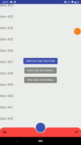
Material Bottom Bar is an Android library that let you implement a customized BottomAppBar and a bottom drawer with just few simple steps.
Dsl ready
Navigation Component ready
Wiki
Full wiki
Docs
MaterialBottomBar Doc
Navigation Doc
Setup
Add the library:
implementation "studio.forface.materialbottombar:materialbottombar:$version"
Add the optional navigation extension:
implementation "studio.forface.materialbottombar:materialbottombar-navigation:$version"
Getting started
Layout ( minimal )
First you need to use a MaterialBottomDrawerLayout as parent of MaterialBottomAppBar.
<studio.forface.materialbottombar.layout.MaterialBottomDrawerLayout
    xmlns:android="http://schemas.android.com/apk/res/android"
    android:id="@+id/drawerLayout"
    android:layout_width="match_parent"
    android:layout_height="match_parent">

    <!-- Here it goes your content -->

    <studio.forface.materialbottombar.appbar.MaterialBottomAppBar
        android:layout_width="match_parent"
        android:layout_height="wrap_content"
        android:layout_gravity="bottom"/>

</studio.forface.materialbottombar.layout.MaterialBottomDrawerLayout>
More info about MaterialBottomDrawerLayout and MaterialBottomAppBar
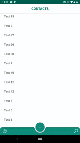
Drawer ( minimal )
with DSL
drawerLayout.drawer = drawer {
    header {
        iconUrl = IMAGE_URL
        titleText = "My drawer"
    }
    body {
        onItemClick = { id, title -> /* do something */ }
        primaryItem( "Messages" ) {
            id = 1
            iconResource = R.drawable.ic_message_black_24dp
        }
        primaryItem( contactsSpannable ) {
            id = 2
            iconDrawable = contactsDrawable
        }
        divider()
        primaryItem( R.string.settings_drawer_title ) {
            id = 3
            iconBitmap = settingsBitmap
        }
    }
}
without DSL:
val header = MaterialDrawer.Header()
    .iconUrl( IMAGE_URL )
    .titleText( "My drawer" )

val messages = PrimaryDrawerItem()
    .id( 1 )
    .titeText( "messages" )
    .iconResource( R.drawable.ic_message_black_24dp )

val contacts = PrimaryDrawerItem()
    .id( 2 )
    .titleSpannable( contactsSpannable )
    .iconDrawable( contactsDrawable )

val settings = PrimaryDrawerItem()
    .id( 3 )
    .titleRes( R.string.settings_drawer_title )
    .iconBitmap( settingsBitmap )

val body = MaterialDrawer.Body()
    .itemClikListener { id, title -> /* do something */ }
    .items( listOf(
        messages,
        contacts,
        Divider(),
        settings
    ) )

drawerLayout.drawer = MaterialDrawer( header, body )
More info about Drawer and Panels
Android Navigation Components integration
with DSL ( constructor injected NavController )
navDrawer( navController ) {
    header { ... }
    body {
        primaryItem( "messages" ) {
            navDestinationId = myDestinationId
            navDestinationBundle = myBundle
        }
        primaryItem( "contacts" ) {
            navDestination( myDestinationId ) { mapOf( "arg1" to 15 ) }
        }
        secondaryItem( "favorites" ) {
            navDirections = myNavDirections
        }
    }
}
NavController can also be set later
navDrawer {
    ...
}
in the following ways:
myNavDrawer.navController = navControllermyToolbar.setupWithNavController( navController, myNavDrawer, myNavPanel1, myNavPanel2 )myMaterialBottomDrawerLayout.setupWithNavController( navController )
without DSL
val header = MaterialDrawer.Header()
    .iconUrl( IMAGE_URL )
    .titleText( "My drawer" )

val messages = PrimaryNavDrawerItem()
    .titeText( "messages" )
    .navDestination( myDestinationId )
    .navDestinationBundle( myBundle )

val contacts = PrimaryNavDrawerItem()
    .titeText( "contacts" )
    .navDestination( myDestinationId ) { mapOf( "arg1" to "hello" ) }

val body = MaterialNavPanel.Body()
    .itemClickListener { id, title -> /* do something */ }
    .items( listOf( messages, contacts ) )

drawerLayout.drawer = MaterialNavDrawer( header, body )
TIPS
The lib is built on 3 focal points:
- Customization
- Easiness
- Compactness
The first two are pretty self-explanatory, while the third one means that you should be able to write your fully customized Drawer with the less lines of code as possible; in other word is suggested to use an approach like this:
with DSL:
drawer {
    header { ... }
    body {
        val myBadge = Badge {
            backgroundCornerRadiusDp = 999f // Round badge
            backgroundColorRes = R.color.color_badge_background
            contentColorRes = R.color.color_badge_content
        }
        allPrimary {
            badgeItem = myBadge
            titleSizeSp = 20f
            titleColor = Color.RED
        }
        primaryItem( "First" ) { badgeContentText = "1" " }
        primaryItem( "Second" ) { /* No badge content, so the badge will be hidden */ }
    }
}
withou DSL:
val myBadge = BadgeItem()
    .backgroundCornerRadiusDp( 999f ) // Round badge
    .backgroundColorRes( R.color.color_badge_background )
    .contentColorRes( R.color.color_badge_content )

class MyPrimaryDrawerItem() { init {
    badge( myBadge )
    titleSizeSp( 20f )
    titleColor( Color.RED )
} }

val firstItem = MyPrimaryDrawerItem()
    .titleText( "First")
    .badgeContentText( "1" )

val secondItem = MyPrimaryDraweItem()
    .titleText( "Second" )
    // No badge content, so the badge will be hidden.
