advancedcardview
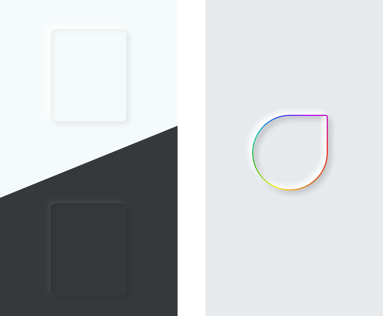
A CardView that simplifies implementing inner shadows, colorful drop shadows, gradients (specially sweep gradient), and more in Android. With this library you can implement beautiful NeoMorphism concept UI style into your app easily. Minimum api is Api 14+ (Android 4.0.0). Apache License 2.0
Features
- Supports 2 Inner Shadows and 2 Outer (Drop) Shadows.
- Supports All gradients type for background and stroke.
- Supports Dashed style stroke
- With different cap style support
- Supports Different Radius for Different Corners.
Screens and Demos
With this library you can implement designs like images below very easily:

Import
First add this line to your project gradle file:
allprojects {
    repositories {
        // ..
        maven { url 'https://jitpack.io' }
    }
}
And you need to add gradle dependency:
implementation 'com.github.sina-seyfi:AdvancedCardView:1.0.1'
Usage
AdvancedCardView is a subclass of FrameLayout that can have multiple children base on your needs.
First you define view component in xml
<com.sinaseyfi.advancedcardview.AdvancedCardView
    android:id="@+id/advancedCardView"
    android:layout_width="match_parent"
    android:layout_height="match_parent">

<!--    child views     -->

<com.sinaseyfi.advancedcardview.AdvancedCardView/>
And then you should define xml attributes base on your needs. On upcoming paragraphs we explain these attributes.
app:background_Type
It has three different values:
fill(default): View only has fill color.stroke: View only has stroke color.fill_stroke: View has both fill and stroke color.
Caution: This property strictly define the view color behavior. When you define background_Type as fill it doesn't matter if you define stroke color or width, it will be ignored.
app:stroke_Width
It's the width of stroke if you choose to have stroke. The default width is 1dp.
app:stroke_Type
It works just like background_Type and will define the type of stroke.
It has two different values:
solid(default): View stroke is solid.dash: View stroke is dashed.
Caution: This property strictly define the stroke type.
app:[background/stroke]_ColorType
If you wants to implement gradients on background or stroke, you have to define ColorType of them.
We have app:background_ColorType property for background and app:stroke_ColorType for stroke.
Both have these values (Except that gradient_radial is not supported in stroke):
solid(default): The color is solid.gradient_linear: The color is linear gradient.gradient_radial: The color is radial gradient (Stroke DOES NOT support this one).gradient_sweep: The color is sweep_gradient.
Caution: These properties are strictly define color type.
app:[background/stroke]_Color and app:[background/stroke]_Alpha
if you define solid as your background/stroke color type, the color of background/stroke will be determined by app:[background/stroke]_Color property.
Of course we have alpha for background/stroke: app:[background/stroke]_Alpha
Remember: app:[background/stroke]_Alpha will affect on gradients too.
Caution: If you defined alpha in your color hex, the library will multiply app:[background/stroke]_Alpha to your defined color hex alpha. So keep that in mind.
app:[background/stroke]_Gradient_Color[index/End]
If you chose one method of gradients as your background/stroke color type, you can define up to 8 colors as your gradient colors. Properties that define the gradient colors are:
app:[background/stroke]_Gradient_Color0app:[background/stroke]_Gradient_Color1app:[background/stroke]_Gradient_Color2app:[background/stroke]_Gradient_Color3app:[background/stroke]_Gradient_Color4app:[background/stroke]_Gradient_Color5app:[background/stroke]_Gradient_Color6app:[background/stroke]_Gradient_ColorEnd
You don't have to define all of these xml properties, just define as many as colors that you want on gradients in index order and last color on app:[background/stroke]_Gradient_ColorEnd.
Caution: you have to define ColorEnd of your gradient colors, otherwise the library will assume Color0 as you gradient's end color.
You can have infinite colors on your gradient if you define gradient colors programmatically:
acd.[background/stroke]_Gradient_Colors = colorArray
app:[background/stroke_Gradient_Angle
As the name explains, you can change gradient angle. Default angle is 0 and it means upside down.
Angle range is from 0 to 360 and it turns clockwise.
You can see image below:

Remember: These angle rules, applies on all angle attributes that we'll see in upcoming document.
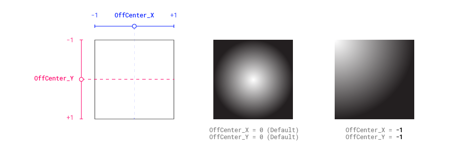
app:[background/stroke]_Gradient_OffCenter_[X/Y]
In both gradient_radial and gradient_sweep the center of gradient is the center of view. You can change gradient centers with OffCenter_X or OffCenter_Y multipliers. The range of these multiplier are from -1 to +1 and the default is 0 that means don't move the center. For more information about how these multipliers works, see the image below:

app:stroke_DashSize, app:stroke_GapSize and app:stroke_CapType
If you choose to have dashed typed of stroke, you can define these attributes to change dashed behavior.
For more information see the image below:

app:cornerRadius, app:cornerRadius_TopLeft, app:cornerRadius_TopRight, app:cornerRadius_BottomRight and app:cornerRadius_BottomLeft
These attributes, define corner radii. app:cornerRadius will change all corners simultaneously, but you can define other specific corners too.
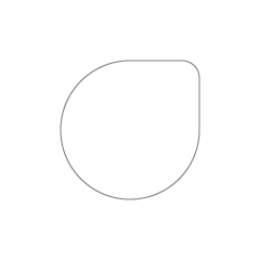
Point: The app:cornerRadius is low priority, that means if you defines this attribute and specificly define other corner radius like app:cornerRadius_TopLeft, top left corner radius WILL NOT be determined by app:cornerRadius anymore. So if you want to have one corner different than others, you can define cornerRadius and specifically tell library what corner you want to be different and you don't have to implement all corners individually. For example:
<com.sinaseyfi.advancedcardview.AdvancedCardView
    android:id="@+id/advancedCardView"
    android:layout_width="128dp"
    android:layout_height="128dp"
    app:background_Type="stroke"
    app:stroke_Color="#808080"
    app:cornerRadius="64dp"
    app:cornerRadius_TopRight="16dp">
Will have the result like this:

app:corner_Type
It will automate and calculate the corner radius for you base of these values:
custom(default): The library will take corner radii from you.rectangular: It will set corner radius to 0dp no matter if you defined relevant attributes.circular: It will make circular the edges of view. If you have view with equal width and height (sqauare), it will make it a circle. In this method, the library calculate minimum edge length of view and set corner radius to half of it to make it cirle.third: It curves the corners, but with less tension thancircular. Library calculate minimum edge length of view and set corner radius to one third of it.quarter: Same as third method, but library set the corner radius as quarter of minimum edge length.
For more information about how these methods works, see the image below:

app:shadow[index]_[Inner/Outer]_[Blur/Distance/Alpha/Color/Angle]
Finally we have attributes that define shadows for us. So if we want to define first inner shadow's blur by the naming convection, we will have attribute like this: app:shadow0_Inner_Blur.
Shadow Properties are described below:
Blur: Defines blurriness of shadow.Distance: Defines distance of shadow.Alpha: Defines alpha of shadow.Color: Defines color of shadow.Angle: Defines angle of shadow.
Remember: Angle behavior is just same as gradient angle that we discussed before.
Caution: Blur attribute has to be defined, otherwise library don't draw related shadow.
app:shadow_Outer_Area and how library draw outer (drop) shadows
From api 26, android framework doesn't let the views to draw outside of their boundaries. For this problem to be fixed, outer shadows are part of view boundaries. This means that we have inset or padding if we draw outer shadows as the image below explains. The app:shadow_Outer_Area parameter defines how much inset we needs for outer shadows. This parameter will have default value of 8dp as soon as you declare first outer shadow, otherwise we don't have any inset.
When app:shadow_Outer_Area is defined, library automatically sets padding so the child views doesn't clip unnaturally.

Point: For most cases 8dp inset is enough, it means that if you have outer shadows' distance less than 8dp, view boundaries won't clip outer shadows. But if you have outer shadows' distance more than 8dp, change this attribute properly.
Remember: This value is only matters for outer shadows not the inner shadows.
Caution: Let the library automatically sets padding and don't sets padding manually. You can use margin for your view children to adjust their positions.
