Compose-Settings

Preview
This library provides a set of Settings like composable items to help android Jetpack Compose developers build complex settings screens without all the boilerplate.
Two flavors are available: standard Material 3 components and Material 3 Expressive components.
The expressive variants are built on SegmentedListItem and support segmented list styling.
Ui tiles (ui-tiles) — Material 3
| Component | Screenshot |
|---|---|
| SettingsMenuLink | 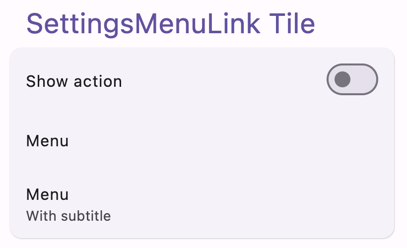 |
| SettingsCheckbox | 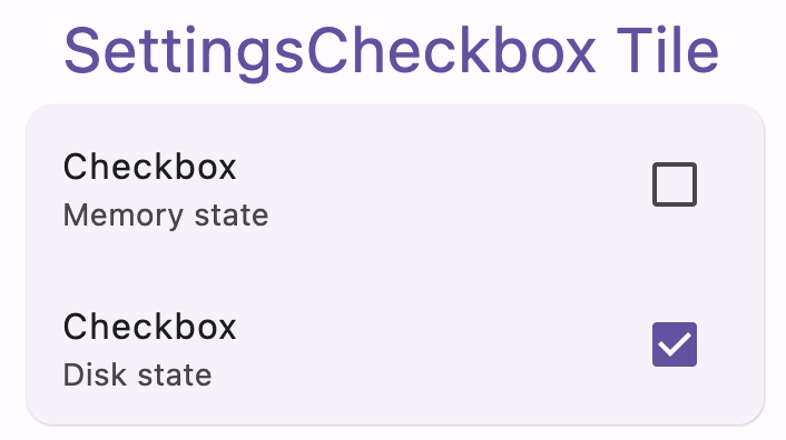 |
| SettingsTriStateCheckbox | 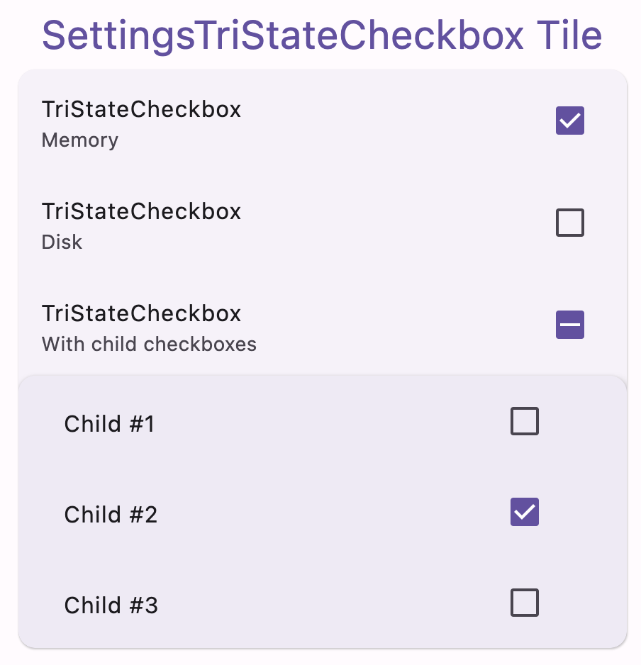 |
| SettingsRadioButton | 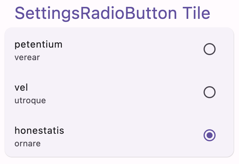 |
| SettingsSwitch | 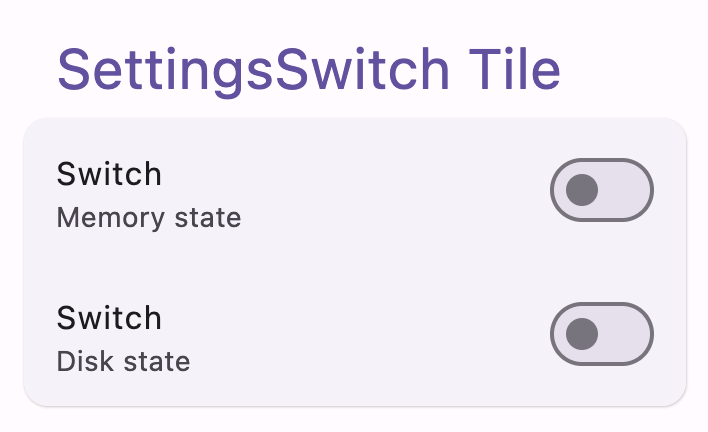 |
| SettingsGroup | 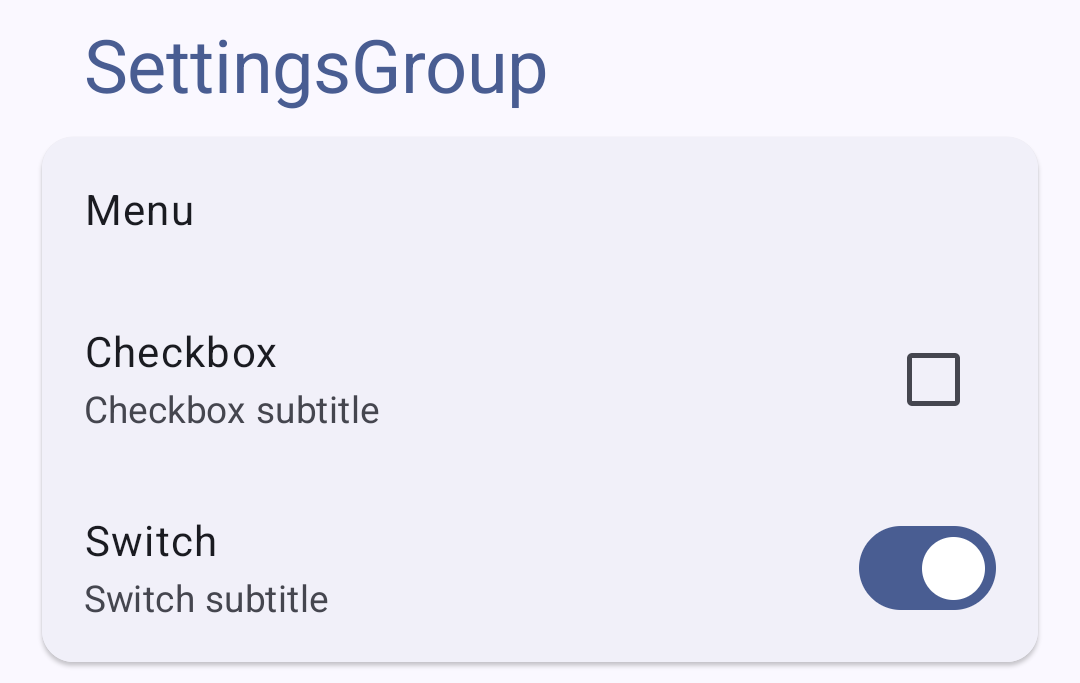 |
Ui tiles extended (ui-tiles-extended) — Material 3
| Component | Screenshot |
|---|---|
| SettingsSlider | 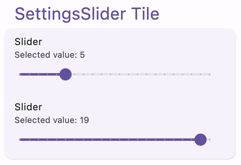 |
| SettingsSegmented |
Ui tiles expressive (ui-tiles-expressive) — Material 3 Expressive
Requires Material 3 Expressive API (
@OptIn(ExperimentalMaterial3ExpressiveApi::class)). All components support segmented list styling via theshapesparameter.
Install
Pick the module(s) you need:
| Module | Contents |
|---|---|
ui-tiles |
Standard M3: MenuLink, Checkbox, TriStateCheckbox, RadioButton, Switch, Group |
ui-tiles-extended |
Standard M3: Slider, Segmented |
ui-tiles-expressive |
Expressive M3: all of the above + ButtonGroup, with segmented list support |
// groovy
implementation 'com.github.alorma.compose-settings:ui-tiles:$version'
implementation 'com.github.alorma.compose-settings:ui-tiles-extended:$version'
implementation 'com.github.alorma.compose-settings:ui-tiles-expressive:$version'

[...]

// kotlin DSL

implementation("com.github.alorma.compose-settings:ui-tiles:$version")
implementation("com.github.alorma.compose-settings:ui-tiles-extended:$version")
implementation("com.github.alorma.compose-settings:ui-tiles-expressive:$version")

[...]

// Catalog versions:

[versions]
compose-settings = "{{libVersion}}"

[libraries]
composeSettings-ui = { group = "com.github.alorma.compose-settings", name = "ui-tiles", version.ref = "compose-settings" }
composeSettings-ui-extended = { group = "com.github.alorma.compose-settings", name = "ui-tiles-extended", version.ref = "compose-settings" }
composeSettings-ui-expressive = { group = "com.github.alorma.compose-settings", name = "ui-tiles-expressive", version.ref = "compose-settings" }
Usage
Customization
All settings components support customization through common parameters:
Shape
Customize the shape of any settings component using the shape parameter:
SettingsSwitch(
  state = switchState,
  title = { Text("Rounded corners") },
  shape = RoundedCornerShape(16.dp), // Custom shape
  onCheckedChange = { switchState = it },
)
Available shapes include:
RoundedCornerShape(size)- Rounded cornersCutCornerShape(size)- Cut cornersCircleShape- Fully circular- Custom shapes implementing the
Shapeinterface
Text Styles
Customize title and subtitle text styles using the textStyles parameter:
SettingsCheckbox(
  state = checkboxState,
  title = { Text("Custom styled title") },
  subtitle = { Text("Custom styled subtitle") },
  textStyles = SettingsTileDefaults.textStyles(
    titleStyle = MaterialTheme.typography.headlineSmall.copy(fontWeight = FontWeight.Bold),
    subtitleStyle = MaterialTheme.typography.bodyLarge,
  ),
  onCheckedChange = { checkboxState = it },
)
This allows you to:
- Change font sizes, weights, and families
- Adjust letter spacing and line height
- Apply custom colors and decorations
- Match your app's typography system
Components
Material 3 (ui-tiles, ui-tiles-extended)
SettingsMenuLink:
SettingsMenuLink(
  title = { Text(text = "Setting title") },
  subtitle = { Text(text = "Setting subtitle") },
  modifier = Modifier,
  enabled = false / true,
  icon = { Icon(...) },
  action = { IconButton() },
  onClick = { ... },
)
SettingsCheckbox:
SettingsCheckbox(
  state = false / true,
  title = { Text(text = "Setting title") },
  subtitle = { Text(text = "Setting subtitle") },
  modifier = Modifier,
  enabled = false / true,
  icon = { Icon(...) },
  onCheckedChange = { newState: Boolean -> },
)
SettingsTriStateCheckbox:
SettingsTriStateCheckbox(
  state = false / true / null,
  title = { Text(text = "Setting title") },
  subtitle = { Text(text = "Setting subtitle") },
  modifier = Modifier,
  enabled = false / true,
  icon = { Icon(...) },
  onCheckedChange = { newState: Boolean -> },
)
SettingsRadioButton:
SettingsRadioButton(
  state = false / true,
  title = { Text(text = "Setting title") },
  subtitle = { Text(text = "Setting subtitle") },
  modifier = Modifier,
  enabled = false / true,
  icon = { Icon(...) },
  onClick = { },
)
SettingsSwitch:
SettingsSwitch(
  state = false / true,
  title = { Text(text = "Setting title") },
  subtitle = { Text(text = "Setting subtitle") },
  modifier = Modifier,
  enabled = false / true,
  icon = { Icon(...) },
  onCheckedChange = { newState: Boolean -> },
)
SettingsSlider:
SettingsSlider(
  value = x.xf,
  valueRange = X.f..Y.f,
  steps = X,
  title = { Text(text = "Setting title") },
  subtitle = { Text(text = "Setting subtitle") },
  modifier = Modifier,
  enabled = false / true,
  icon = { Icon(...) },
  onValueChange = { newValue: Float -> },
)
SettingsSegmented:
SettingsSegmented(
  title = { Text(text = "Setting title") },
  items = listOf(1, 2, 3),
  selectedItem = 2,
  itemTitleMap = { item -> "#$item" },
  onItemSelected = { selectedItem -> },
  modifier = Modifier,
  enabled = false / true,
  subtitle = { Text(text = "Setting subtitle") },
  icon = { Icon(...) },
)
SettingsGroup
Updates on
enabledwill be reflected on its internal components unless you change theirenabledstate manually.
SettingsGroup(
  modifier = Modifier,
  enabled = false / true,
  title = { Text(text = "SettingsGroup") },
  contentPadding = PaddingValues(16.dp),
  verticalArrangement = Arrangement.spacedBy(8.dp), // Spacing between items (default: 8.dp)
) {
    SettingsMenuLink(...)
    SettingsCheckbox(...)
    SettingsSwitch(...)
    ...
}
Spacing customization:
Control the spacing between items in the group using the verticalArrangement parameter:
// Compact spacing
SettingsGroup(
  verticalArrangement = Arrangement.spacedBy(4.dp),
) { ... }

// No spacing (tightly packed items)
SettingsGroup(
  verticalArrangement = Arrangement.Top,
) { ... }

// Large spacing
SettingsGroup(
  verticalArrangement = Arrangement.spacedBy(16.dp),
) { ... }
Material 3 Expressive (ui-tiles-expressive)
These components require
@OptIn(ExperimentalMaterial3ExpressiveApi::class).They are built on
SegmentedListItemand expose ashapes: ListItemShapesparameter, which enables the segmented list visual style (rounded groups of items with connected borders).
Segmented list example:
@OptIn(ExperimentalMaterial3ExpressiveApi::class)
val colors = ListItemDefaults.segmentedColors(
  containerColor = MaterialTheme.colorScheme.surfaceContainer,
)

SettingsSwitch(
  state = switchState,
  title = { Text("Wi-Fi") },
  colors = colors,
  shapes = ListItemDefaults.segmentedShapes(index = 0, count = 3),
  onCheckedChange = { switchState = it },
)
SettingsSwitch(
  state = switchState2,
  title = { Text("Bluetooth") },
  colors = colors,
  shapes = ListItemDefaults.segmentedShapes(index = 1, count = 3),
  onCheckedChange = { switchState2 = it },
)
SettingsMenuLink(
  title = { Text("Airplane mode") },
  colors = colors,
  shapes = ListItemDefaults.segmentedShapes(index = 2, count = 3),
  onClick = { },
)
Use
ListItemDefaults.segmentedShapes(index, count)to give each item the correct corner rounding based on its position in the group. Pair withArrangement.spacedBy(ListItemDefaults.SegmentedGap)between items.
SettingsMenuLink (Expressive):
SettingsMenuLink(
  title = { Text(text = "Setting title") },
  subtitle = { Text(text = "Setting subtitle") },
  modifier = Modifier,
  enabled = false / true,
  icon = { Icon(...) },
  action = { IconButton() },
  colors = colors,
  shapes = ListItemDefaults.segmentedShapes(index, count),
  onClick = { ... },
)
SettingsCheckbox (Expressive):
SettingsCheckbox(
  state = false / true,
  title = { Text(text = "Setting title") },
  subtitle = { Text(text = "Setting subtitle") },
  modifier = Modifier,
  enabled = false / true,
  icon = { Icon(...) },
  colors = colors,
  shapes = ListItemDefaults.segmentedShapes(index, count),
  onCheckedChange = { newState: Boolean -> },
)
SettingsTriStateCheckbox (Expressive):
SettingsTriStateCheckbox(
  state = ToggleableState.On / ToggleableState.Off / ToggleableState.Indeterminate,
  title = { Text(text = "Setting title") },
  subtitle = { Text(text = "Setting subtitle") },
  modifier = Modifier,
  enabled = false / true,
  icon = { Icon(...) },
  colors = colors,
  shapes = ListItemDefaults.segmentedShapes(index, count),
  onCheckedChange = { newState: ToggleableState -> },
)
SettingsRadioButton (Expressive):
SettingsRadioButton(
  state = false / true,
  title = { Text(text = "Setting title") },
  subtitle = { Text(text = "Setting subtitle") },
  modifier = Modifier,
  enabled = false / true,
  icon = { Icon(...) },
  colors = colors,
  shapes = ListItemDefaults.segmentedShapes(index, count),
  onClick = { },
)
SettingsSwitch (Expressive):
SettingsSwitch(
  state = false / true,
  title = { Text(text = "Setting title") },
  subtitle = { Text(text = "Setting subtitle") },
  modifier = Modifier,
  enabled = false / true,
  icon = { Icon(...) },
  colors = colors,
  shapes = ListItemDefaults.segmentedShapes(index, count),
  onCheckedChange = { newState: Boolean -> },
)
SettingsGroup (Expressive):
Works exactly like the M3 version. Pair with
Arrangement.spacedBy(ListItemDefaults.SegmentedGap)andListItemDefaults.segmentedShapeson children to achieve a connected segmented look.
SettingsGroup(
  modifier = Modifier,
  enabled = false / true,
  title = { Text(text = "SettingsGroup") },
  contentPadding = PaddingValues(16.dp),
  verticalArrangement = Arrangement.spacedBy(ListItemDefaults.SegmentedGap),
) {
    SettingsMenuLink(...)
    SettingsCheckbox(...)
    SettingsSwitch(...)
    ...
}
SettingsButtonGroup
Exclusive to the expressive module. Uses
OutlinedToggleButtonfrom Material 3 Expressive.
SettingsButtonGroup(
  title = { Text(text = "Setting title") },
  items = listOf(1, 2, 3),
  selectedItem = 2,
  itemTitleMap = { item -> "#$item" },
  onItemSelected = { selectedItem -> },
  modifier = Modifier,
  enabled = false / true,
  subtitle = { Text(text = "Setting subtitle") },
  icon = { Icon(...) },
  colors = colors,
  shapes = ListItemDefaults.segmentedShapes(index, count),
)

