ViewWorld
Introduction: 自定义 View 合集,展示各种自定义 View,持续更新中:wink::wink::wink:
Tags:
自定义 View 合集,开启自定义 View 的神奇之旅.
TKBanner
自定义无限轮播滚动控件,可高度自定义,简单实用
亮点
- 支持无限轮播,支持自定义 UI 和指示符,高度解耦
- 默认支持圆点和数字指示符
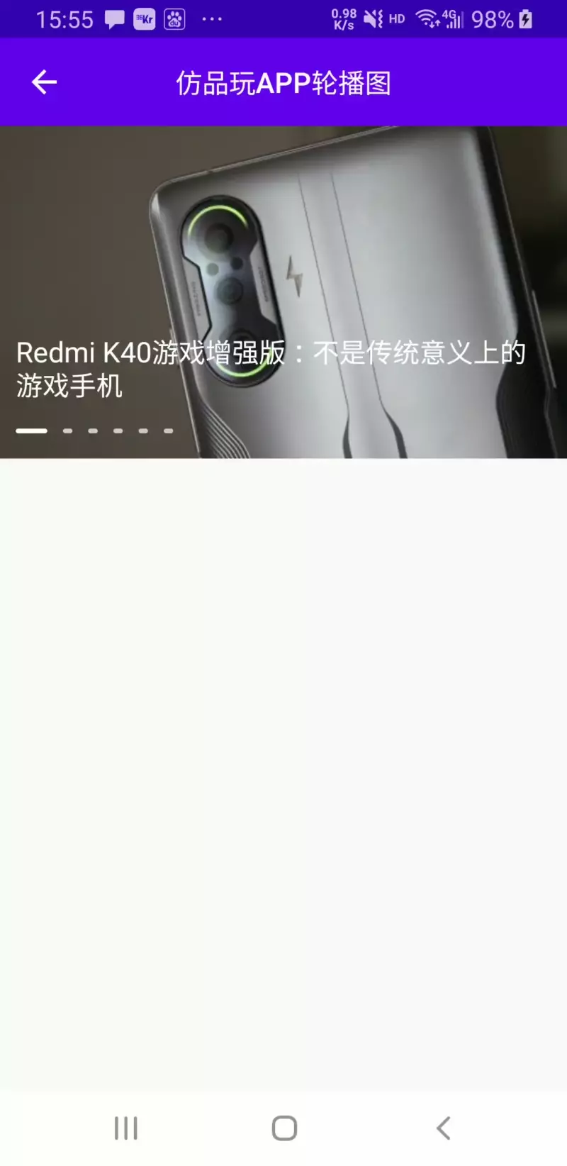
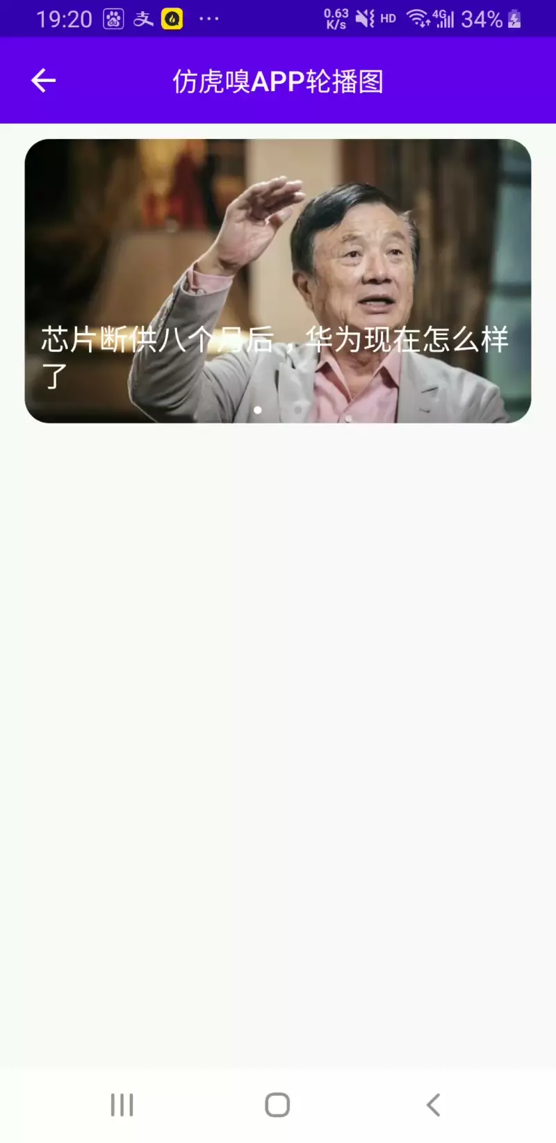
截图
| 仿知乎日报 APP 轮播图 | 仿品玩 APP 轮播图 | 仿虎嗅 APP 轮播图 |
|---|---|---|
 |
 |
 |
相关属性
| 属性名称 | 类型 | 说明 |
|---|---|---|
| banner_autoPlayAble | boolean | 是否自动轮播,默认为 true |
| banner_autoPlayInterval | integer | 轮播时间间隔,默认为 3000 毫秒 |
| banner_showIndicator | boolean | 是否显示指示符,默认为 true,如设置为 false,则使用自定义的指示符 |
| banner_pointContainerLeftRightPadding | dimension | 底部圆点指示符容器左右 Padding |
| banner_pointContainerTopBottomPadding | dimension | 底部圆点指示符容器上下 Padding |
| banner_pointLeftRightMargin | dimension | 圆点指示符左右 Margin |
| banner_pointTopBottomMargin | dimension | 圆点指示符上下 Margin |
| banner_pointDrawable | reference | 圆点指示符对应的 drawable Id |
| banner_isNumberIndicator | boolean | 是否为数字指示符,默认为 false |
| banner_numberIndicatorTextColor | color | 数字指示符文本颜色 |
| banner_numberIndicatorTextSize | dimension | 数字指示符文本字体大小 |
| banner_numberIndicatorBackground | reference | 数字指示符背景 |
VerificationCodeEditText
亮点
- 支持自定义验证码背景,可根据需求自定义每个验证码背景,高度解耦
- 支持自定义光标颜色和宽度,支持光标隐藏或闪烁
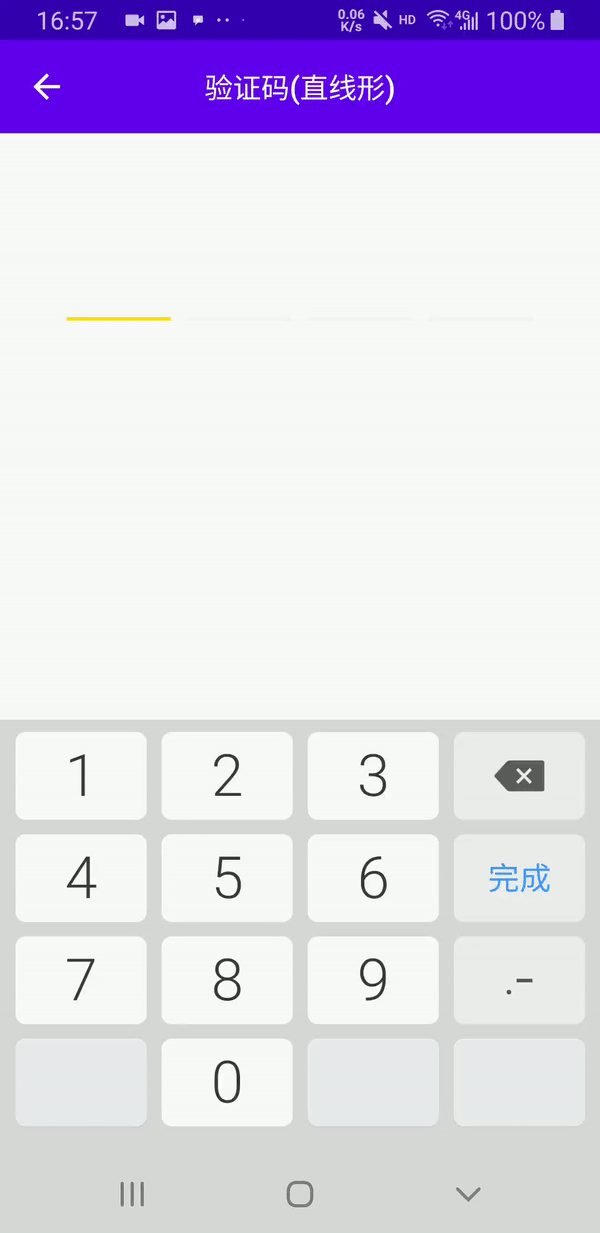
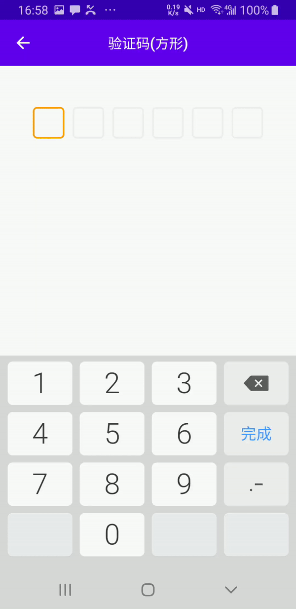
截图
| 直线形验证码 | 方形验证码 |
|---|---|
 |
 |
相关属性
| 属性名称 | 类型 | 说明 |
|---|---|---|
| codeLength | integer | 验证码总个数,默认为 6 |
| codeWidth | dimension | 每个验证码的宽度,默认为 150px,高度和宽度相同,仅当 android:layout_width="wrap_parent"时起作用,当 android:layout_width="match_parent"时每一个验证码的宽度由动态计算获取,其值为(控件总宽度-(验证码总个数 -1)*验证码之间的间隔)/验证码总个数 |
| codeMargin | dimension | 验证码之间的间隔,默认为 20px |
| codeBackground | reference | 每个验证码的背景,必须项 |
| codeCursorVisible | boolean | 是否显示光标,默认为 false,即不显示光标 |
| codeCursorDrawable | reference | 光标背景,仅当 codeCursorVisible 为 true 起作用,默认为颜色值为 colorAccent,宽度为 1dp 的 GradientDrawable |
使用
- 直线形验证码
<com.github.kongpf8848.viewworld.views.VerificationCodeEditText
    android:id="@+id/et_verification_code"
    android:layout_width="match_parent"
    android:layout_height="wrap_content"
    android:layout_marginStart="40dp"
    android:layout_marginTop="50dp"
    android:layout_marginEnd="40dp"
    android:cursorVisible="true"
    android:inputType="number"
    android:singleLine="true"
    android:textColor="@color/black"
    android:textSize="40sp"
    app:codeBackground="@drawable/bg_code_edit_line"
    app:codeCursorDrawable="@drawable/bg_code_edit_cursor"
    app:codeCursorVisible="true"
    app:codeLength="4"
    app:codeMargin="10dp" />
app:codeBackground 定义每个验证码的背景,其中android:state_selected="true"为选中状态下的背景,如:
<?xml version="1.0" encoding="utf-8"?>
<selector xmlns:android="http://schemas.android.com/apk/res/android">
  <item android:state_selected="true">
      <layer-list>
          <item android:gravity="bottom">
              <shape>
                  <solid android:color="#FFDE00" />
                  <size android:height="2dp" />
              </shape>
          </item>
      </layer-list>
  </item>
  <item>
      <layer-list>
          <item android:gravity="bottom">
              <shape>
                  <solid android:color="#f4f4f4" />
                  <size android:height="2dp" />
              </shape>
          </item>
      </layer-list>
  </item>
</selector>
app:codeCursorDrawable 定义光标颜色,如:
<?xml version="1.0" encoding="utf-8"?>
<shape xmlns:android="http://schemas.android.com/apk/res/android">
  <solid android:color="#FFDE00" />
  <size android:width="2dp" />
</shape>
- 方形验证码
<com.github.kongpf8848.viewworld.views.VerificationCodeEditText
   android:id="@+id/et_verification_code"
   android:layout_width="match_parent"
   android:layout_height="wrap_content"
   android:layout_marginStart="40dp"
   android:layout_marginEnd="40dp"
   android:layout_marginTop="50dp"
   android:inputType="number"
   android:singleLine="true"
   android:textSize="20sp"
   android:textColor="@color/black"
   app:codeBackground="@drawable/bg_code_edit_square"
   app:codeLength="6"
   app:codeMargin="10dp"
   app:codeCursorVisible="true"
   app:codeCursorDrawable="@drawable/bg_code_edit_cursor"
   />
app:codeBackground 定义每个验证码的背景,其中android:state_selected="true"为选中状态下的背景,如:
<?xml version="1.0" encoding="utf-8"?>
<selector xmlns:android="http://schemas.android.com/apk/res/android">
   <item android:state_selected="true">
       <shape>
           <stroke android:width="2dp" android:color="#FFFB9C00" />
           <corners android:radius="4dp" />
       </shape>
   </item>
   <item>
       <shape>
           <stroke android:width="2dp" android:color="#EEEEEE" />
           <corners android:radius="4dp" />
       </shape>
   </item>
</selector>
app:codeCursorDrawable 定义光标颜色,如:
<?xml version="1.0" encoding="utf-8"?>
<shape xmlns:android="http://schemas.android.com/apk/res/android">
  <solid android:color="#FFDE00" />
  <size android:width="2dp" />
</shape>
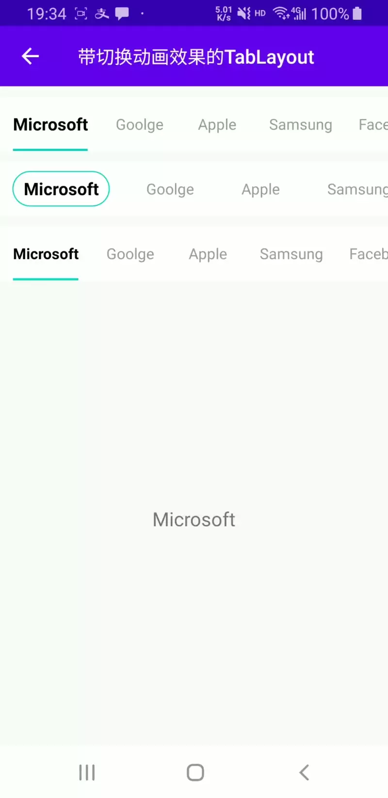
TabLayoutEx
亮点
- 基于原生 TabLayout 源码修改而来,支持原 TabLayout 所有功能,用法也基本保持一致,坚定而固执的认为原生的往往是最好的:smile:
- 取消原生 TabLayout 默认将文字转换为大写的属性
- 添加选中字体变大和加粗效果
- 添加 Tab 圆角背景动画,支持背景越界回弹效果
- 添加指示符跳跃动画
截图
相关属性
TabLayout 原有的属性基本都支持,此处仅列出新添加的属性
| 属性名称 | 类型 | 说明 |
|---|---|---|
| tabUnSelectedTextSize | dimension | 未选中字体大小 |
| tabSelectedTextSize | dimension | 选中字体大小 |
| tabBoldWhenSelected | boolean | 选中字体是否加粗 |
| tabBackgroundIsCorner | boolean | 是否使用圆角背景 |
| tabSlideAnimType | enum | 跳跃动画样式,none 表示不启用跳跃动画,half_glue 表示启用跳跃动画 1,glue 表示启用跳跃动画 2 |
TabLayoutEx 和原生 TabLayout 功能相同但名字有修改的属性
- tabMode 改为 tabModeEx
- tabGravity 改为 tabGravityEx
- tabIconTintMode 改为 tabIconTintModeEx
- tabIndicatorGravity 改为 tabIndicatorGravityEx
用法
<com.github.kongpf8848.viewworld.views.TabLayoutEx
    android:id="@+id/tab_layout"
    android:layout_width="match_parent"
    android:layout_height="50dp"
    android:layout_marginTop="10dp"
    android:background="@color/white"
    <!--每个 TabView 的左边距-->
    app:tabPaddingStart="10dp"
    <!--每个 TabView 的右边距-->
    app:tabPaddingEnd="10dp"
    <!--SlidingTabIndicator 的左边距,其值=app:tabPaddingStart+实际的左边距-->
    app:tabContentStart="25dp"
    <!--tab 模式,scrollable 或 fixed-->
    app:tabModeEx="scrollable"
    <!--指示符和 TabView 宽度是否相同-->
    app:tabIndicatorFullWidth="true"
    <!--指示符高度-->
    app:tabIndicatorHeight="32dp"
    <!--未选中文字颜色-->
    app:tabTextColor="#999999"
    <!--选中文字颜色-->
    app:tabSelectedTextColor="@color/black"
    <!--点击波纹颜色,透明即去除波纹-->
    app:tabRippleColor="@color/transparent"
    <!--未选中文字大小-->
    app:tabUnSelectedTextSize="14sp"
    <!--选中文字大小-->
    app:tabSelectedTextSize="16sp"
    <!--是否为圆角背景-->
    app:tabBackgroundIsCorner="true"
    <!--选中字体是否加粗-->
    app:tabBoldWhenSelected="true"
    />
