ShadowLayout
Introduction: 阴影布局,不管你是什么控件,放进阴影布局即刻享受你想要的阴影
Tags:

特点功能
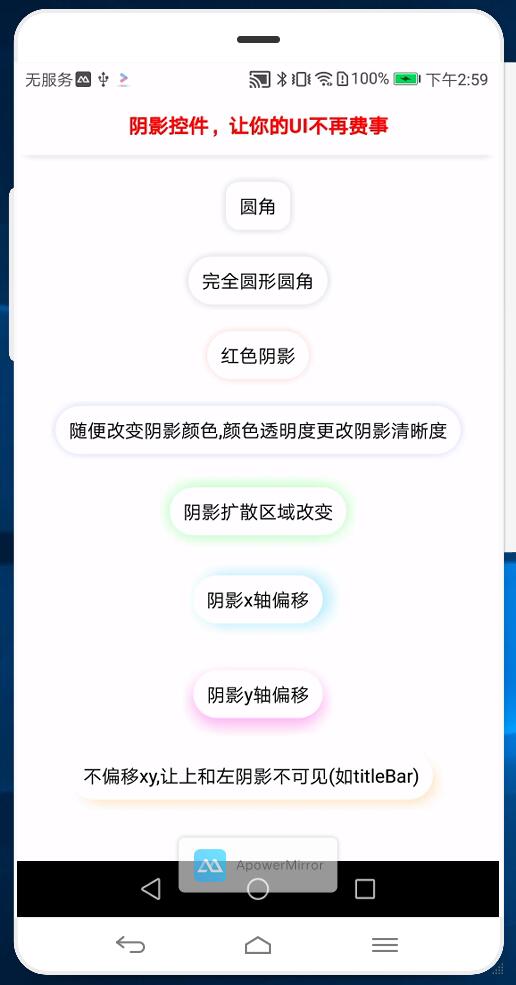
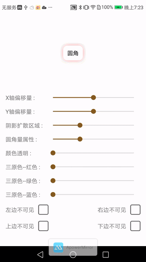
任何 view 被包裹后即可享受阴影,以及系统 shape,selector 功能(清空项目 drawable 文件夹)。具体介绍如下:
支持定制化阴影:
1. 随意修改阴影颜色值
2. 阴影圆角:可统一设置圆角,也可对某几个角单独设置
3. 阴影 x,y 偏移量
4. 随意修改阴影扩散程度,即阴影大小
5. 隐藏阴影:隐藏某边或多边阴影,或完全隐藏
6. 可随意代码动态修改阴影
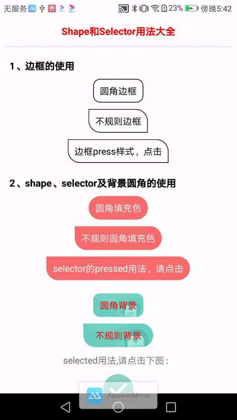
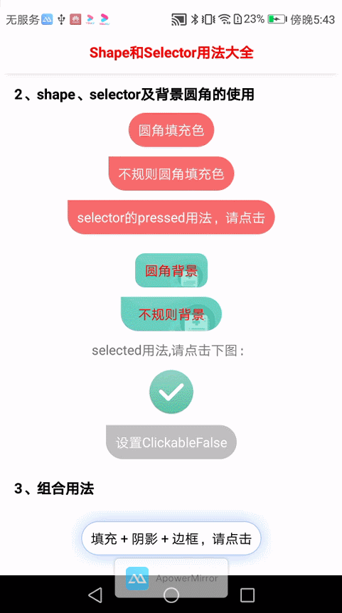
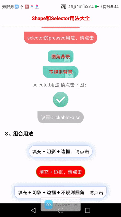
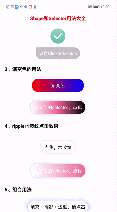
不止于阴影;系统 shape 功能:项目中 shape、selector、ripple 统统拥有。解放你的双手,清空项目 drawable 文件夹
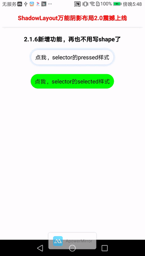
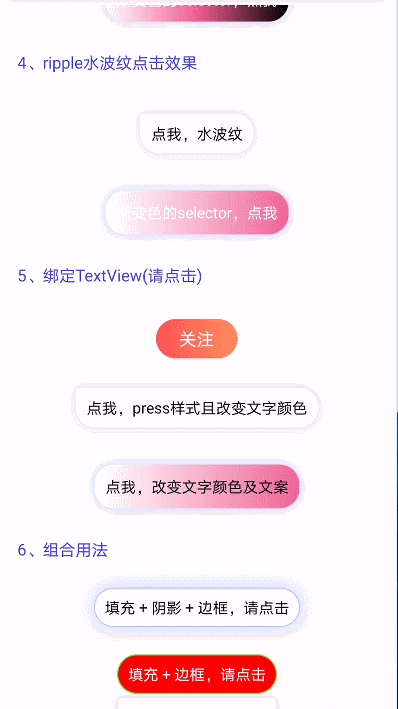
1. shape 样式:pressed(按钮点击)、selected(按钮选择)、ripple(点击水波纹)
2. 背景色设置
3. stroke 边框设置
4. 渐变色背景色设置
5. 按钮是否可被点击及不可点击背景
6. 可绑定 textView 后,可伴随文案变化,可伴随文案颜色变化
7. 支持设置图片背景,支持图片 selector
8. 可以剪裁子 view,比如用到播放器之类的地方,想要各种不同的圆角时,ShadowLayout 可以轻松解决
ShadowLayout 动态
- ShadowLayout 成长史
- 注意:3.0 后修改大量 api 及规范命名,如果还在用 2.0,不方便转移的可查看ShadowLayout2.0 文档
- 注意:3.4.0 后适配了 AndroidX
- 注意:3.4.1 加入了 SmartLoadingView 的使用。点击查看 SmartLoadingView 的使用
Demo
为录制流畅,截图分辨率比较模糊。可在下方扫描二维码下载 apk,查看真机效果。
效果展示
为录制流畅,截图分辨率模糊。可下载 apk 查看真机效果
1.0 功能展示
| 基础功能展示 | 各属性展示 | 随意更改颜色 |
|---|---|---|
 |
 |
 |
2.0 功能更新
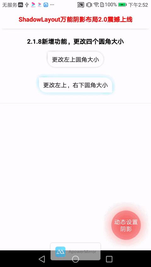
| 2.1.6 新增 shape,selector 功能 | 2.1.7isSym 属性对比 | 2.1.8 单独更改某圆角大小 |
|---|---|---|
 |
 |
 |
3.0.1 版本来袭
| stroke 边框及点击 | shape 及图片 selector | 组合使用 |
|---|---|---|
 |
 |
 |
3.1.0 新增 ripple 及渐变色及 3.1.1 绑定 textView
| 3.1.0 渐变色及 ripple | 3.1.1 绑定 textView |
|---|---|
 |
 |
3.3.1 功能更新
| 增加虚线边框 | 单边虚线 | 边框和 ripple 共存 |
|---|---|---|
 |
 |
 |
添加依赖
- 项目 build.gradle 添加如下
allprojects { repositories { maven { url 'https://jitpack.io' } } } - app build.gradle 添加如下
dependencies {

    //使用 AndroidX 版本
    implementation 'com.github.lihangleo2:ShadowLayout:3.4.5'

    //不使用 AndroidX
    //implementation 'com.github.lihangleo2:ShadowLayout:3.3.3'
}
热门问题
基本使用
一、阴影的简单使用
            <com.lihang.ShadowLayout
                android:id="@+id/mShadowLayout"
                android:layout_width="wrap_content"
                android:layout_height="wrap_content"
                android:layout_gravity="center_horizontal"
                app:hl_cornerRadius="10dp"
                app:hl_shadowColor="#2a000000"
                app:hl_shadowLimit="5dp"
                >

                <TextView
                    android:id="@+id/txt_test"
                    android:layout_width="wrap_content"
                    android:layout_height="36dp"
                    android:gravity="center"
                    android:paddingLeft="10dp"
                    android:paddingRight="10dp"
                    android:text="圆角"
                    android:textColor="#000" />
            </com.lihang.ShadowLayout>
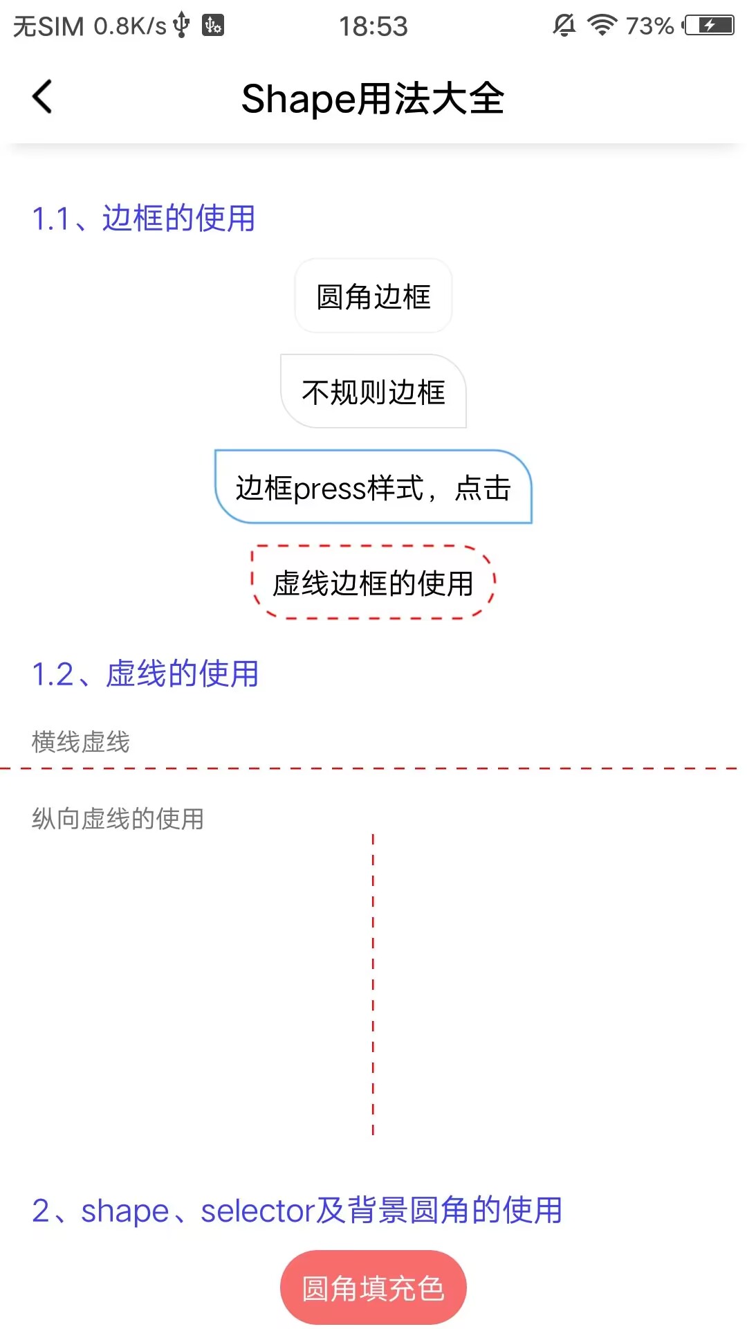
二、stroke 边框的简单使用
            <com.lihang.ShadowLayout
                android:layout_width="wrap_content"
                android:layout_height="wrap_content"
                android:layout_gravity="center_horizontal"
                app:hl_cornerRadius="10dp"
                app:hl_strokeColor="#000">

                <TextView
                    android:layout_width="wrap_content"
                    android:layout_height="36dp"
                    android:gravity="center"
                    android:paddingLeft="10dp"
                    android:paddingRight="10dp"
                    android:text="圆角边框"
                    android:textColor="#000" />
            </com.lihang.ShadowLayout>
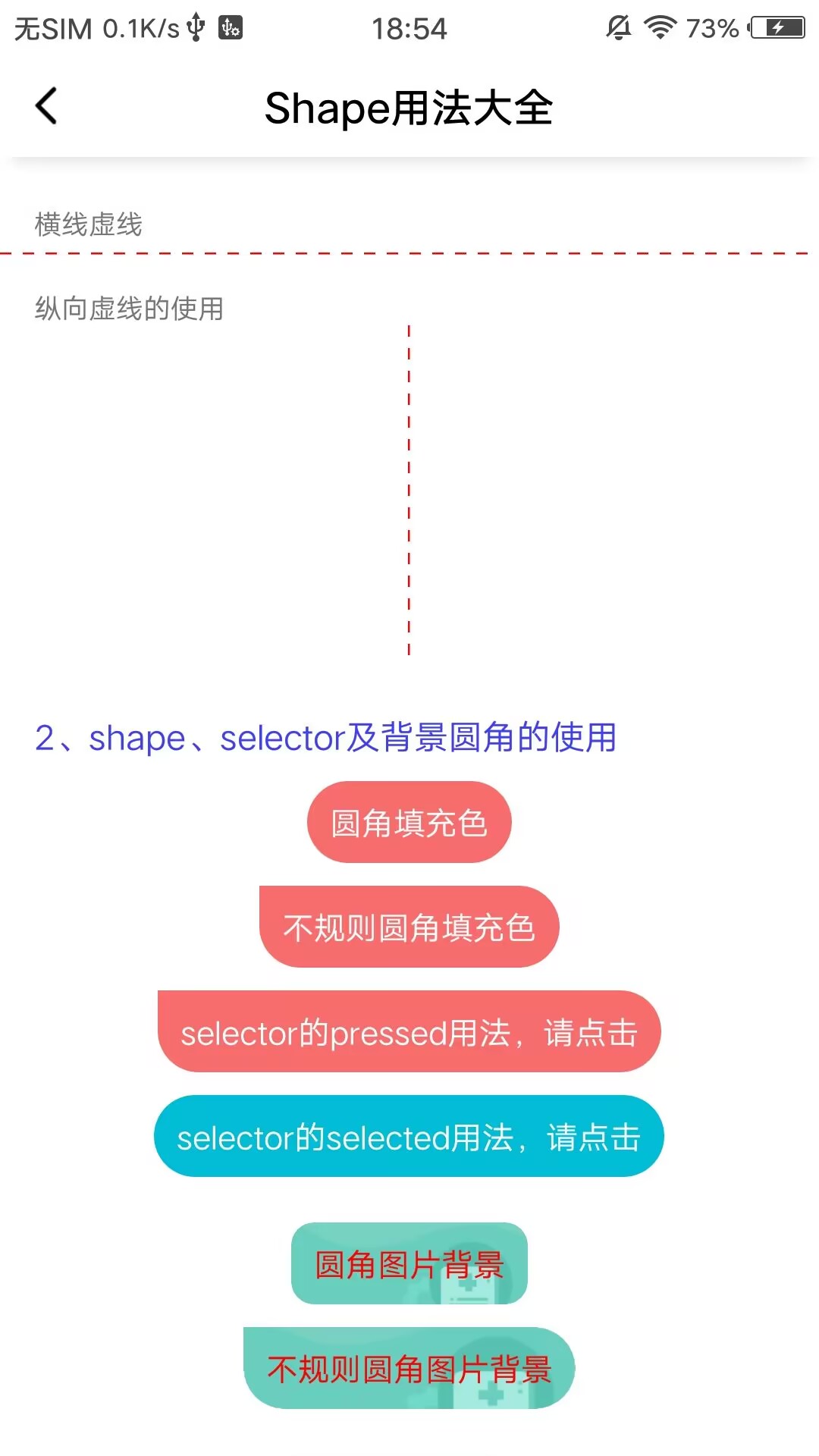
三、shape selector 的简单使用
            <com.lihang.ShadowLayout
                android:layout_width="wrap_content"
                android:layout_height="wrap_content"
                android:layout_gravity="center_horizontal"
                android:layout_marginTop="10dp"
                app:hl_cornerRadius="30dp"
                app:hl_cornerRadius_leftTop="0dp"
                app:hl_layoutBackground="#F76C6C"
                app:hl_layoutBackground_true="#89F76C6C"
                app:hl_shapeMode="pressed">

                <TextView
                    android:layout_width="wrap_content"
                    android:layout_height="36dp"
                    android:gravity="center"
                    android:paddingLeft="10dp"
                    android:paddingRight="10dp"
                    android:text="selector 的 pressed 用法,请点击"
                    android:textColor="#fff" />
            </com.lihang.ShadowLayout>
四、图片 selector 的简单使用
    <com.lihang.ShadowLayout
        android:id="@+id/ShadowLayout_shape"
        android:layout_width="wrap_content"
        android:layout_height="wrap_content"
        android:layout_gravity="center_horizontal"
        android:layout_marginTop="10dp"
        app:hl_cornerRadius="18dp"
        app:hl_cornerRadius_rightTop="0dp"
        app:hl_layoutBackground="@mipmap/test_background_false"
        app:hl_layoutBackground_true="@mipmap/test_background_true">


        <TextView
            android:layout_width="wrap_content"
            android:layout_height="36dp"
            android:gravity="center"
            android:paddingLeft="10dp"
            android:paddingRight="10dp"
            android:text="图片 selector"
            android:textColor="#fff" />

    </com.lihang.ShadowLayout>
如果你觉得麻烦,你还可以这样
            <com.lihang.ShadowLayout
                android:id="@+id/ShadowLayout_image"
                android:layout_width="50dp"
                android:layout_height="50dp"
                android:layout_gravity="center_horizontal"
                android:layout_marginTop="10dp"
                app:hl_layoutBackground="@mipmap/game_6_right"
                app:hl_layoutBackground_true="@mipmap/game_6_wrong"
                app:hl_shapeMode="pressed" />
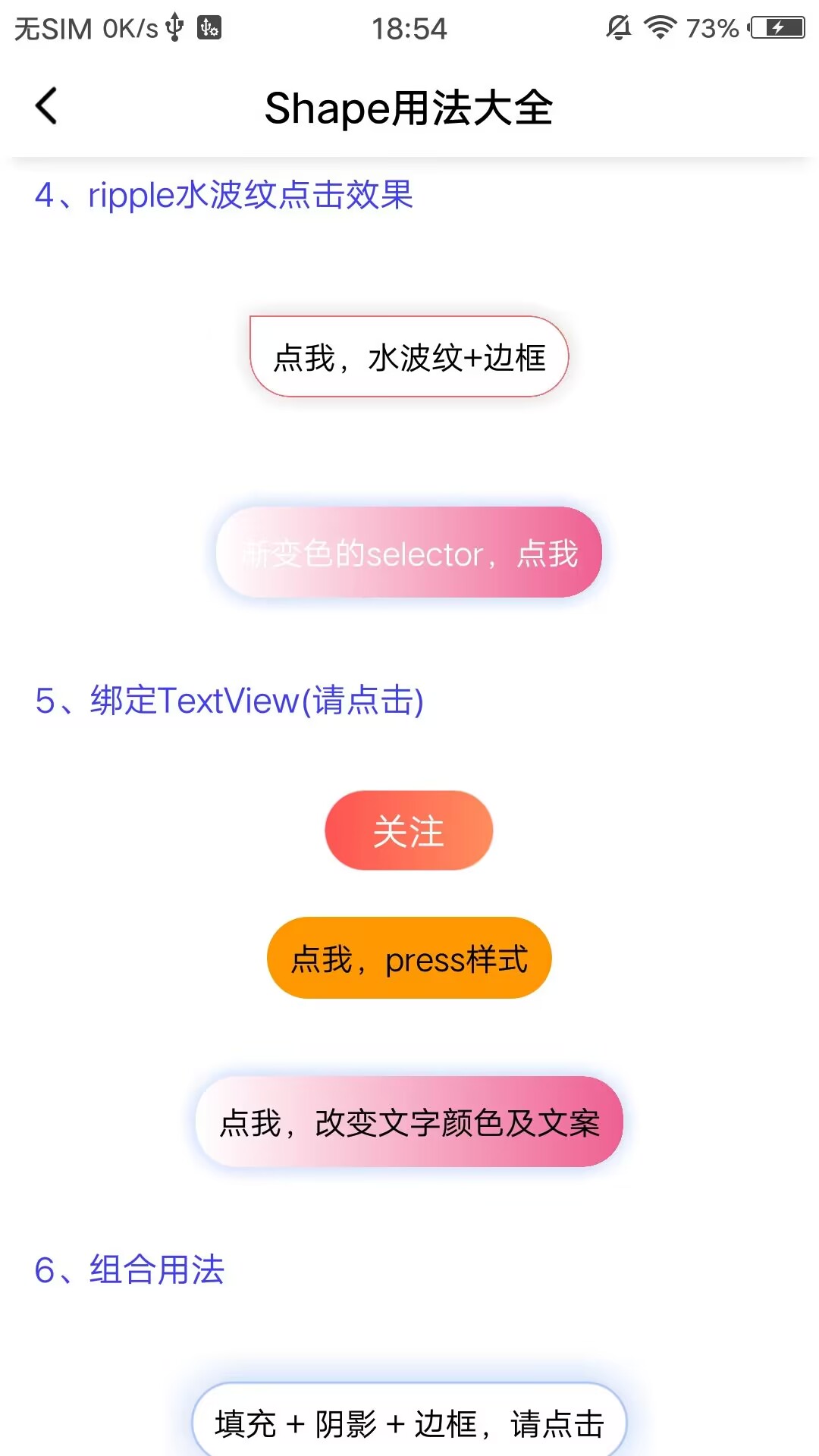
五、渐变色的简单使用
            <com.lihang.ShadowLayout
                android:layout_width="wrap_content"
                android:layout_height="wrap_content"
                app:hl_cornerRadius="18dp"
                app:hl_startColor="#ff0000"
                app:hl_endColor="#0000ff"
                >

                <TextView
                    android:layout_width="160dp"
                    android:layout_height="40dp"
                    android:gravity="center"
                    android:text="渐变色"
                    android:textColor="#fff" />

            </com.lihang.ShadowLayout>
六、水波纹 ripple 的使用
            <com.lihang.ShadowLayout
                android:layout_width="wrap_content"
                android:layout_height="wrap_content"
                app:hl_cornerRadius="18dp"
                app:hl_shadowColor="#2a000000"
                app:hl_shadowLimit="7dp"
                app:hl_layoutBackground="#fff"
                app:hl_layoutBackground_true="#ff0000"
                app:hl_shapeMode="ripple"
                >

                <TextView
                    android:layout_width="160dp"
                    android:layout_height="40dp"
                    android:gravity="center"
                    android:text="水波纹"
                    />

            </com.lihang.ShadowLayout>
七、绑定 textView,伴随文案及颜色变化
        <com.lihang.ShadowLayout
                    android:layout_width="wrap_content"
                    android:layout_height="wrap_content"
                    android:layout_gravity="center_horizontal"
                    android:layout_marginTop="20dp"
                    app:hl_bindTextView="@+id/txt_press"
                    app:hl_cornerRadius="18dp"
                    app:hl_layoutBackground="#FF9800"
                    app:hl_layoutBackground_true="#ff0000"
                    app:hl_shapeMode="pressed"
                    app:hl_textColor_true="#fff"
                    app:hl_text="点我,press 样式"
                    app:hl_text_true="我改变了文案了"
                    >

                    <TextView
                        android:id="@+id/txt_press"
                        android:layout_width="wrap_content"
                        android:layout_height="36dp"
                        android:gravity="center"
                        android:paddingLeft="10dp"
                        android:paddingRight="10dp"
                        android:text="点我,press 样式"
                        android:textColor="#000" />

                </com.lihang.ShadowLayout>
八、单条虚线、hl_shapeMode:dashLine 的使用(以长边为宽度,短边为虚线 width。由此可知,如下例子:为横向虚线)
                <com.lihang.ShadowLayout
                    android:id="@+id/ShadowLayout_line"
                    android:layout_width="match_parent"
                    android:layout_height="1dp"
                    app:hl_strokeColor="#ff0000"
                    app:hl_shapeMode="dashLine"
                    app:hl_stroke_dashWidth="5dp"
                    app:hl_stroke_dashGap="5dp"
                    />
九、剪裁各种难以搞定的圆角(如特殊视频圆角剪裁,注意任何 view 被 ShadowLayout 包裹都能剪裁)
如下代码,剪裁视频播放器(注明 2 点)
- app:hl_layoutBackground="@color/transparent" 取消 shadowLayout 默认背景白色改透明
- app:clickable="false" 取消 shadowLayout 的点击焦点(用于解决 recyclerView 里的点击冲突)
    <com.lihang.ShadowLayout
        android:id="@+id/shadowlayout_Container"
        android:layout_width="match_parent"
        android:layout_height="@dimen/dp_259"
        app:hl_cornerRadius_leftTop="@dimen/dp_12"
        app:hl_cornerRadius_rightTop="@dimen/dp_12"
        app:hl_layoutBackground="@color/transparent"
        app:clickable="false"
        >
        <com.iccapp.module.common.widget.video.VideoView
            android:id="@+id/video_view"
            android:layout_width="match_parent"
            android:layout_height="match_parent"
            />
    </com.lihang.ShadowLayout>
属性表格(Attributes)
一、关于阴影
| name | format | description |
|---|---|---|
| hl_shadowHidden | boolean | 是否隐藏阴影(默认 false) |
| hl_shadowColor | color | 阴影颜色值,如不带透明,默认透明 16% |
| hl_shadowLimit | dimension | 阴影扩散程度(dp) |
| hl_shadowOffsetX | dimension | x 轴的偏移量(dp) |
| hl_shadowOffsetY | dimension | y 轴的偏移量(dp) |
| hl_shadowHiddenLeft | boolean | 左边的阴影不可见,其他 3 边同理 |
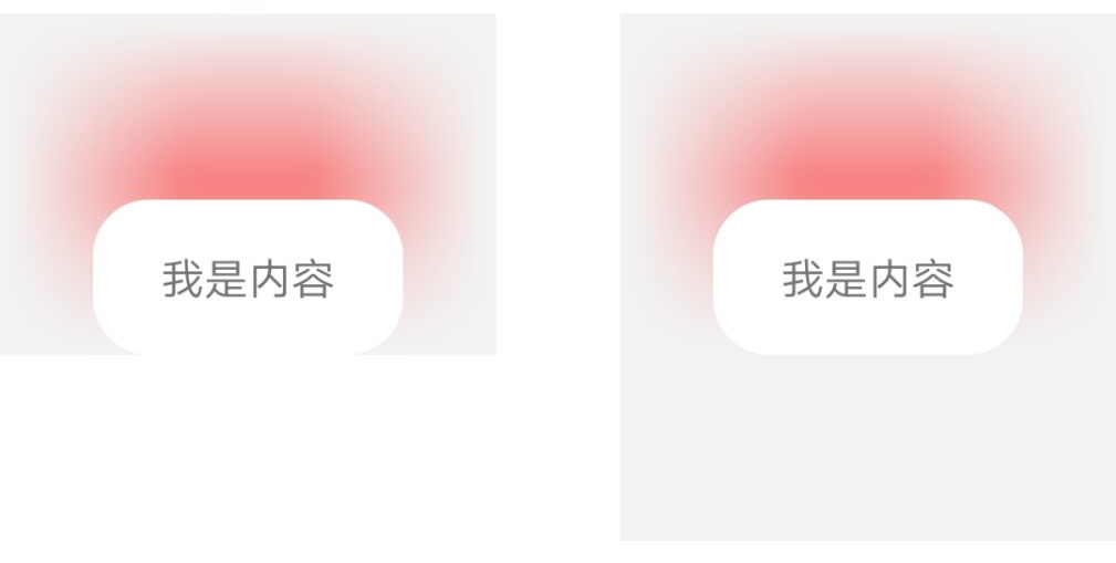
| hl_shadowSymmetry | boolean | 控件区域是否对称(默认 true)根据此图理解 |
二、关于圆角
| name | format | description |
|---|---|---|
| hl_cornerRadius | dimension | 包括阴影圆角、shape 圆角(dp) |
| hl_cornerRadius_leftTop | dimension | 左上圆角,其他角还是 hl_cornerRadius 值;同理其他 3 角(dp) |
三、关于 shape
3.1、关于 shape 样式及背景色
| name | format | description |
|---|---|---|
| hl_shapeMode | enum | 有 4 种模式:pressed 和 selected。和系统 shape 一样,以及 ripple 点击水波纹。新增 dashLine |
| hl_layoutBackground | reference/color | 背景色,为 false 时展示:可以是颜色值,图片以及系统 shape 样式 |
| hl_layoutBackground_true | reference/color | 背景色,为 true 时展示:可以是颜色值,图片以及系统 shape 样式 |
3.2、关于 stroke 边框
| name | format | description |
|---|---|---|
| hl_strokeWith | dimension | stroke 边框线宽度 |
| hl_strokeColor | color | 边框颜色值,为 false 展示 |
| hl_strokeColor_true | color | 边框颜色值,为 true 展示 |
| hl_stroke_dashWidth | dimension | 虚线边框的实线部分长度 |
| hl_stroke_dashGap | dimension | 虚线边框的间隔宽度 |
3.3、关于渐变色
| name | format | description |
|---|---|---|
| hl_startColor | color | 渐变起始颜色(设置渐变色后,hl_layoutBackground 属性将无效) |
| hl_centerColor | color | 渐变中间颜色(可不填) |
| hl_endColor | color | 渐变的终止颜色 |
| hl_angle | integer | 渐变角度(默认 0) |
3.4、关于绑定 textView
| name | format | description |
|---|---|---|
| hl_bindTextView | reference | 当前要绑定的 textView 的 id |
| hl_textColor | color | shape 为 false 是展示的文案颜色 |
| hl_textColor_true | color | shape 为 true 是展示的文案颜色 |
| hl_text | string | shape 为 false 时展示的文案 |
| hl_text_true | string | shape 为 true 时展示的文案 |
四、关于 clickable
| name | format | description |
|---|---|---|
| clickable | boolean | 设置 ShadowLayout 是否可以被点击;代码设置:mShadowLayout.setClickable(false);(默认 true) |
| hl_layoutBackground_clickFalse | reference/color | Clickable 为 false 时,要展示的图片或颜色。(此属性应当在 app:hl_shapeMode="pressed"时生效) |
方法表格(Method)
| name | format | description |
|---|---|---|
| setShadowHidden() | boolean | 是否隐藏阴影 |
| setShadowColor() | color | 设置阴影颜色值 |
| setShadowLimit() | dimension | 设置阴影扩散区域 |
| setOffsetX() | dimension | 设置阴影的 X 轴偏移量 |
| setOffsetY() | dimension | 设置阴影的 Y 轴偏移量 |
| setShadowHiddenTop() | boolean | 隐藏上边阴影(同理其他三遍) |
| setCornerRadius() | dimension | 设置圆角 |
| setLayoutBackground() | color | 设置 false 时的背景颜色值 |
| setLayoutBackgroundTrue() | color | 设置 true 时的背景颜色值 |
| setStrokeColor() | color | 设置 false 时的边框颜色 |
| setStrokeColorTrue() | color | 设置 true 时的边框颜色 |
| setStrokeWidth() | dimension | 设置边框的粗细 |
| setClickable() | boolean | 设置 ShadowLayout 是否可以点击 |
| setSpecialCorner() | integer | 设置 ShadowLayout 四个角的大小 |
| setGradientColor() | integer | 设置渐变颜色 |
赞赏
如果你喜欢 ShadowLayout 的功能,感觉 ShadowLayout 帮助到了你,可以点右上角 "Star" 支持一下 谢谢! ^_^ 你也还可以扫描下面的二维码~ 请作者喝一杯咖啡。或者遇到工作中比较难实现的需求请作者帮忙。

如果在捐赠留言中备注名称,将会被记录到列表中~ 如果你也是 github 开源作者,捐赠时可以留下 github 项目地址或者个人主页地址,链接将会被添加到列表中
捐赠列表
其他作品
万能 ViewPager2 适配器 SmartViewPager2Adapter
RichEditTextCopyToutiao
mPro
SmartLoadingView
关于作者。
Android 工作多年了。前进的道路上是孤独的。如果你在学习的路上也感觉孤独,请和我一起。让我们在学习道路上少些孤独
- QQ 群: 209010674
 (点击图标,可以直接加入)
Licenses
MIT License

Copyright (c) 2019 leo

Permission is hereby granted, free of charge, to any person obtaining a copy
of this software and associated documentation files (the "Software"), to deal
in the Software without restriction, including without limitation the rights
to use, copy, modify, merge, publish, distribute, sublicense, and/or sell
copies of the Software, and to permit persons to whom the Software is
furnished to do so, subject to the following conditions:

The above copyright notice and this permission notice shall be included in all
copies or substantial portions of the Software.
