SmoothCompoundButton
Introduction: Android CompoundButtons (Switch, CheckBox, RadioButton) in Material Design, works on Android 4.0+(SDK 14). SmoothCompoundButton 是全套 Material 风格的 Switch、CheckBox 和 RadioButton 组件,纯 Java 代码(非贴图)像素级复刻了 Material 动画与阴影效果,支持 Android 4.0+。基本实现了在不同 Android 版本上与 Material 风格一致的效果,体验优于官方 AppCompat,可能是目前最好的 Material 风格 CompoundButton 组件之一。
Tags:
Android CompoundButtons (Switch, CheckBox, RadioButton) in Material Design, works on Android 4.0+(SDK 14).
SmoothCompoundButton 是全套 Material 风格的 Switch、CheckBox 和 RadioButton 组件,纯 Java 代码(非贴图)像素级复刻了 Material 动画与阴影效果,支持 Android 4.0+。基本实现了在不同 Android 版本上与 Material 风格一致的效果,体验优于官方 AppCompat,可能是目前最好的 Material 风格 CompoundButton 组件之一。
Screenshots
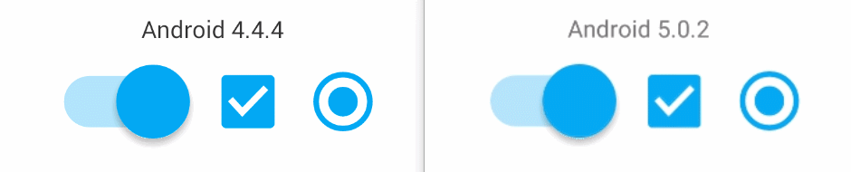
Android 4.x Switch - Click to show GIF, CheckBox - Click to show GIF, RadioButton - Click to show GIF
Android 5.0+ Switch - Click to show GIF, CheckBox - Click to show GIF, RadioButton - Click to show GIF
Sample APK
Features 特性
- 完整地复刻了 Material 风格动画效果,顺滑!流畅!
- 继承于 Button,本身支持显示文字,无需配合 TextView 使用
- 无文字时使按钮标记等比例充满 View,这个在某些场景中很有用
- Switch 的 thumb 具有“逼真”的阴影,像素级代码实现而非贴图
- toogle 动画过程中的颜色变化为渐变效果
- 按下效果和 Material 风格一致,可超出 View 布局边界,5.0+为原生 ripple,4.x 使用 StateListDrawable 实现类似效果
- 支持“正确的”padding,系统的 CheckBox 和 RadioButton 对 padding 的处理很不合常理,见 Sample
- 支持 ClickMarkOnly,是否仅按下“按钮标记”部分为 toogle(即忽略点击文字部分)
- 支持 ReverseMarkPosition,是否反转“正常的按钮标记位置”
- 支持 RTL 从右到左布局,不过懒得处理 Switch 的的按钮标记的左右了
- 支持 Disabled 状态而无需任何手动配置
- 无!任!何 Resources!对,你没有听错,只需导入jar即可(原谅我这个强迫症患者)
Usage 用法
- 只需导入jar
- 使用 SmoothSwitch、SmoothCheckBox、SmoothRadioButton、SmoothRadioGroup 替换掉系统对应的类即可
- Java api 和系统 CompoundButton 完全一致,额外增加的一个方法:
public void setChecked(boolean checked, boolean withAnimation, boolean notifyOnCheckedChangeListener)
- 其他配置见下面的 Attrs
Attrs 属性
除了支持 android:checked,由于本 Library 无!任!何 Resources!故从其他 View 中“借来”了几个属性:
| attr | format | description | notice |
|---|---|---|---|
| android:adjustViewBounds | boolean | ClickMarkOnly,是否仅可点击按钮标记部分 | 默认 false,即整体可点击 |
| android:cropToPadding | boolean | ReverseMarkPosition,是否反转“正常的按钮标记位置” | 默认 false,即正常位置 |
| android:tint | color | MarkColor,按钮标记的颜色 | 如果是单个颜色则取为 state_checked 时的颜色,如果是 selector 会分别取两种对应状态的颜色 |
- 如果没有指定 android:gravity,则设置为 Gravity.CENTER_VERTICAL
- 其实 android:checked 也是借来的,这个是 CompoundButton 的属性,而 SmoothCompoundButton 的基类是继承于 Button
Developed By
Mixiaoxiao - xiaochyechye@gmail.com or mixiaoxiaogogo@163.com
License
Copyright 2016 Mixiaoxiao

Licensed under the Apache License, Version 2.0 (the "License");
you may not use this file except in compliance with the License.
You may obtain a copy of the License at

   http://www.apache.org/licenses/LICENSE-2.0

Unless required by applicable law or agreed to in writing, software
distributed under the License is distributed on an "AS IS" BASIS,
WITHOUT WARRANTIES OR CONDITIONS OF ANY KIND, either express or implied.
See the License for the specific language governing permissions and
limitations under the License.
