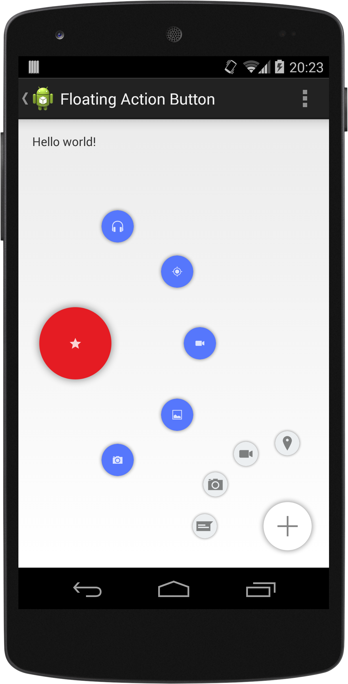
CircularFloatingActionMenu

An animated, customizable circular floating menu for Android, inspired by Path app.
Getting Started
Requirements
- API >= 15
Installation
Grab the AAR from Maven Central by adding it as a dependency in your build.gradle file:
dependencies {
    compile 'com.oguzdev:CircularFloatingActionMenu:1.0.2'
}
Alternatively, clone the repo and add library as a module to your project.
Usage
CircularFloatingActionMenu can be attached to any view in your layout. A Floating Action Button implementation is available in the library, with a similar look to new Material Design's FAB.
1 - Create a button to attach the menu:
// in Activity Context
ImageView icon = new ImageView(this); // Create an icon
icon.setImageDrawable( ... );

FloatingActionButton actionButton = new FloatingActionButton.Builder(this)
                                        .setContentView(icon)
                                        .build();
2 - Create menu items:
SubActionButton.Builder itemBuilder = new SubActionButton.Builder(this);
// repeat many times:
ImageView itemIcon = new ImageView(this);
itemIcon.setImageDrawable( ... );
SubActionButton button1 = itemBuilder.setContentView(itemIcon).build();
3 - Create the menu with the items:
FloatingActionMenu actionMenu = new FloatingActionMenu.Builder(this)
                                    .addSubActionView(button1)
                                    .addSubActionView(button2)
                                    // ...
                                    .attachTo(actionButton)
                                    .build();
And you're ready to go!
Customization
Animations, start angle, end angle and radius are customizable via FloatingActionMenu.Builder.
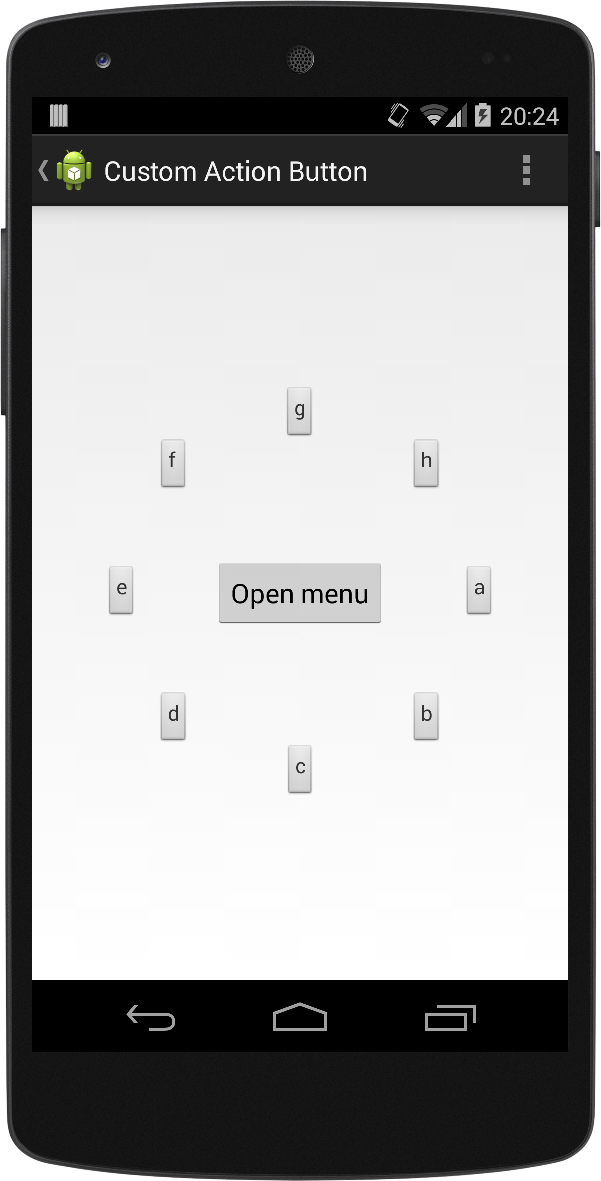
FloatingActionMenu is the essential class for the menu. Other two classes, FloatingActionButton and SubActionButton are just views and they can be replaced with any other view. You are completely free to create your own menu button and item views.
Existing FloatingActionButton and SubActionButton views are customizable too. These parameters can be changed via Builders of both classes:
- Theme (Light / Dark)
- Background drawable
- LayoutParams (width & height)
- Content View
FloatingActionButton can be placed to one of 8 predefined positions on the screen. To place it somewhere else, extend it!


Custom Animations
You can write your own animation handler class by extending from MenuAnimationHandler to completely customize menu opening and closing animations.
Then all you need is to create an instance of your custom animation handler and pass it to FloatingActionMenu.Builder via setAnimationHandler( ) method.
See CustomAnimationHandler in samples module for a sample animation handler.
Licence
CircularFloatingActionMenu is released under MIT Licence. See file LICENCE.
