viewpagerdots
Introduction: Simple, compact Kotlin library for ViewPager page indicators.
Tags:
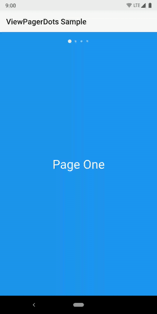
This library provides a very small, compact, Kotlin-based implementation for ViewPager dots. The dots can of course be switched out for whatever type of Drawable you wish. The animation can be customized as well.

Dependency
dependencies {

  implementation 'com.afollestad:viewpagerdots:1.0.0'
}
Usage
Your layout would look something like this:
<LinearLayout
    xmlns:android="http://schemas.android.com/apk/res/android"
    android:layout_width="match_parent"
    android:layout_height="match_parent"
    android:orientation="vertical"
    >

  <com.afollestad.viewpagerdots.DotsIndicator
      android:id="@+id/dots"
      android:layout_width="match_parent"
      android:layout_height="48dp"
      />

  <androidx.viewpager.widget.ViewPager
      android:id="@+id/pager"
      android:layout_width="match_parent"
      android:layout_height="match_parent"
      />

</LinearLayout>
You attach the view pager to the dots indicator in your code:
val viewPager: ViewPager = // ...
val dots: DotsIndicator = // ...

viewPager.adapter = // ... This must be set before attaching
dots.attachViewPager(viewPager)
Customization
Lots of things can be visually customized about the DotsIndicator.
From your layout, here's a list of XML attributes:
app:dot_width(the width of each individual dot)app:dot_height(the height of each individual dot)app:dot_margin(spacing between each dot)app:dot_drawable(the default icon for each dot)app:dot_drawable_unselected(defaults todot_drawable)app:dot_tint(lets you apply a color tint to the above drawables)app:dots_animator(the animator when a dot becomes selected)app:dots_animator_reverse(defaults to reversed version of the above)app:dots_orientation(orientation of the whole strip; defaults tohorizontal)app:dots_gravity(gravity of the whole strip; defaults tocenter)
You can also apply some basic changes dynamically in your code:
val dots: DotsIndicator = // ...

// This lets you switch out the indicator drawables at runtime.
dots.setDotDrawable(
  indicatorRes = R.drawable.some_drawable,
  unselectedIndicatorRes = R.drawable.other_drawable // optional, defaults to above
)

// These two let you dynamically tint your indicators at runtime.
dots.setDotTint(Color.BLACK)
dots.setDotTintRes(R.color.black)
