JPagerSlidingTabStrip
JPagerSlidingTabStrip: 增强版的 PagerSlidingTabStrip. 使用方式和 PagerSlidingTabStrip 一样简单,但功能和样式更丰富
内置 3 中 tab 风格 还可以 继承子自 JTabStyle 实现自己的风格和动画 (JTabStyle)
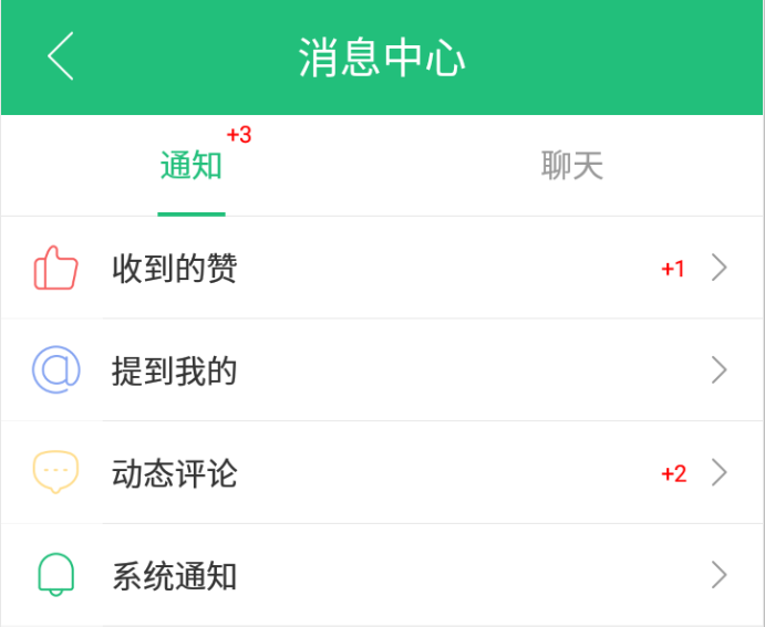
增加 右上角的提示信息 (仿微信)
0.1.13 版本 新增 PromptImageView,PromptTextView
使用方法
1,引入依赖
implementation 'com.yun.ospl:jtabstrip:0.1.14-X'
2,布局
<android.support.v4.view.ViewPager
        android:id="@+id/pager"
        android:layout_width="match_parent"
        android:layout_height="wrap_content"
        tools:context=".MainActivity"/>

<april.yun.JPagerSlidingTabStrip
    	android:id="@+id/tab_buttom"
    	android:layout_width="match_parent"
    	android:layout_height="wrap_content"
    	android:padding="5dp"/>
2,属性设置(当然也可以在布局里面设置相关属性)
1, 找控件
    ISlidingTabStrip buttomTabStrip = (ISlidingTabStrip) findViewById(R.id.tab_buttom);
2,拿 TabStyleDelegate
    tabStyleDelegate = buttomTabStrip.getTabStyleDelegate();
3, 用 TabStyleDelegate 设置属性
    tabStyleDelegate.setJTabStyle(type)//类型有提供 3 种,还可以自己实现想要的效果,待会儿详细介绍
                    .setShouldExpand(true)//用过的都知道干啥用的
                    .setFrameColor(Color.parseColor("#45C01A"))//边框颜色 设置为透明则不画边框
                    .setTabTextSize(getDimen(R.dimen.tabstrip_textsize))//tab 栏的字体大小
                    //也可以直接传字符串的颜色,第一个颜色表示 checked 状态的颜色第二个表示 normal 状态
                    .setTextColor(Color.parseColor("#45C01A"),Color.GRAY)
                    .setDividerColor(Color.parseColor("#45C01A"))//tab 之间的分割线 设置透明不画
                    .setDividerPadding(0)//tab 之间分割线 的上下 pading
                    .setUnderlineColor(Color.parseColor("#3045C01A"))//底部横线 透明不画
                    .setUnderlineHeight(0)//底部横线的高度
                    .setCornerRadio(0)//设置滚动指示器和边框的圆角半径
                    .setIndicatorColor(Color.parseColor("#7045C01A"))//滚动的指示栏的颜色 透明不画
        //滚动的指示栏的高度 :高度如果大于 0 小于 tab 高的一半则指示栏在底部 小于 0 则在 tab 栏的顶部 高度如果大于 tab 栏高度的一般那么包裹文字
                    .setIndicatorHeight(-8);
3, 给 ViewPager 写个 Adapter
public class MyPagerAdapter extends FragmentPagerAdapter implements ISlidingTabStrip.IconTabProvider {

    public MyPagerAdapter(FragmentManager fm) {
        super(fm);
    }


    @Override public CharSequence getPageTitle(int position) {
        return mTitles[position];//标题
    }

    //返回的是一个数组 第一个 normal 状态的 icon 第二个 checked 状态下的
    @Override public int[] getPageIconResIds(int position) {
        //return new int[]{mNormal[position],mChecked[position]};
        return null;
    }


    @Override public int getPageIconResId(int position) {
        //		return mPressed[position];
        return mSelectors[position];
    }
    @Override public int getCount() {
        return mTitles.length;
    }


    @Override public Fragment getItem(int position) {
        return DemoCardFragment.newInstance(position);
    }
}
如果要实现微信的底部导航栏的效果那么 adapter 需要实现 IconTabProvider 接口
- 重点 3 个方法 getPageTitle(提供标题文字内容),getPageIconResIds(提供标题的 icon 图标),getPageIconResId(提供标题的 icon 图标),
- 后面两个方法的区别是:getPageIconResIds 只需要两个数组,getPageIconResId 需要一个数组+多个 selector 文件
  mTitles = getResources().getStringArray(R.array.tabs);
  //for getPageIconResIds
   mNormal = new int[] { R.drawable.ic_tab_msg, R.drawable.ic_tab_contact,
                          R.drawable.ic_tab_moments, R.drawable.ic_tab_profile };
   mChecked = new int[] { R.drawable.ic_tab_msg_h, R.drawable.ic_tab_contact_h,
                           R.drawable.ic_tab_moments_h, R.drawable.ic_tab_profile_h };
  //for getPageIconResId (需要 selector)
   mSelectors = new int[] { R.drawable.tab_msg, R.drawable.tab_contact, R.drawable.tab_moment, R.drawable.tab_profile };
  R.drawable.tab_msg 如下:
  <selector xmlns:android="http://schemas.android.com/apk/res/android">
       <item android:state_checked="true" android:drawable="@drawable/ic_tab_msg_h"/>
       <item android:drawable="@drawable/ic_tab_msg"/>
  </selector>
4,绑定 ViewPager
(JPagerSlidingTabStrip) buttomTabStrip.bindViewPager(viewpager);
效果图:

=============================================
tabStyleDelegate.setJTabStyle 方法详细介绍
setJTabStyle 有两个重载方法 setJTabStyle(int tabStyle)和setJTabStyle(JTabStyle tabStyle)
setJTabStyle(int tabStyle)提供三种 Style,分别是 STYLE_DEFAULT,STYLE_ROUND,STYLE_DOTSSTYLE_DEFAULT效果

STYLE_ROUND效果

STYLE_DOTS效果

setJTabStyle(JTabStyle tabStyle)自己实现 tab 栏的效果绘制比如这个效果

示例代码: public class CustomTabStyle extends JTabStyle { private Path mTrianglePath = new Path(); private int mTrigangleHeight = 10; public CustomTabStyle(ISlidingTabStrip slidingTabStrip) { super(slidingTabStrip); } @Override public void onDraw(Canvas canvas, ViewGroup tabsContainer, float currentPositionOffset, int lastCheckedPosition) { //计算指示栏滚动时左右两边的位置 具体实现方式在父类 calcuteIndicatorLinePosition(tabsContainer, currentPositionOffset, lastCheckedPosition); if (mTabStyleDelegate.getIndicatorColor() != Color.TRANSPARENT) { // draw indicator line calcuteIndicatorLinePosition(tabsContainer, currentPositionOffset, lastCheckedPosition); //draw indicator calcuteTrianglePath(); canvas.drawPath(mTrianglePath,mIndicatorPaint); } } //计算三角形的 path private void calcuteTrianglePath() { float tabWidth = mLinePosition.y - mLinePosition.x; float vertex = mH-mTrigangleHeight; float tr_left = mLinePosition.x+tabWidth/2-mTrigangleHeight; float tr_right = mLinePosition.x+tabWidth/2+mTrigangleHeight; mTrianglePath.reset(); mTrianglePath.moveTo(tr_left, mH); mTrianglePath.lineTo(mLinePosition.x + tabWidth / 2, vertex); mTrianglePath.lineTo(tr_right, mH); mTrianglePath.close(); } }
setIndicatorHeight(int)和 setCornerRadio()

.setTextColor()设置 tab 栏文字颜色
######两个重载方法setTextColor(@Size(value = 2)@ColorInt int... colors)和setTextColor(@Size(value = 2) String... colorStrs)
setTabIconGravity(int tabIconGravity)
设置 icon 显示的位置,默认Gravity.TOP(微信导航栏效果)也可以设置下左右和Gravity.NO_GRAVITY(就是 background 了)
一行代码完成微信的消息提示

//index:导航栏种第几个 tab ,msgNum:(0~99 显示数字,0 移除消,>99 显示~)
(JPagerSlidingTabStrip) buttomTabStrip..setPromptNum(index, msgNum);
为提示信息增加的属性
mPromptBgColor提示信息胶囊背景颜色mPromptNumColor提示信息文字颜色
新增控件
PromptImageView 实现效果

PromptTextView 实现效果

两个控件的公有方法:
    public SuperPrompt getPromptHelper();
        //设置提示内容
        public IPrompt setPromptMsg(String promptMsg);
        //显示提示小圆圈
        public IPrompt showNotify();
        //设置提示背景为圆形
        public IPrompt forcePromptCircle();
        //调整提示框的位置
        public IPrompt setPromptOffset(int offset);
        //强制提示框竖直剧中
        public IPrompt forceCenterVertical();
        //设置提示框的背景颜色和文字颜色
        public IPrompt configPrompt(int promptBgColor, int promptColor);
        //只显示 提示文本背景为透明,文本为红色
        public IPrompt asOnlyNum();
        //PromptTextView 中 强制 提示 居右侧,同时设置距离右边边距
        public PromptTextView forceRightOffset(int)
感谢
License
Copyright 2013 Andreas ZuYun

Licensed under the Apache License, Version 2.0 (the "License");
you may not use this file except in compliance with the License.
You may obtain a copy of the License at

   http://www.apache.org/licenses/LICENSE-2.0

Unless required by applicable law or agreed to in writing, software
distributed under the License is distributed on an "AS IS" BASIS,
WITHOUT WARRANTIES OR CONDITIONS OF ANY KIND, either express or implied.
See the License for the specific language governing permissions and
limitations under the License.
