LQRDropdownLayoutLibrary
Introduction: 下拉导航菜单,使用非常简单
Tags:
下拉导航菜单,使用非常简单
LQRDropdownLayout
该项目是下拉导航菜单,使用非常简单。基于 FilterDropDownMenu-master 项目进行封装,因为原项目的使用太复杂了,光布局就得几十行代码,如果项目中多处用到下拉菜单,那代码的冗余度就太大了,故本布局对其进行精简,并增加更多效果(如:选中时条目的背景及旁边的图标都可自定义等),使用时仅仅只要 2 个步骤:
1、导入
compile 'com.lqr.dropdownLayout:library:1.0.0'
2、设置布局
<com.lqr.dropdownLayout.LQRDropdownLayout
    android:id="@+id/dl"
    android:layout_width="match_parent"
    android:layout_height="match_parent"
    app:ddl_item_selected__drawable="@mipmap/ic_task_status_list_check"
    app:ddl_item_text_gravity="left"
    app:ddl_list_max_height="250dp"
    app:ddl_top_btn_noraml_drawable="@mipmap/ic_dropdown_normal"
    app:ddl_top_btn_selected_drawable="@mipmap/ic_dropdown_actived"/>
3、代码控制
LQRDropdownLayout mDl = (LQRDropdownLayout) findViewById(R.id.dl);
mDl.setCols(2);
//创建内容区
TextView tv = new TextView(this);
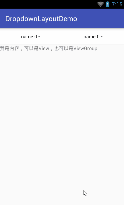
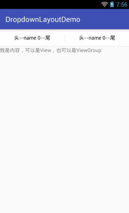
tv.setText("我是内容,可以是 View,也可以是 ViewGroup");
//创建下拉列表数据
final List<Map<String, String>> listData = new ArrayList<>();
for (int i = 0; i < mDl.getCols(); i++) {
//这里使用 LinkedHashMap 是为了让下拉列表的条目有序
Map<String, String> map = new LinkedHashMap<>();
for (int j = 0; j < 6; j++) {
map.put("name " + j, "value " + j);
}
listData.add(map);
}
//初始化(该方法必须调用)
mDl.init(tv, listData);
//设置菜单点击监听
mDl.setOnDropdownListListener(new LQRDropdownLayout.OnDropdownListListener() {
@Override
public void OnDropdownListSelected(int indexOfButton, int indexOfList, String textOfList, String valueOfList) {
}
@Override
public void onDropdownListOpen() {
}
@Override
public void onDropdownListClosed() {
}
});
4、可实现的效果如下:
5、其他设置
由于该控件的可自定义属性太多,这里就一一举例了,请看其自定义属性
<resources>
<declare-styleable name="DropdownLayout">
    <!--下拉列表的列数-->
    <attr name="ddl_cols" format="integer"/>
    <!--下拉按钮与下拉列表中只显示一个,如果在下拉列表中选择了 item5,则 item5 消失,下拉按钮显示 item5 的 name-->
    <attr name="ddl_only_show_one" format="boolean"/>

    <!--下拉按钮区背景-->
    <attr name="ddl_top_bg" format="color"/>
    <!--下拉按钮区的高度-->
    <attr name="ddl_top_height" format="dimension"/>
    <!--下拉按钮区的分割线颜色-->
    <attr name="ddl_top_split_line_color" format="color"/>
    <!--下拉按钮区的分割线宽度-->
    <attr name="ddl_top_split_line_width" format="dimension"/>
    <!--下拉按钮区的分割线高度-->
    <attr name="ddl_top_split_line_height" format="dimension"/>

    <!--下拉按钮文本前缀-->
    <attr name="ddl_top_btn_text_prefix" format="string"/>
    <!--下拉按钮文本后缀-->
    <attr name="ddl_top_btn_text_suffix" format="string"/>
    <!--下拉按钮文字大小-->
    <attr name="ddl_top_btn_text_size" format="dimension"/>
    <!--下拉按钮未选中时文字颜色-->
    <attr name="ddl_top_btn_text_normal_color" format="color"/>
    <!--下拉按钮选中时文字颜色-->
    <attr name="ddl_top_btn_text_selected_color" format="color"/>
    <!--下拉按钮文字未选中时显示的图标-->
    <attr name="ddl_top_btn_selected_drawable" format="reference"/>
    <!--下拉按钮文字选中时显示的图标-->
    <attr name="ddl_top_btn_noraml_drawable" format="reference"/>

    <!--下划线宽度-->
    <attr name="ddl_top_bottom_line_width" format="dimension"/>
    <!--下划线高度-->
    <attr name="ddl_top_bottom_line_height" format="dimension"/>
    <!--下划线颜色-->
    <attr name="ddl_top_bottom_line_color" format="color"/>

    <!--分割线颜色-->
    <attr name="ddl_split_line_color" format="color"/>
    <!--分割线宽度-->
    <attr name="ddl_split_line_width" format="dimension"/>
    <!--分割线高度-->
    <attr name="ddl_split_line_height" format="dimension"/>

    <!--遮盖层颜色-->
    <attr name="ddl_mask_bg" format="color"/>

    <!--下拉列表的最大高度-->
    <attr name="ddl_list_max_height" format="dimension"/>

    <!--下拉列表 item 的左内间距-->
    <attr name="ddl_item_padding_left" format="dimension"/>
    <!--下拉列表 item 的右内间距-->
    <attr name="ddl_item_padding_right" format="dimension"/>
    <!--下拉列表 item 的高度-->
    <attr name="ddl_item_height" format="dimension"/>
    <!--下拉列表 item 文字大小-->
    <attr name="ddl_item_text_size" format="dimension"/>
    <!--下拉列表 item 未选中时文字颜色-->
    <attr name="ddl_item_text_normal_color" format="color"/>
    <!--下拉列表 item 选中时文字颜色-->
    <attr name="ddl_item_text_selected_color" format="color"/>
    <!--下拉列表 item 未选中时背景颜色-->
    <attr name="ddl_item_normal_bg" format="color"/>
    <!--下拉列表 item 选中时背景颜色-->
    <attr name="ddl_item_selected_bg" format="color"/>
    <!--下拉列表 item 未选中图标-->
    <attr name="ddl_item_normal_drawable" format="reference"/>
    <!--下拉列表 item 选中图标-->
    <attr name="ddl_item_selected__drawable" format="reference"/>
    <!--下拉列表 item 的文字位置-->
    <attr name="ddl_item_text_gravity">
        <enum name="center" value="0"></enum>
        <enum name="left" value="1"></enum>
        <enum name="right" value="2"></enum>
    </attr>

    <!--下拉列表 item 下划线高度-->
    <attr name="ddl_item_bottom_line_height" format="dimension"/>
    <!--下拉列表 item 下划线左边距-->
    <attr name="ddl_item_bottom_line_margin_left" format="dimension"/>
    <!--下拉列表 item 下划线右边距-->
    <attr name="ddl_item_bottom_line_margin_right" format="dimension"/>
    <!--下拉列表 item 下划线颜色-->
    <attr name="ddl_item_bottom_line_color" format="color"/>

</declare-styleable>
</resources>
